")

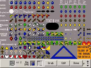
My only big gripe is how bright the colours are and the little contrast between colours. Given the original idea, though, I can understand why they're so bright. Still, I'd personally make the colours contrast more and perhaps tone the colours down a little.
The shape of the items themselves are good. They could be better, but it's definitely a step forward. All I can really say is keep at it; you'll get better.
Also, I laughed when I read the sign. :3


