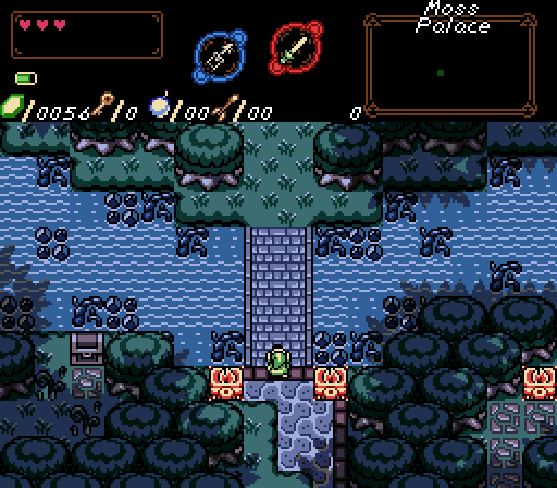
I really like Aefre's screen. It's just a nice mood with a nice palette, and I appreciate little touches like the treasure chest's colors being desaturated but the torches standing out. I took a bit to realize that the effect in the shallow water in the top right was a treetop layer effect--I thought it was a funky reflection for a bit. Still looks cool!
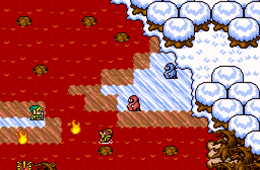
Einsiety's screen doesn't do it for me. I'm not sure whether to call it a tileset or a palette thing, considering the trees are what bother me the most and they're recolored GBC trees. The bold unaliased black outlines just stand out against the white way too much for my taste, and the brown trunks are also a bit too saturated to really sell the winter half's look for me. The unholy lava ice effects are kinda neat.
I don't really know what to say about Majora's screen! It's a title screen, I was never gonna vote here. I do think the world underneath is awkward, it's full of all these stray pixels.
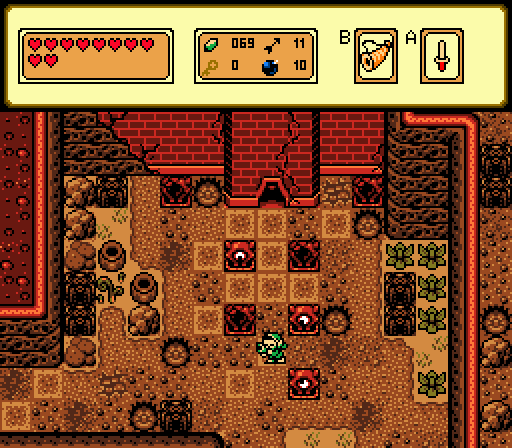
Taco Chopper's screen is perfectly serviceable, it's just...harsh. The red glare on everything is a little overpowering. The building especially, I think? I do like how it gives that one plant on the left this little reddish gleam and sort of wish there was more of that. Kinda forces you to break GBC, but only in a non-obvious way where I had to stop and count colors to make sure, sooooo.

 This topic is locked