Jump to content

Pure Houses and Ect.

Overview
Creator: Manifesto Empire Added: 17 Apr 2005 Downloads: 32
Rating[?]: Rating: 4.13/5 (7 ratings)
Download Tile
(6.65 KB)
Tags: Original, Overworld, Structure
Information

About Reviews

ZeldaLord  
Rating: 3/5

Posted 02 June 2005 - 04:05 PM
These are quite nice, although the last two do look slightly wrong, as Happyman pointed out.
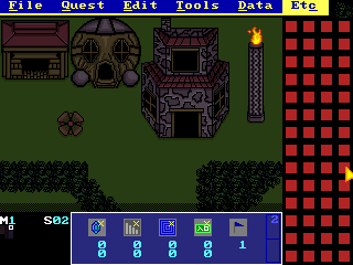
The leftmost one is my favorite, although it does seem to lack a doorframe for some reason.

The center one would actually look quite good layered over a cliff, the flatness would be less noticable then, and it would look like part of the cliff. Alternatively, it could be edited to look like and underground passge, which would need to be flat.

The last "house", unfortunately, needs to be completely redone.
The roof is good, but he windows are awkward, the chimney is drawn from the wrong perspective, and the wall texture is questionable.

The pillar on the right also looks a bit flat, though that doesn't really matter, since pillars often are flat.

Overall good effort, but work on perspective.
 

Reft  
Rating: 5/5

Posted 14 May 2005 - 11:04 AM
on the picture its dark but i thinks it great am going to download it
 

Aaron  
Rating: 5/5

Posted 23 April 2005 - 06:05 PM
Great job, Shashomaru . The perspectives on one isn't perfect, but everything else is great.
 

HappyPuppet  
Rating: 3/5

Posted 21 April 2005 - 03:56 PM
I can appreciate the effort it took to make these, but there are problems.

The left house was great.

The middle house, when I first saw it, looked like it was something laying flat on the ground, maybe a skull emblem. I think it'd look better if you made it look like the door was really coming out of the house. I can see that you were trying, but the points where the door's "tunnel" connects to the house need to have some darkish outlines.

The right house is unsound geometrically. I could tell with a short glance that the windows were drawn a little weird. For one thing, their asymmetry bothers me. Also, if you were to look at them straight on, they would be slanted. That would be fixed if their top and bottom edges were made to be parallel (or close) to the walls of the house above and below. Finally, the roof is straight on the top edge, but it should probably extend back a little behind the red slanted part.

Sorry if I came off too hard. Just trying to be honest and provide suggestions.
 

Radien  
Rating: 4/5

Posted 18 April 2005 - 07:28 PM
Could use some more shading, but otherwise excellent.

Why do you keep making preview shots in this dark palette? It's hard to see.
 

View all reviews (7)