")
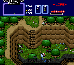
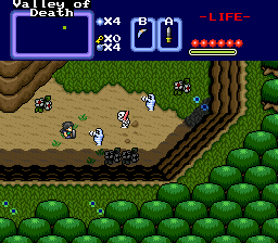
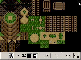

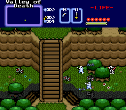
I don't deny they look quite good. It doesn't seem to be too much of an edit of the LTTP mountain though, so I gave a 4 stars. And as Petoe pointed out, there are some minor problems.
Particularly that light line just below the black one Petoe mentioned. There are two things I don't like about it. The first thing is I personally think it's a bit too bright compared to the other colors. Perhaps you could edit the palette to solve that (or those who rip it can). The other thing I don't like is how that light line suddenly changes to dark in the diagonal cliff tile. It's not that good of a transition. Could use a bit of work.
Good job.