Link128:Side view, eh? Hmm, interesting... but it'd be nice if it used a greater variety of tiles. Why is the rain purplish? I think you should recolor it, if your problem is the dungeon palette.
Ian:This week isn't a very good week for shots, IMO, so I somehow felt one screen would run away with the votes... well, for once, I'm sorry, but I really don't think this one deserves it.

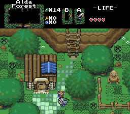
The house tiles are cool, the ladder tiles are cool, the fence tiles are cool. But I hate this layout. The grass is placed randomly and looks like a mess, the tree graphics clash with the rest of the tiles and look very flat, and well... there's not much going on here, either.

All the good content is in the tiles.
ML3K:This room is way too cluttered...
Edit: One other thing. You shouldn't have a dark translucency over that "entrance" passageway. If you're going to use those tiles, you have to treat it as a light source, and make a new shape of "light" to shine from it (the circle-shaped ones you already have are good for torches and skylights, but not doorways).
Snort:Hey, cool. Where did you get those wall tiles? They're very nice.
Unfortunately, I don't like the rest of this shot, due to the way-too-bright green and the unappealing floor pattern.
Shoelace:Fun scene... looks good.

However, the color is being leached out by whatever palette or translucency you're using. It looks like one whole shade of green is missing.
Mr. ZThis shot defines the difference between fancy tiles and good layout. There's nothing new here, yet I like it already.

My vote goes here!
EDIT:
....WAITASECOND!!
Shoelace! Crap! What happened to your picture?! The one we SHOULD have seen looks 10x better... Sorry, Shoelace, my vote WOULD have gone to yours if I'd seen that in time.

But regardless, good job.
I'm sorry it got screwed up during transmission. :\
Edited by Radien, 22 November 2004 - 04:20 PM.

 This topic is locked