Jump to content

Photo

Screenshot of the Week 589

Joelmacool Kivitoe ywkls Linkle Plutia

  • This topic is locked This topic is locked
16 replies to this topic

Poll: Screenshot of the Week 589 (42 member(s) have cast votes)

~

You cannot see the results of the poll until you have voted. Please login and cast your vote to see the results of this poll.
Vote

#1 The Satellite

The Satellite

    May the way of the Hero lead to the Triforce.

  • Members
  • Real Name:Michael
  • Pronouns:He / Him

Posted 11 December 2016 - 09:44 PM

Kivitoe

Kivitoe.png

This dungeon is mad cuz I let it freeze up...


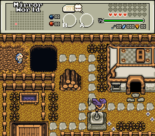
ywkls

ywkls.png

You know, this place seems oddly familiar...


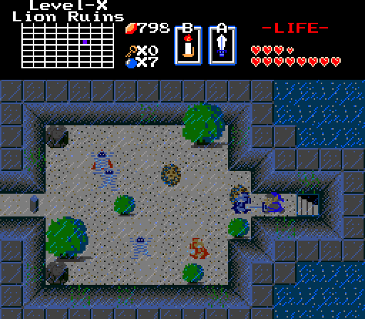
Linkle

Linkle.png

"Will I ever find where I'm going?"


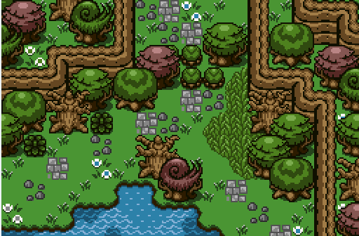
Joelmacool

Joelmacool.png

To pass the trees you must: A. Burn the Bushes or B. Rock climb around the trees?


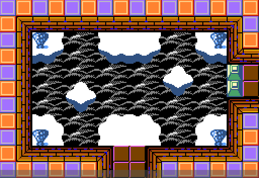
Plutia

Plutia.png

Memories of the past are easily dug up by a Heavenly Keep.


  • Neppy, Joelmacool and Kivitoe like this

#2 Moosh

Moosh

    Tiny Little Questmaker

  • ZC Developers

Posted 11 December 2016 - 10:32 PM

Kivitoe: You've made something out of the norm here, that's for sure. I think a big problem Classic suffers from is there's only one overworld palette and this means that when you've seen one screen, you've seen them all pretty much. I think with a custom palette and maybe some less blocky tiles for the frozen water this screen could be good. I could see it working well with either some blues to complement the ice in the shot or some oranges (sunset, perhaps?) to contrast it.

ywkls: You seem to be using the fences here more to block places the player can go than how a person would actually place them down. The fence going around the house looks fine, but then having another fence directly next to it is odd. And then there's fences perfectly aligned along the top and bottom edges of the screen too...This is just the village of fences, isn't it? And then there's the path made of perfectly identical stones. I feel like there are some alternate stone path tiles that you could alternate between in the tileset...

Linkle: Is this for an actual quest being developed? The layout seems very NES-like, but I really like the rain overlay and the water inside the walls. Kinda looks like your standard NES dungeon but with the roof cut open. I like. [Votes]

Joel: The shadows in the water are cool. Layout is pretty solid. It kinda falls into the same problems I have with Kivitoe's screen though. Tileset default palettes just don't do it for me anymore usually.

Plutia: Sky dungeon? Did someone say sky dungeon? I do love me some sky dungeon! That background looks gorgeous too. But following the trend this week, I'm not a big fan of the palette. There's too many colors fighting for attention here. There's the purple/orange contrast going on on the walls, the black/white contrast with the clouds and the background, and then the green from the raised block and blue from the...whatever those are in the corners too. I'd suggest changing the orange and purple walls to a more subdued color like a gray or faded blue so it doesn't draw attention away from the rest of the screen. The blue and green are probably fine.


The theme of this week is "Not enough purple tree, 0/5."


  • Matthew likes this

#3 Plutia

Plutia

    CPU of Planeptune

  • Members
  • Real Name:Iris Heart

Posted 11 December 2016 - 10:42 PM

There's reasons for the purple and orange tiles -- it's a mini-gauntlet of rooms representing past areas.


#4 Moosh

Moosh

    Tiny Little Questmaker

  • ZC Developers

Posted 11 December 2016 - 10:46 PM

There's reasons for the purple and orange tiles -- it's a mini-gauntlet of rooms representing past areas.

I see...Perhaps instead of making the walls gray you could make the clouds purple or orange then? I still feel like there's too much going on color wise...


#5 Neppy

Neppy

    Grand Overlord Empress

  • Members
  • Real Name:It's dangerous to go alone. Take Nep!
  • Pronouns:She / Her
  • Location:Minnesota

Posted 11 December 2016 - 10:49 PM

Nulled with entry.
 
Kivitoe-I like this Classic shot, there is always a place in my heart for a quest in the style of Z1. I like the addition of the flowers to the "trees." Also looks like the dungeon is keeping an eye on Link. Good shot.
 
ywkls- I always like seeing this style quest. Feels like a huge world is out there to explore. Your layout is very enjoyable, and I'm assuming with the map title being "Mirror World" that we have kind of a duality going on in this quest. Also love the hud, sharp looking.
 
Linkle... Rydia- This is actually a shot from a quest of mine that has been in a decade long hiatus. I opened a new Quest Project for it just today. I want to get it finished up, as it's been sitting at about 90% complete this entire time.
 
Joelmacool- Very nice screen layout here. I notice some color variation in the water, which looks pretty neat. 
 
Plutia- Simple, yet beautiful screen. Looking down upon the clouds is always a really neat thing. I would never have thought that purple and orange would work well together, but you proved me wrong here.

  • ywkls and Kivitoe like this

#6 Kivitoe

Kivitoe

    Sponsored by Taco Bell

  • Members
  • Location:Beyond Sagittarius A*

Posted 11 December 2016 - 11:08 PM

Me:  That's a shot from my latest quest, Rebirth of Hyrule. It's the screen where the frozen level-2 is.


ywkls: I really like this shot. I love the subscreen and the detailed town screen. This is usually a hard tileset to work with, but you pulled it off perfectly.


Linkle: This is a very creative screen. I love the dungeon colors, and how it's raining. Over all a very well done screen.


Joelmacool: This screen, in my opinion, isn't as good as the past two, however it's still a very nice screen. The way those smaller trees are placed doesn't look very natural to me.


Plutia:  I'm sorry, but to be honest, I don't like this screen. The colors just seem very messed up and the clouds don't look very good against the floor(?). Please don't take this in a bad way, I only say this for improvement.


  • Neppy and ywkls like this

#7 ywkls

ywkls

    Master

  • Members

Posted 11 December 2016 - 11:12 PM

Not voting since I'm in this one, so here's my thoughts on the others.


Kivitoe- Is this the entrance to an ice dungeon or a water dungeon? Or both? (If both, my interest is piqued.) Otherwise, not a lot going on here.


Linkle- That's a very dark, gloomy shot. So dark and gloomy that I can't tell if the object in front of Link is an NPC or enemy. I can't really say how I feel about it, because I can't see a lot.


Joelmacool- This is my favorite of the competitors. Bright and sunny, yet with a certain amount of complexity to it as well. Too bad there isn't anything else on the screen but mountains, water and trees.


Plutia- I think I get what's going on here, but the layer under the clouds just seems too dark for my tastes.


May the best screenshot win!


#8 Erdrick

Erdrick

    Redeemed

  • Members
  • Location:There

Posted 11 December 2016 - 11:45 PM

My thoughts on this week's entries:


Kivitoe: Looks like an ice/water dungeon outside. It could use a bit more variety with the grass tiles there but it's looking good.

ykwls: It looks like a gloomy world there and the character must find a way around it? I do like the grim setting there.

Linkle: That must be the ruins of the first Level 8 dungeon! I like the rainy atmosphere there.
Joelmacool: Or C: jump over the small trees and bypass it. :P The shadows in the water are great so far, and the ground looks very detailed there.

Plutia: A battle area atop the skies. I think that's a boss or mini-boss area and I saw it animated. Looks great so far.


My vote is going to Joelmacool this week.


  • Joelmacool likes this

#9 Titanium Justice

Titanium Justice

    Justice is served!

  • Members
  • Real Name:Jared
  • Location:Ontario

Posted 12 December 2016 - 12:16 AM

Voted for Linkle. Love the atmosphere.


  • Cukeman likes this

#10 Cukeman

Cukeman

    "Tra la la, look for Sahasrahla. ... ... ..."

  • Banned
  • Location:Hyrule/USA

Posted 12 December 2016 - 12:17 AM

I voted Linkle, the storytelling really stands out in this screen.


Edited by Cukeman, 12 December 2016 - 12:18 AM.


#11 Shane

Shane

    🩶

  • Moderators
  • Location:South Australia

Posted 12 December 2016 - 02:00 AM

I absolutely love Linkle's screen, it's full of charm and atmosphere!


#12 Naru

Naru

    Magus

  • Members

Posted 12 December 2016 - 10:57 AM

Kivitoe - I agree with the others, but you used so many squares that the screen has kind of a blocky charm to me. Could make an interesting design if you pull that through your quest.

Ywkls - great screen design for your standards, you improve more and more. Indeed the fences next to each other are a bit odd and a bit more variation wouldn't hurt, but the screen looks interesting and is nice to look at. Only Links palette is a really pain and I still don't like this sprite.

Linkle - I can't say that I find the screen very good looking, but the colors are pleasant to the eyes and it is the screen that makes me want to play the game the most.

Joelmacool - for me the best looking screen this week, but at the same time nothing is going on there and I feel as if I have seen similar screens countless times, nothing that can excite me for playing the quest behind it (if there should be one)

Plutia - like others said before I have some issues with your screen, but it is the most original and interesting, with a few changes it could be perfect.
  • Joelmacool likes this

#13 Jared

Jared

    Deified

  • Members
  • Real Name:Jared
  • Pronouns:He / Him
  • Location:New Hampshire

Posted 12 December 2016 - 11:46 AM

Great week! I vote for Joel. I like how he has such a sense of adventure. It reminds me of Metroid Prime or something. I love it!!


  • Cukeman and Joelmacool like this

#14 Eddy

Eddy

    ringle

  • Moderators
  • Real Name:Edward
  • Pronouns:He / Him
  • Location:London, United Kingdom

Posted 12 December 2016 - 11:49 AM

Kivitoe - Looks like a pretty standard shot, and I like the simplicity. Though I'm not sure on using ice tiles for an overworld screen like that. Maybe if the palette was something more snow-like then it would suit more, but here it doesn't fit too well IMO.


ywkls - I like the concept of what you got going here, but I feel like there's still quite a lot to improve on. For example, I feel like there should be more variation with ground detail, especially with using different grass tiles and using different slab tiles. I also don't really like the use of fences being used as walls. It feels too straight for me and probably having something like a mountain instead near the top would make things look better.


Linkle - Nice screen here. I like the dark atmosphere you got going on here, and the screen design is nice and simple. The only thing I don't really like is the use of floor tiles being used on the ceiling, which looks kinda odd to me. Probably using different ceiling tiles that don't look like floor tiles would look better. Other than that, nice job.


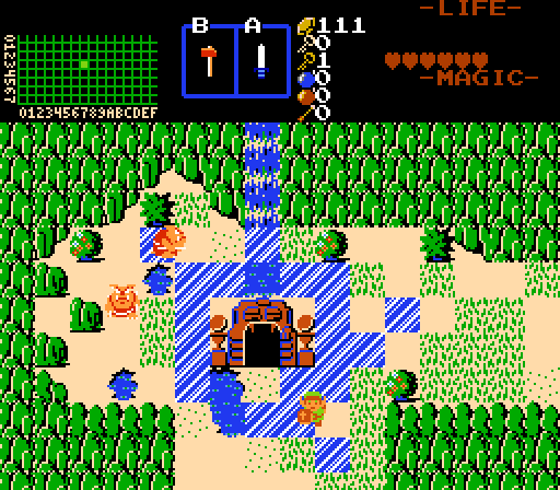
Joelmacool - Probably my favourite screen this week. I can't really see any issues with this one, and I love the design and effort put into this. The touches with the water is really neat too.


Plutia - Pretty nice shot. I really like the cloudy background here and the screen is nice and simple. Like with Linkle's screen though, I don't really like the tiles on the ceiling, they don't really suit the screen for me IMO and could really use different ceiling tiles that can blend in better.


I voted for Joel this week.

  • Joelmacool likes this

#15 Cukeman

Cukeman

    "Tra la la, look for Sahasrahla. ... ... ..."

  • Banned
  • Location:Hyrule/USA

Posted 13 December 2016 - 05:18 AM

Linkle, is that Gibdo carrying the Triforce of Power?  :eek:


Also tagged with one or more of these keywords: Joelmacool, Kivitoe, ywkls, Linkle, Plutia

0 user(s) are reading this topic

0 members, 0 guests, 0 anonymous users