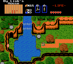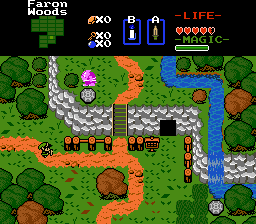


 But I seriously want honest opinions on if the palette is too faithful. It's bright, especially for people with newer, brighter screens. I think it is too much but I am having trouble coming up with an alternative.
On a side note, I'm pretty content with the greens, it's mostly the yellow/ orangy path mountain colors I am having trouble with. However, if you feel that the greens are too bright, let me know.
EDIT: On another side note, I am getting closer to putting together a demo which will show the first dungeon, and the beginning areas. Maybe about 30-45 minutes of gameplay depending on your playing style, and speed
 I could have it ready to go in a few hours of work, and I hope to release the demo within the next week.