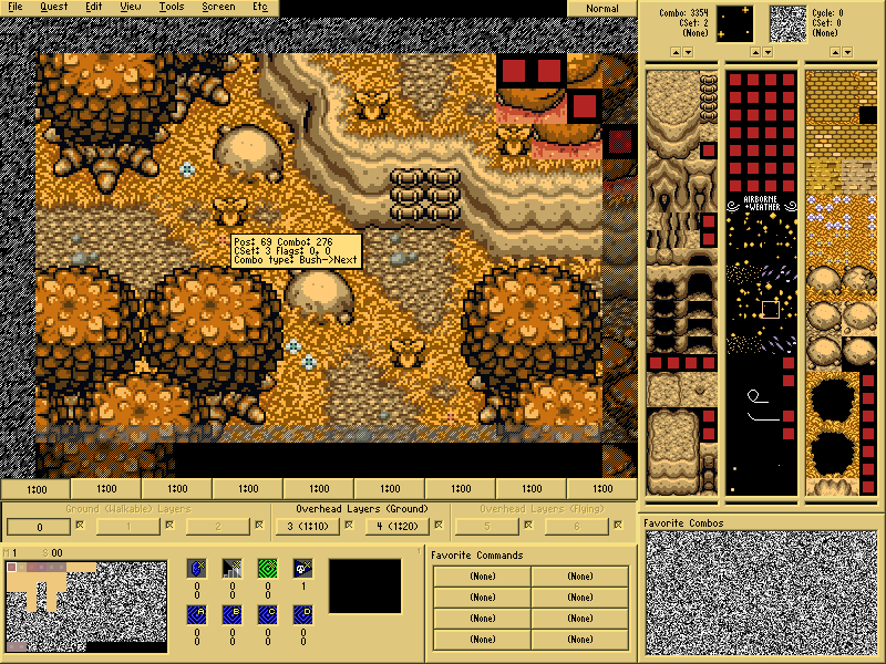
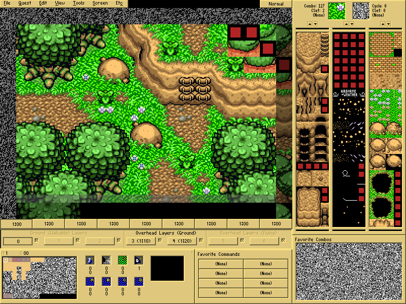
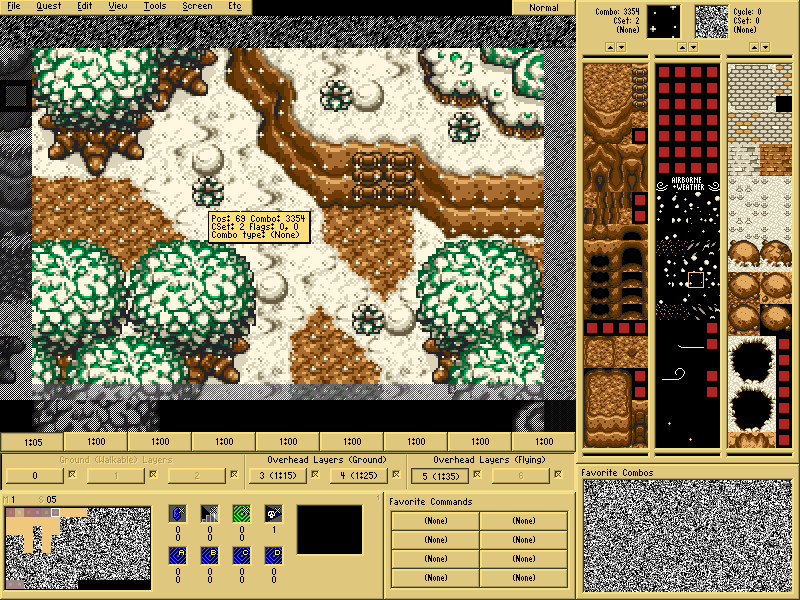
Okay, quick response to Grantgreif and Lightwulf, I thought of adding extra tiles as well, but since I don't know in hell to sprite (but I'm kinda getting the basics), I haven't done so, in order to not commit style clashing 
As for RedmageAdam:
The Fall/Autumn one's rocks are too bright IMO. The other two look fine to me, but then again, I'm not really the most qualified to speak. Regardless, great palettes. 9/10
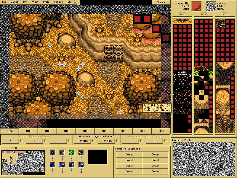
The rocks are a bit darker with a golden touch :O
The spring palette needs to have some work on the grass colors. Less neon; more bright water colors. Maybe make them a light green with a hint of red and blue.
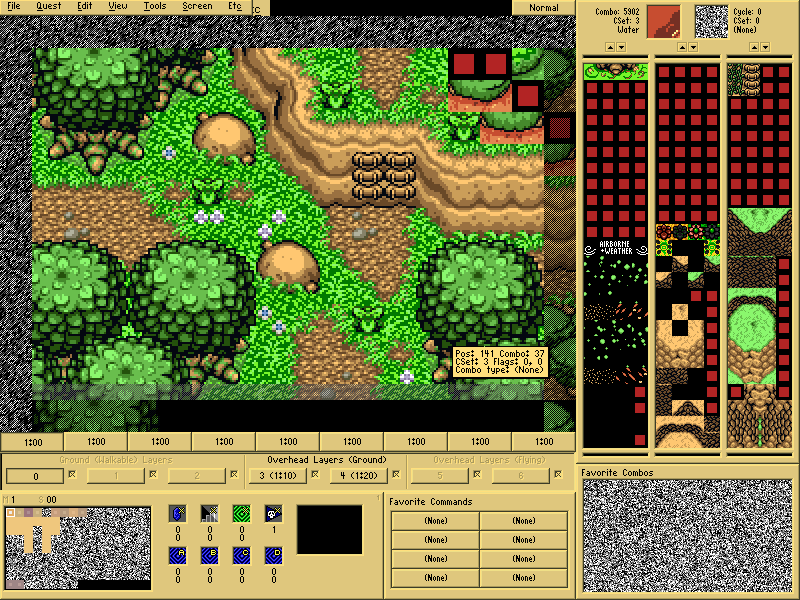
Not sure if I did what you meant, but the grass details are a bit more noticeable than back then. 
As for everybody, I whipped up this other palette, titled "Wild Jungle":
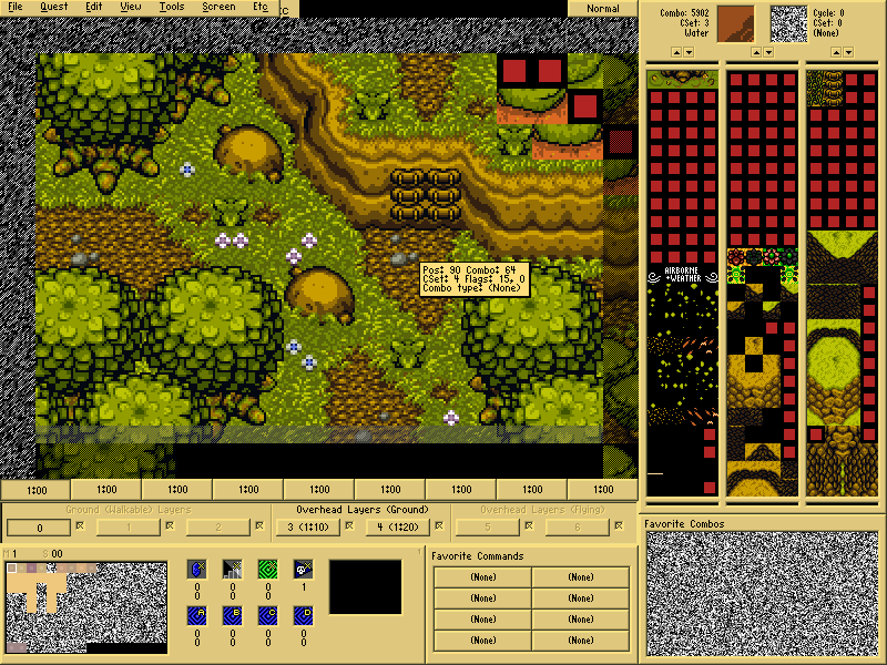
I think I did a pretty good job for a first try on this one!
Opinions? Thoughts? Critics? Tips?
Edited by Demonlink, 23 April 2014 - 10:26 PM.






 ... The only reservation I have is that it seems just a tad bit dark for what I would think of as summer ( = "sunny"). (At least, I would think that spring & summer are supposed to be bright & sunny.) Then again, I haven't played any of the Oracle games, so if that's how they looked in OoS, then great job!