Jump to content

Photo

Screenshot of the Month 199

Joelmacool Architect Abdiel Bourkification Colin

  • This topic is locked This topic is locked
7 replies to this topic

Poll: Screenshot of the Month 199 (34 member(s) have cast votes)

Cast your vote!

You cannot see the results of the poll until you have voted. Please login and cast your vote to see the results of this poll.
Vote

#1 Taco Chopper

Taco Chopper

    protector of the darn forum

  • Administrators
  • Pronouns:He / Him
  • Location:South Australia

Posted 07 January 2024 - 09:21 PM

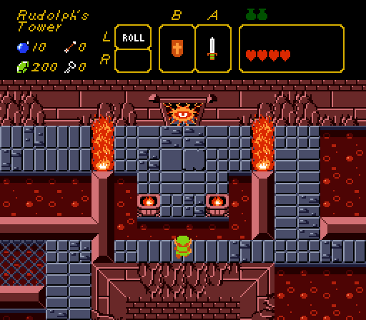
Joelmacool - SotW 804
Joelmacool.png
huh

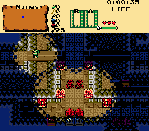
Architect Abdiel - SotW 805
ArchitectAbdiel.png
Link is trapped in the Lizalfos filled mines after the rope he comes down on snaps.
Can he find a way out?


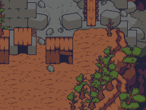
Colin - SotW 805
Colin.png
Shanties of Saxum: Inside the breach, a patchwork of lives unfolds, telling the tale of a city that has withstood the test of time.

Bourkification - SotW 806
Bourkification.png
This ain’t your daddies DoR.
 

Wondering why there's two entries from Screenshot of the Week 805? It's because the contest was a tie between Architect Abdiel and Colin.


#2 Matthew

Matthew

  • Administrators
  • Pronouns:He / Him
  • Location:Ohio

Posted 09 January 2024 - 12:50 PM

Voted Bourkification due to the novelty. The NPC sprites are actually quite nice on their own, but for this to be a usable tileset, I do think they should be 16x24. This is due to the size of environmental objects relative to the NPC sprites.


#3 Haylee

Haylee

    ~ Hope of Energy Nede ~

  • Contributors
  • Real Name:Haylee
  • Pronouns:She / Her
  • Location:Italian Restaurant in Koorong

Posted 09 January 2024 - 01:37 PM

Joel's use of Classic is absolute wizardry at times so he's got my vote.


This is due to the size of environmental objects relative to the NPC sprites.

wow matthew why do you hate short people


  • Taco Chopper and Joelmacool like this

#4 Matthew

Matthew

  • Administrators
  • Pronouns:He / Him
  • Location:Ohio

Posted 10 January 2024 - 12:27 PM

I don’t hate ALL short people, just those who are 16x16!
  • Haylee likes this

#5 Shoshon the Elegant

Shoshon the Elegant

    White Tiger King!

  • Members
  • Real Name:Michael
  • Pronouns:He / Him
  • Location:Florida

Posted 11 January 2024 - 11:57 AM

Joel. I was wondering, since I also like the way you use classic. What’s your thought process behind making them? Do you plan out things like hazards in advance, plan out on paper? Just curious.
  • Joelmacool likes this

#6 Moonbread

Moonbread

    Playing With Psychos

  • Members
  • Pronouns:They / Them

Posted 14 January 2024 - 12:54 AM

Bourkification... Now there's a name I haven't heard for a long time.


And that's who I ended up voting for too.  I really like the layout and it's refreshing to look at.  But everyone had fantastic entries!  I almost voted for Colin just because I like the art style- reminds me of Mother 3.


#7 Joelmacool

Joelmacool

    Addicted to Overwatch

  • Moderators
  • Real Name:Joel
  • Location:Country of Europe

Posted 14 January 2024 - 05:02 PM

Joel. I was wondering, since I also like the way you use classic. What’s your thought process behind making them? Do you plan out things like hazards in advance, plan out on paper? Just curious.

In terms of designing the dungeons, I tend to think of a concept (something as basic as 'Destroyed Tower', for example) and try to expand on it in any way I think would be adequate. Here, I thought it'd be cool to make it a fire dungeon, and then I thought of ways to convey that the tower is crumbling and destroyed (such as the use of overworld mountains on the walls, and crumbled floor tiles). I map out the layout of the dungeon pretty much by sculpting the shape in the D-Map, and there I decide if it needs a certain amount of floors or not.

From there, I take a screenshot of that outline and put it into paint to draw out the path I expect the player to take, and then note where all the keys, key doors, etc will be placed (I do this simply using paint to draw a key or lock symbol on top of the empty map layout). And then, when I start detailing all the rooms, if I get any ideas I think would elevate the dungeon, I try to implement it into the path to make it a little more interesting for the player (the enemy blocking the door is one of these ideas that had been spontaneous, since the original plans had it being labelled as a simple shutter door to be opened after getting the dungeon item).

I've got all the dungeon items pre-planned though, since I planned a really rough outline of the quest prior to myself working on Canaria (my other quest, now finished). Those plans are being altered as I get through the quest though, since I don't really like following my plans so strictly. Glad to hear you like how I use classic anyhow! Hope I provided good insight into my thought process! 


#8 Taco Chopper

Taco Chopper

    protector of the darn forum

  • Administrators
  • Pronouns:He / Him
  • Location:South Australia

Posted 22 January 2024 - 05:23 AM

With 40.00% of the vote, the winner of Screenshot of the Month 199 is Joelmacool!
 
Joelmacool.png
huh
 
Congratulations!
 
Voting totals:
  • Joelmacool - 12 (40.00%)
  • Bourkification - 10 (33.33%)
  • Colin - 4 (16.67%)
  • Architect Abdiel - 3 (10.00%)


Also tagged with one or more of these keywords: Joelmacool, Architect Abdiel, Bourkification, Colin

1 user(s) are reading this topic

0 members, 1 guests, 0 anonymous users