Joelmacool - SotW 751
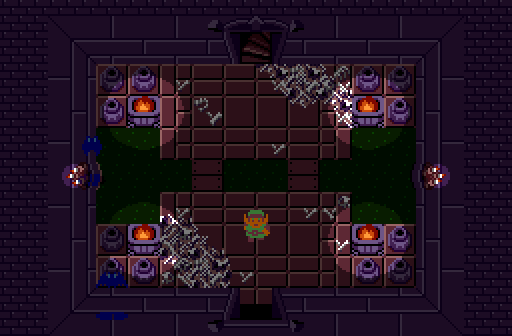
spooky tomb with acid
Aslion - SotW 752
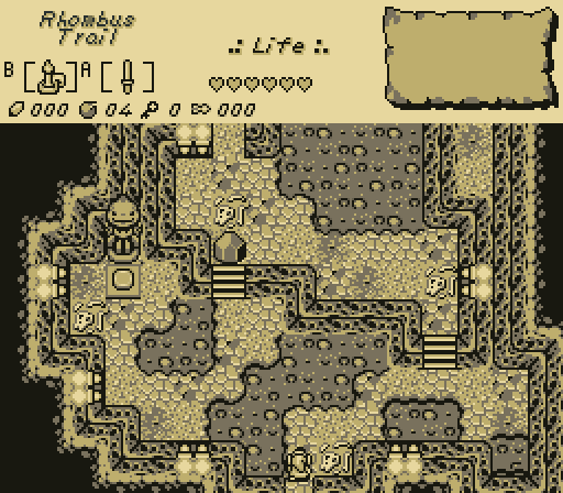
it's so hot in this restaurant i might just get fully naked
Haritiro - SotW 753
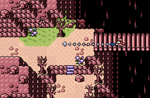
Cliffs and chasms and stuff.
TheManHimself - SotW 754
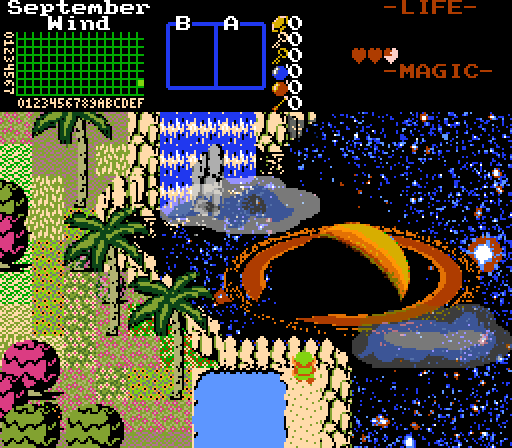
Lay your heart down onto the sea of stars.

Posted 15 May 2021 - 12:16 PM
Joelmacool - SotW 751

spooky tomb with acid
Aslion - SotW 752

it's so hot in this restaurant i might just get fully naked
Haritiro - SotW 753

Cliffs and chasms and stuff.
TheManHimself - SotW 754

Lay your heart down onto the sea of stars.
Posted 15 May 2021 - 02:51 PM
Edited by TheManHimself, 15 May 2021 - 03:40 PM.
Posted 15 May 2021 - 09:19 PM
Really torn between Joelmacool and TheManHimself. Both are great Classic screens, but I think Joel's just barely won out thanks to my love for skeletons. I know TheManHimself has some in his quest, it's just a shame he forgot to put any on this particular screen. Maybe just have a little skelebro floating out in space, just chillin.
Posted 15 May 2021 - 10:24 PM
You'll enjoy my next submission, my dudeI know TheManHimself has some in his quest, it's just a shame he forgot to put any on this particular screen. Maybe just have a little skelebro floating out in space, just chillin.
Edited by TheManHimself, 15 May 2021 - 10:26 PM.
Posted 20 June 2021 - 11:45 PM
With 40.00% of the vote, the winner of Screenshot of the Month 186 is Haritiro!
Cliffs and chasms and stuff.
Congrats!
Voting totals:
- Joelmacool - 6 votes [20.00%]
- Aslion - 4 votes [13.33%]
- Haritiro - 12 votes [40.00%]
- TheManHimself - 8 votes [26.67%]
 |
Jenny
PureZC Events →
Screenshot of the Week →
Poll Screenshot of the Week 823Started by Taco Chopper , 02 Oct 2024 |
|

|
|
 |
Sheik
PureZC Events →
Screenshot of the Week →
Poll Screenshot of the Week 818Started by Taco Chopper , 21 Jul 2024 |
|

|
|
 |
Matthew
PureZC Events →
Screenshot of the Week →
Poll Screenshot of the Month 201Started by Taco Chopper , 28 May 2024 |
|

|
|
 |
Jenny
PureZC Events →
Screenshot of the Week →
Poll Screenshot of the Week 814Started by Taco Chopper , 13 May 2024 |
|

|
|
 |
Twilight Knight
PureZC Events →
Map of the Month →
Poll Map of the Month 151Started by Shane , 02 May 2024 |
|

|
0 members, 1 guests, 0 anonymous users