Wow! So many shots this week, a total of 10! It's clear that something strange is afoot ... Pick your favorite from among your many options. Choose carefully - your life might just depend on it!
Avaro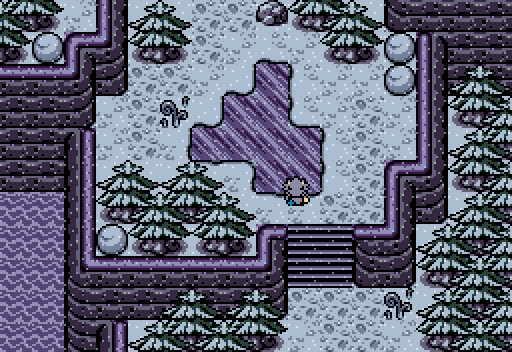
This seems too quiet.
Eddy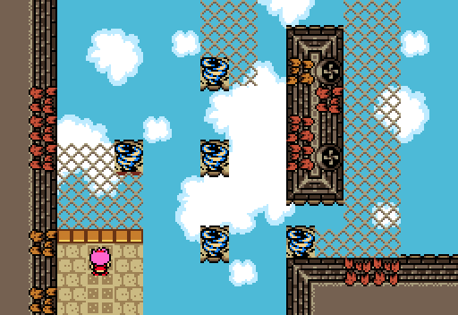
Watch your step!
Hookshot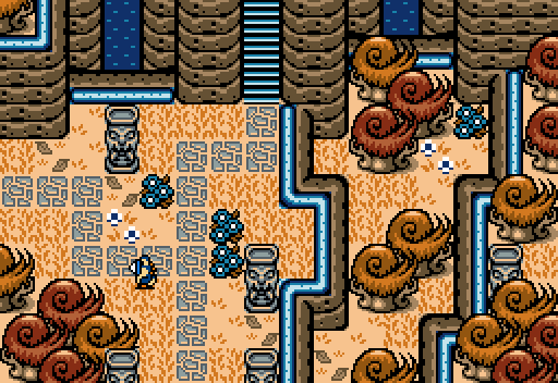
Yoshot explores the Elysian Ruins.
Joelmacool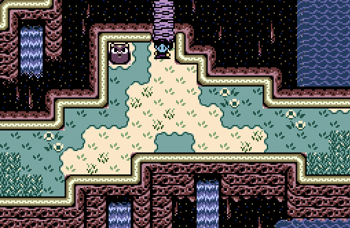
generic chasm screen
Matthew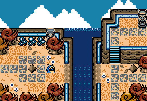
Goum eg'ad men ennoama!
Orithan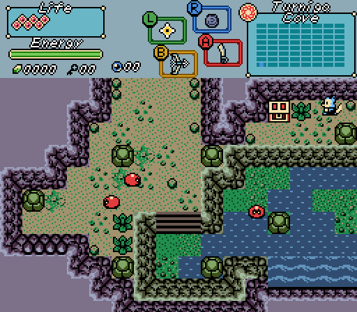
Shane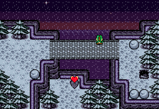
Though your travels may be hard, appreciate the glimpses of beauty within them.
Sheik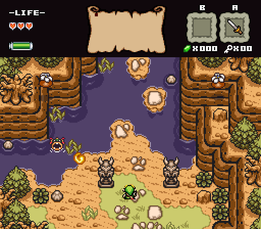
Twilight Knight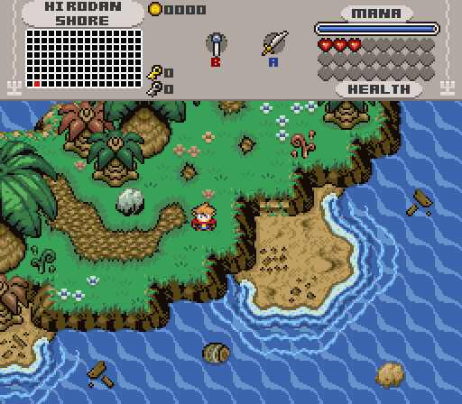
Stranded
Yoshi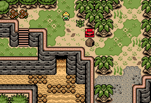
Is this the real life? Is this just fanta sea?

Screenshot of the Week 718
#1

Posted 08 December 2019 - 12:34 PM
- Anthus, Twilight Knight, LinkFan212 and 2 others like this
#4

Posted 08 December 2019 - 04:25 PM
Here is my review for the screens
Avaro: I love the placement of all the object such as the trees and the snowballs, it gives the player just enough space to move around, while at the same time being able to examine their surroundings. Also the frozen water being in the center is a nice touch.
Eddy: I love how you make the player decide between two different paths, which gives the player a sense of freedom. Also the placement of the plants on the wall is nicely organized, which causes them to not feel too grouped together.
Hookshot: I love the placement of the unlit torches, due to them just being in the right places to not make the screen feel crowded and just enough the player will be able to appreciate their design.
Joelmacool: I love the design of the waterfalls and their placement throughout the screen. Also how the grass is structured on the floor gives the screen a nice touch and the owl being the first thing you see as you enter the screen, will cause the player to examine it.
Matthew: I love how when the player enter the screen, it makes them wonder how to get to the other side of the screen and what lies beyond it, which can drive them to keep exploring to find out.
Orithan: I love how the screen focuses on the chest, which will grab the player's attention and cause them to find out what is inside. Also the enemy placement with the combination of the rocks helps make the screen more fun.
Shane: I love the placements of the trees, which causes the screen to not feel too crowded and can cause the player to appreciate the screen even more. Also the heart piece being under the bridge, is a great way to catch the player's attention.
Sheik: I love the placement of the enemies, which causes the player to be careful and not take their guard down. Also the screen having the right balance between the land, lake, and the mountain areas is a nice touch.
Twilight Knight: I love how you give the palm trees different sizes, which can cause the screen to feel more real. Also the placement of the objects in the water is balanced enough where it doesn't cause the ocean to feel crowded, while also giving it more atmosphere.
Yoshi: I love how the chest is the first thing the player sees when they enter the screen, which causes the player to open it right away. Also the design and the color of the waterfall makes the screen very unique.
- Twilight Knight, Shane, Eddy and 5 others like this
#5

Posted 08 December 2019 - 05:36 PM
Love the turnout here :>
Great screens everyone, although I did notice a light tile error on Sheik's screen, from the top left:

Edited by Matthew, 10 December 2019 - 04:49 PM.
- Shane and Hari like this
#6

Posted 09 December 2019 - 11:30 PM
Avaro
Nice snowy scene. Are those Pokémon trees? I've always taken those OoS marks in the snow to be footprints. If that's the case, I think there might be a few too many to the left of the lake. Perhaps mixing up the details in the snow (perhaps by adding branches sticking up) would mix it up a bit? You do have rocks and sprouts and snow clumps and things, so that's good.
Eddy
I'd love to see this screen in motion and play it. Though I enjoy its ivy and cloud details, the scene doesn't quite stand out in a field of ten.
Hookshot
Very interesting color palette dominated by red, orange, and blue. But—what the heck?—Matthew has the same palette! I see what's going on here. I like the overall aesthetics and details of the shot, though I think the space on the middle-right of the screen could have been utilized better. The perspective of the water is also a tad difficult to make out at first because the shape of the water resembles the ladder, but the ladder goes up in elevation, and, of course, water can't do that.
Joelmacool
Very interesting scene. I really like the sideways waterfall transition tiles toward the right side. It's distinctive!
Matthew
This is a well-executed and very practical shot. Good use of detail and plenty of room to move around.
Orithan
Wow... there are so many good shots this week. I like how this cave scene has two distinct environments between the rocky higher elevation and the mossy lower elevation. Very playable area. Nicely done.
Shane
I'm loving this dramatic, contrasty color palette with the subtle color on the horizon. There are so many good shots... The green sprite (is that Yoshi?) is a little too different from the remainder of the palette.
Sheik
This is gorgeously organic with a beautiful palette. My only critique is the contrast in trunk sizes between the Pokémon trees and the dead trees.
Twilight Knight
I love these water tiles. Perhaps the intersection of these tiles and the rocks could use some subtle ripples?
Yoshi
I enjoy the layout and how much diversity you have crammed into one scene. The palette feels slightly... off though. I wish I could be more precise.
Bottom line: I would easily vote for any of these shots in an average contest. They are seriously all good, and I'm not just saying that to be polite. I have to give my vote to Sheik, but it hurts that I can't vote for everyone. Shh, I know that would be the same as not voting.
- Shane, Eddy, Sheik and 4 others like this
#7

Posted 09 December 2019 - 11:39 PM
A lot of good screenshots this week. Shane and Sheik are very close for me, but my vote is going to have to go to Sheik this week.
- Shane likes this
#8

Posted 10 December 2019 - 01:32 PM
Perhaps the intersection of these tiles and the rocks could use some subtle ripples?
Thanks for the suggestion! I will most likely add that.
- nicklegends likes this
#9

Posted 10 December 2019 - 02:16 PM
This is the second time that an 8+ people collab has entered the SotW competition and none of them wins. I'm not complaining, this is a testament of our perfect balance! Were one of us to win, the balance would be broken. Our mission is to take over SotW, not by winning, but by intimidation.
...
Thanks for all the comments Nick A and nicklegends.
- nicklegends, Shane, Jared and 3 others like this
#10

Posted 10 December 2019 - 04:51 PM
This SotW is a perfect case study for why the Independent party suffers in modern America. They are not strong enough to win on their own, and fracture votes across multiple other incumbents. Clearly, if everyone rallied around Amy Rose and her lofty enterprise, the vote sum would be far higher for the Gollab constituency.
- nicklegends, Shane, Eddy and 4 others like this
#11

Posted 21 December 2019 - 01:00 PM
I voted for Shane this week. I love the design of the sky, and the colors are very nice.
Edited by Yoshot, 21 December 2019 - 01:01 PM.
- Shane likes this
Also tagged with one or more of these keywords: Sheik, Avaro, Eddy, Hookshot, Joelmacool, Matthew, Orithan, Shane, Twilight Knight, Yoshi
 |
PureZC Events →
Screenshot of the Week →
Poll Screenshot of the Week 824Started by Taco Chopper , 14 Oct 2024 |
|
|
|
 |
Jenny
PureZC Events →
Screenshot of the Week →
Poll Screenshot of the Week 823Started by Taco Chopper , 02 Oct 2024 |
|

|
|
PureZC Events →
Screenshot of the Week →
Poll Screenshot of the Month 203Started by Taco Chopper , 01 Oct 2024 |
|
|
||
 |
Haylee
PureZC Events →
Screenshot of the Week →
Poll Screenshot of the Week 821Started by Taco Chopper , 02 Sep 2024 |
|

|
|
 |
Twilight Knight
PureZC Events →
Screenshot of the Week →
Poll Screenshot of the Week 819Started by Taco Chopper , 05 Aug 2024 |
|

|
1 user(s) are reading this topic
0 members, 1 guests, 0 anonymous users

 This topic is locked


