Screenshot of the Week 753
#1
Posted 11 April 2021 - 10:08 PM
with your head full of sorrow you go on your way, all your life i can follow and i'll lose you all the time
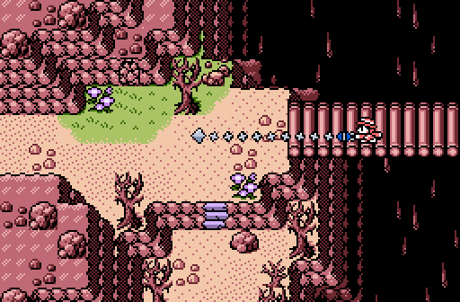
Haritiro
Cliffs and chasms and stuff.
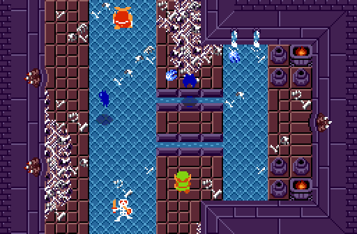
Joelmacool
Here is the upper floor of the dungeon (last time you saw the lower floor), inspired by OoT's Bottom of the Well!
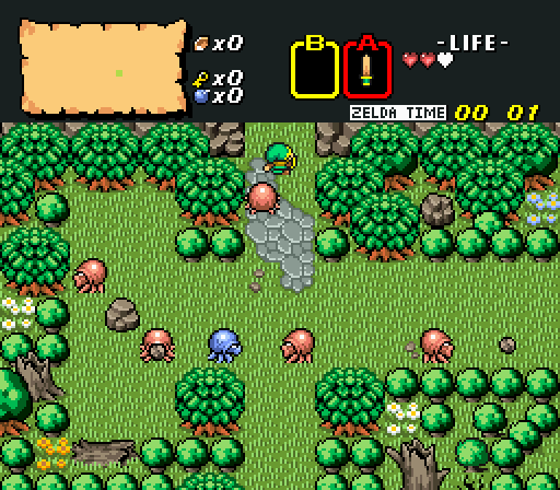
Valerie
Foresty forest fun!
- Twilight Knight, Hari and Matthew like this
#2
Posted 11 April 2021 - 10:36 PM
Voted for Haritiro, beautiful shot
- Rambly and Hari like this
#3
Posted 12 April 2021 - 02:37 AM
Great shots this week. Especially hats off to Valerie, that screen is a great remake yet very recognisable.
But I voted for Haritiro. Never figured GB Pokémon mountains could look this good in a quest!
#4
Posted 12 April 2021 - 03:16 AM
My vote went to Joelmacool. I really love the intricate details shown. I never thought I'd see a classic dungeon ooze with actual, serious atmosphere until now.
- Twilight Knight and Joelmacool like this
#5
Posted 12 April 2021 - 03:43 AM
I find the bones a little too busy and distracting in Joelmacool's shot. It would also be cool if the piles of bones rose up the walls a little bit to give them some depth. (That might be a little complicated though.)
As for Valerie... By my notes, you last entered SotW seventeen years ago!? (SotW 69.) Welcome back! This is a clean shot with a nice lush palette (especially compared to many
Voted Haritiro.
- Rambly, Twilight Knight and Hari like this
#6
Posted 12 April 2021 - 09:50 AM
#7
Posted 12 April 2021 - 02:08 PM
I voted for Valerie. I really love those trees!
- Valerie likes this
#8
Posted 12 April 2021 - 03:56 PM
I decided to submit something after I found out there where no submissions, and there needed to be three or it would be delayed.As for Valerie... By my notes, you last entered SotW seventeen years ago!? (SotW 69.) Welcome back! This is a clean shot with a nice lush palette (especially compared to many New 1st shots). I'm thinking it would benefit from a focal point though—some interesting feature.
Voted Haritiro.
- nicklegends and Matthew like this
#9
Posted 12 April 2021 - 07:45 PM
My vote went to Joelmacool. I like how his use of simple edits to the classic tileset create a ton of atmosphere. Creative use of limited resources is something that should be commended.
As for the others
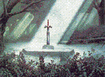
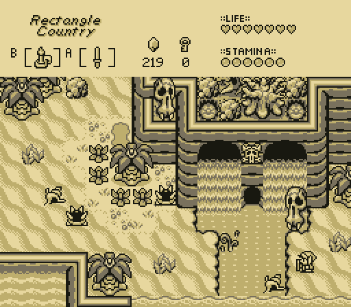
I love Aslion's palette choice. I don't think its nostalgia: the 3 color palettes really make the gameboy sets shine. My biggest problem is the symmetrical waterfall/cliiff/cave thing; The hard 90 degree angles of the GBC cliffs make it really easy to fall into a habit of making symmetrical natural features.
Haritiro's custom tiles and screen composition are excellent; while the screen transitions are aligned in a simple cross (a design choice I would generally try to avoid) the detailing on the cliffs, and sense of depth they provide distract from the actual simplicity of the screen layout; the Pokemon cliffs seem to be really useful for designing more natural cliff shapes, and are better at signaling elevation change without being too rigidly defined like the default Zelda GB cliffs. I love the color gradient for elevation change, but the world seems a little... pink? This would be my choice if the palette were refined just a little more. (I know this is a weird thing to latch on to, but I really like that staircase tile)
Valerie's shot is vibrant, colorful, and her trees really fit the BS aesthetic; I especially like her crooked logs and fallen trees. On the other hand, the composition seems a little basic: The N/S/E exits are aligned in a simple cross shape; and everything seems a little too basic Zelda 1 for my taste (okay, no wonder. the screen is just an exact replica of screen 59 of Zelda 1 but with some basic BS flavor)
Edited by TheManHimself, 16 April 2021 - 10:18 AM.
- nicklegends, Aslion and Joelmacool like this
#10
Posted 13 April 2021 - 06:20 PM
Haritiro easy good mix of different graphics i spot some pokemon cliffs he he
#11
Posted 23 April 2021 - 02:09 PM
Going to null this vote. Me says Alison has the better tiles and screen layout, but my eyes keep uncontrollably drifting towards Haritiro's palette.
#12
Posted 26 April 2021 - 03:30 PM
With 55.26% of the vote, the winner of Screenshot of the Week 753 is Haritiro!
Cliffs and chasms and stuff.
Congrats!
Voting totals:
- Aslion - 6 votes [15.79%]
- Haritiro - 21 votes [55.26%]
- Joelmacool - 5 votes [13.16%]
- Valerie - 6 votes [15.79%]
Also tagged with one or more of these keywords: Haritiro, Joelmacool, Valerie, Aslion
|
Jenny
PureZC Events →
Screenshot of the Week →
Poll Screenshot of the Week 823Started by Taco Chopper , 02 Oct 2024 Jenny, Joelmacool, notmichaeljfox |
|
|
|
|
Sheik
PureZC Events →
Screenshot of the Week →
Poll Screenshot of the Week 818Started by Taco Chopper , 21 Jul 2024 Sheik, Joelmacool, Orithan and 1 more... |
|
|
|
|
Matthew
PureZC Events →
Screenshot of the Week →
Poll Screenshot of the Month 201Started by Taco Chopper , 28 May 2024 Matthew, )-( Marchland Malady )-( and 2 more... |
|
|
|
|
Jenny
PureZC Events →
Screenshot of the Week →
Poll Screenshot of the Week 814Started by Taco Chopper , 13 May 2024 Jenny, Jambu, Joelmacool |
|
|
|
|
Twilight Knight
PureZC Events →
Map of the Month →
Poll Map of the Month 151Started by Shane , 02 May 2024 Twilight Knight, TheRock, Jenny and 2 more... |
|
|
1 user(s) are reading this topic
0 members, 1 guests, 0 anonymous users