Bagu
By the Fragments of Power
...I HAVE THE POWEEER!!!
Geoffrey
hey, link? you ever wonder why geoffrey's screenshots never show the subscreen? me too.
HeroOfFire
Something about down in Pumpkin Hill?
Sheik

Posted 11 November 2021 - 01:49 AM
Bagu

By the Fragments of Power
...I HAVE THE POWEEER!!!
Geoffrey

hey, link? you ever wonder why geoffrey's screenshots never show the subscreen? me too.
HeroOfFire

Something about down in Pumpkin Hill?
Sheik

Posted 11 November 2021 - 01:52 AM
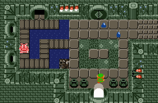
Hard choice between Geoffrey and Sheik, both are using Cambria beautifully. Though, I've decided to vote for Geoffrey, I quite enjoy the new dungeon set being used. ![]()
Posted 11 November 2021 - 05:43 AM
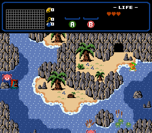
Sheikh!
...simply Seikh
Nothing more to say
Posted 11 November 2021 - 05:58 AM
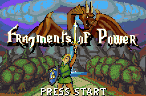
I was very, very tempted to vote Bagu, because that title screen practically screams '80s era fantasy game' (yes, I know ZC is based on an 80s era fantasy game. That title screen just kicks it up a notch). However, I wasn't sure how entirely fair that would be, given that SOTW is usually for in-game screenshots. Just know, however, that I love Bagu's shot, regardless. ![]()
Posted 11 November 2021 - 06:08 AM
I was very, very tempted to vote Bagu, because that title screen practically screams '80s era fantasy game' (yes, I know ZC is based on an 80s era fantasy game. That title screen just kicks it up a notch). However, I wasn't sure how entirely fair that would be, given that SOTW is usually for in-game screenshots. Just know, however, that I love Bagu's shot, regardless.
I also wasn't sure, to submit a title shot
But yeah, there was still a leak of one shot,
...so I sent what I got.
Posted 15 November 2021 - 02:12 AM
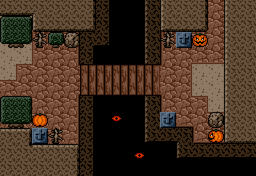
Clearly Bagu or HeroOrFire. Celebrate people making their own graphics, doing something new.
Posted 15 November 2021 - 01:28 PM
I agree with that sentiment, Ghost -- but also, a lot of what you see in Sheik and Geoffrey's screens (Geoffrey's in particular) is new, too.
This is a little plug for Cambria - Geoffrey is planning on making new dungeon walls, and what you see in his shot is an example of that. ![]()
Posted 17 November 2021 - 07:24 PM
>Be me
>Spend hours making entirely new Classic dungeon walls set
>After weeks of tweaking, submit screenshot to SotW
>Get overlooked because my shot didn't do anything new
Just messing with you. ![]() I appreciate the updoots from those that have dooted.
I appreciate the updoots from those that have dooted.
Both Bagu and HoF's shots draw me in in entirely different ways. Sheik's shot is obviously beautiful. This was a good SotW all round.
Posted 18 November 2021 - 12:47 PM
Edited by Ether, 18 November 2021 - 12:51 PM.
Posted 18 November 2021 - 02:36 PM
Bagu's screen is cool, all campy and oldtimey. I wasn't ever going to vote here, since it's not a gameplay screen, but it's still a neat touch for the game it's in.
I completely agree, not to vote for a non-gameplay screen,in this kind of poll.
What makes me think,we might need a TilteScreen contest.
I don't think that it would make sense, weekly.
...But at least once in a year.
...and what about subscreen contests !? ![]()
Edited by Bagu, 18 November 2021 - 02:37 PM.
Posted 18 November 2021 - 02:46 PM
I'm torn on Geoffrey's. The perspective on those walls, especially the corners, feel pretty off. And straight vertical lines like these planks use tend to draw too much attention to that weakness, unfortunately. The other parts of the walls, like the torches and doors and that pillar, do look really cool. (I'm not entirely clear what's his here and what's built into Cambria, full disclosure.) I voted here, after some deliberation--I do want to reward original graphics, and the things that work do work really well.
I agree about the vertical planks. I wish I could both keep them and maintain the illusion of a cohesive perspective (which is all that a dungeon set can really do: maintain an illusion of cohesive perspective), but I have to choose, and I like them too much to rework it. May the sufficient beauty of the diagonal pillars dazzle you into overlooking the flaw. ![]()
The walls, doorways, and windows were drawn by me, as were the floor tiles, the candles on the shelf, the pots, the pillar, and the dungeon entrance light. Not included in the screenshot are fallen log tiles to replace the normal barrier blocks, which looked off in context. The hanging vines and the candelabra were already in the tileset, although I'm not sure by whom they were drawn. I was careful to ensure that the 16x16 Z1 doors fit snugly into the doorways so that the set would feel more tied to Z1, despite obviously not having quite the same style. I wanted to include an alternate wall style that's just big leaves, rather than planks, but I couldn't make it feel right; we'll see whether I can manage it later on.
Edited by Geoffrey, 18 November 2021 - 02:48 PM.
Posted 19 November 2021 - 12:47 AM
The hanging vines and the candelabra were already in the tileset, although I'm not sure by whom they were drawn.
Me! A lot of tiles from a former classic project I was working on are now in here. ![]()
Posted 21 November 2021 - 04:29 PM
Me! A lot of tiles from a former classic project I was working on are now in here.
You are the hot diggity dog, my dude.
Posted 27 November 2021 - 02:14 PM
geoffrey's has those hot and spicy round doors so i voted for it
but they were all good this week
altho wow, i never thought i'd see the day when sheik used a classic-derived tileset (and more importantly he kicks just as much ass at it as he does at pretty much everything else he does)
also also the coloring on bagu's is gorgeous and the tilework is incredible. i forgot to mention that
Posted 29 November 2021 - 08:56 PM
great week. went Sheik.Hard choice between Geoffrey and Sheik...
0 members, 1 guests, 0 anonymous users