This topic is locked
/M/: I know the shot is WIP, but nothing seems to work together in this shot. The majority of this shot is composed of the TMC trees, with brown outlines. Now, I know that real is brown, but it just doesn't look good here. The palette could use some work as well. It's probably the reddish-brown outlines around everything, but it looks like Link is in the middle of some trippy dream world, not an actual forest.
CastChaos: Looks like you took the DoR set, slapped some tiles down and called it a screenshot. Bleh.
Evan: Again, you just slapped tiles down, and you didn't even give notice to transition tiles. Also, lol adventure set'd @ those trees
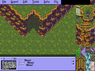
Sharon: As others have said before me, the grass is too repetetive, the palette is too bright for the graphics, and the screen flow is akward. Looks annoying to have to walk through those gates.
ZF: Oh zf... ZF... What a nice way to show how not to use the SD3 graphics. Lemme name the problems here:
The screen is near devoid of objects.
There are no shadows, anywhere.
You filled the screen up with mountain tiles. The mountain tiles in SD3 work the way they do for a reason: They look bad when you put a whole bunch of them on one screen, so that gives you good reason to spread them out.
The water is just terrible.
The cave tiles couldn't have been used in a worse way.
The grass tiles are just randomly placed. Lemme say this now: The SD3 grass tiles do, in fact, follow a pattern. You know that 3x2 block of tiles that you always see the SD3 grass organized in? It's that way for a reason. Look in the game, in the areas where that grass is used: It's that same block of 6 tiles repeated over and over again, not randomly laid down. Here's an example shot for the caves and grass:
Also, try actually experimenting with different heights of the mountain tiles instead of just using the 4-tiles that are in the combo list.