SEVEN ENTRIES! Untold riches.
Base screen: What a terrible entry. What the hell. Didn't get my vote.
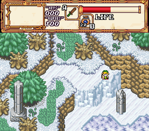
Shane: I'm glad someone's keeping the obligatory SR sky screenshot flame going two weeks in. Reminds me of TotK aesthetics in a way, really nice shot.
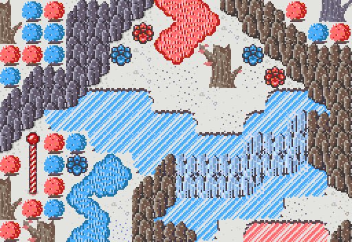
Rambly: If I knew any better this is a screenshot from IHM3, and I'm not apologising for that comparison. The candy cane pinks and blues mesh well together here.
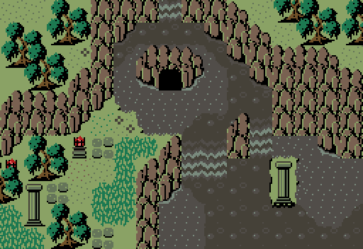
Moon: The mire is a nice twist on the base, and the swamp bubbles are a nice touch too. Unsure how I feel about the cave though, on one hand it seems like it belongs in lieu of the original tree and on the other hand my inner SotW loser nerd vibe is coming out and thinking "HuRRR SCREEN ClutteR". I'm probably incredibly off the mark though and I think it's a very good screen whether I'm second guessing or not.
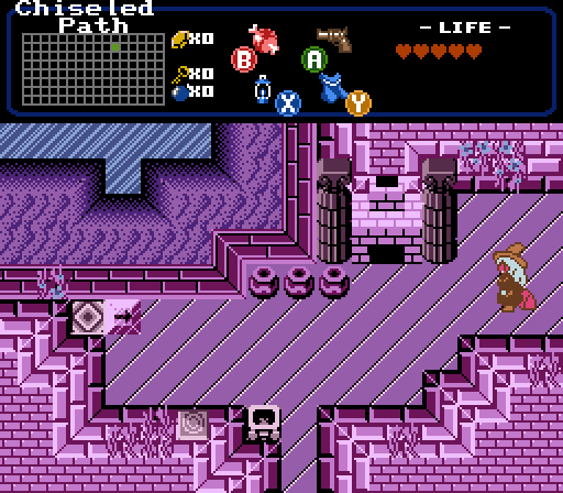
Kifstopher: It's a good screen, but I'm in a similar mind to Haylee where I'm unsure how much of this follows the original screen composition - a screen rearrangement, maybe? Either way it's the only interior screen out of the bunch so I'm gonna give you credit for deviating from the overworld approach, you're always taking the subversive angle with Screen Rebirth and I appreciate that so much.
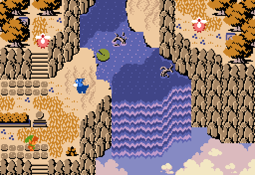
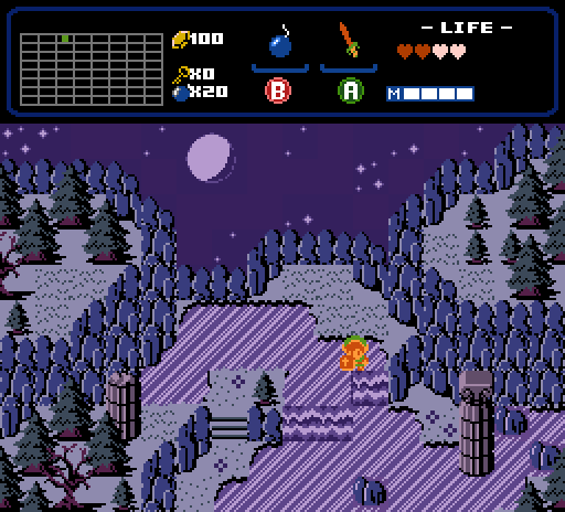
Hari: Voted here, I'm a sucker for a good Cambria animated night-time shot, what can I say? It feels like a slightly compressed version of the original, and while it is closer to the source material than the other entries, that doesn't necessarily mean it's a 1:1 recreation.
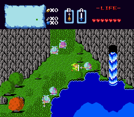
skateboarder11: The BS grass on the classic set is a massive energy. Big 2003 Fall Uh De Honky Pig vibe. BS should be in SR more often. Contest runners, take note.
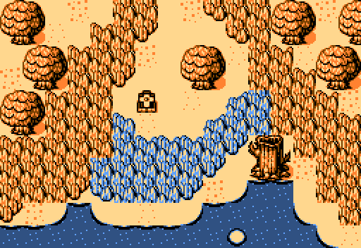
Professor Bedwetter: Koten, huh? Good for making gated community screenshots with. This is the most minimalist of the lot, and the way it's handling being super reductive of a DoR screen... it's kind of on point. I think juuuust a little bit more space on the cliffs on the left and right hand sides would have helped this flow nicer, but that's just me.

 This topic is locked