Dimentio
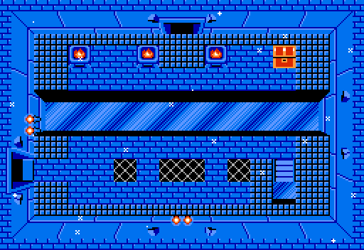
Brace yourselves, Winter is coming. (Again, inspired by a quest I am beta testing. Shoutouts to Mitsukara, for making an excellent game)
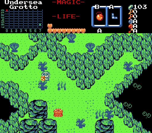
Zaxarone
Strange markings on the floor suggest a musical solution...
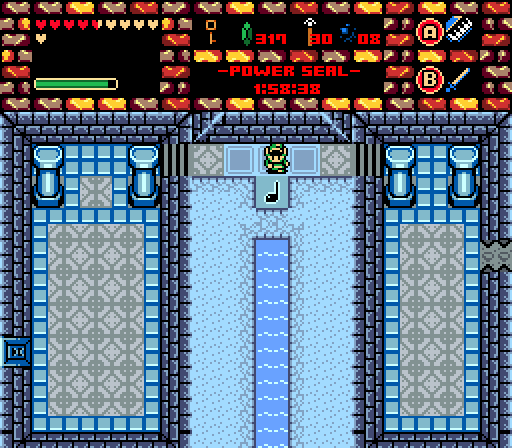
Sheik
[v][>][<][v][>][<]
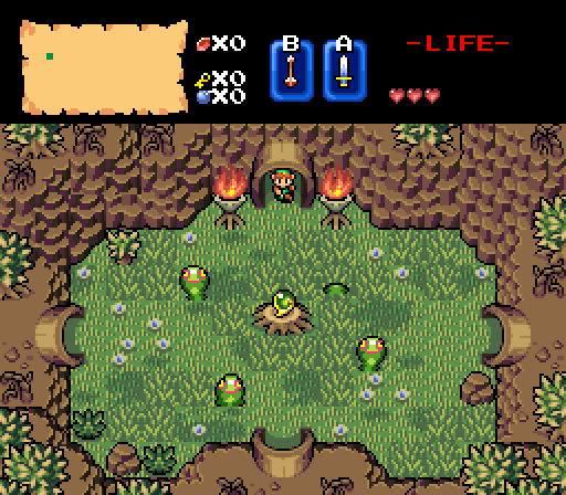
Plutia

 This topic is locked
May the way of the Hero lead to the Triforce.

Posted 27 November 2016 - 09:56 PM
Dimentio
Brace yourselves, Winter is coming. (Again, inspired by a quest I am beta testing. Shoutouts to Mitsukara, for making an excellent game)
Zaxarone
Strange markings on the floor suggest a musical solution...
Sheik
[v][>][<][v][>][<]
Plutia
Justice is served!

Posted 27 November 2016 - 10:05 PM
Voted for Sheik. Very nice use of BS.
🤍

Posted 28 November 2016 - 05:38 AM
Lots of wonderful shots, each nail what they're going for. But I went with Dimentio simply because it looks like ALBW got a Z1 demake.
I was going to vote for Sheik, but the subtle mountain errors on top left and right mountains and the GB roots kind of killed the mood to an otherwise perfect screen. Plutia's is a bit too green, but the design is nice. Zaxarone's is interesting and the design is good, but it didn't pull as much depth as Dimentio's dungeon did. Still looks like a fun dungeon.
Magus

Posted 28 November 2016 - 06:44 AM
Addicted to Overwatch

Posted 28 November 2016 - 10:31 AM
I like Dimentio's screenshot. It is quite unique! I like the two different "levels" in the screen, adds a nice touch...
ringle

Posted 28 November 2016 - 11:51 AM
Dimentio - Once again, another really nice classic shot. I still really love those ice tiles and the sense of depth in this screen is really good. Nice job.
Zaxarone - Pretty decent shot. I really like the subscreen, though I do think the screen itself is a little empty with not a whole lot going on. Maybe add more pots or ice or something to make it look more diverse (if that makes any sense lol).
Sheik - Very beautiful shot here. I love the overall atmosphere you're going for and I especially love the use of the BS Tileset. I got no complaints other than the GB roots which look a little odd since I always thought they suited more for a swamp setting rather than a forest setting. Other than that, good job.
Edit: On closer inspection, I noticed that mountain on the top-left is looking really weird and has quite a bit of tile errors. Probably fixing up that mountain a bit can make things look much nicer.
Plutia - I like what you got going here, but like I've mentioned elsewhere, the mix of GB and Koten doesn't look very good IMO. Other than that, the setting is pretty nice and I do like that green palette.
Overall, I voted for Sheik this week.
"Tra la la, look for Sahasrahla. ... ... ..."

Posted 29 November 2016 - 11:30 AM
Dimentio- The chest looks like it doesn't match the other graphics because it's barely outlined. Would have liked to see Link in this screen.
Zaxarone- A bit empty, and the logic of the column placement is odd, usually columns are centered or evenly spaced along walls to support the weight above- here they just visually block the stair paths. All the colors going on in the subscreen are distracting.
Sheik- There is a lot of perspective clash between the exterior ALttP/BS-style view depicting mostly the south-facing side of mountain walls and the typically interior top-down perspective on the log tunnels.
Plutia- I like the layout and the idea, color isn't bad if you're going for a retro feel. Voted.
Edited by Cukeman, 30 November 2016 - 10:53 AM.
May the way of the Hero lead to the Triforce.
Posted 04 December 2016 - 08:45 PM
With 65.79% of the vote, the winner of Screenshot of the Week 587 is Sheik!
Congratulations!
Voting totals:
- Dimentio (4 votes [10.53%])
- Zaxarone (4 votes [10.53%])
- Sheik (25 votes [65.79%])
- Plutia (5 votes [13.16%])
0 members, 1 guests, 0 anonymous users


