Jump to content

Photo

Screenshot of the Week 144


  • This topic is locked This topic is locked
51 replies to this topic

Poll: Screenshot of the Week 144 (49 member(s) have cast votes)

Here are your choices!

You cannot see the results of the poll until you have voted. Please login and cast your vote to see the results of this poll.
Vote

#1 Neppy

Neppy

    Grand Overlord Empress

  • Members
  • Real Name:It's dangerous to go alone. Take Nep!
  • Location:Minnesota

Posted 06 November 2006 - 02:46 AM

Alrighty, this is the last SotW for next weeks SotM. But remember, there is still a SotW while that is going on, so it can stay 4 per month. So look forward to both SotW, and SotM next week! icon_wink.gif

NoeL
IPB Image
Link tries to hide the fact he just WET HIMSELF OVER THESE AWESOME CUSTOM GRAPHICS! icon_omg.gif

Blue Link 2007
IPB Image
I just hope NoeL doesn't kill me for this...

WindStrike
IPB Image
Link will never figure this one out...

Revfan9
IPB Image
Link begins his final battle with that which threatens all of humanity...

Sharon Daniel
IPB Image
Pointing at the bat is not going to help kill it...

Enjoy this weeks shots! icon_wink.gif

#2 Revfan9

Revfan9

    Hero of Time

  • Banned
  • Real Name:Dr. Pajamas
  • Location:In front of a screen

Posted 06 November 2006 - 02:56 AM

NoeL: Wow... Nice Temple. Did a really good job with the bricks, and an even better one with those Cathedral-style arches and windows.
Blue Link 2007: Umm.... What are we suppossed to like about this shot?
Windstrike: Hmm... To be honest, it looks like you crapped out a bunch of trees and drew a line in them with a stick for Link to pass through. The graphics are nice but they arn't yours... So they don't count...
Revfan: Link fighting PZC lol
Sharon Daniel: Nice idea but, terrible, terrible greyscale pallette.

I nulled, due to my usual policy of not voting for the "outlier".

Edited by Revfan9, 06 November 2006 - 02:58 AM.


#3 link3505

link3505

    Ancient

  • Members
  • Real Name:Ben
  • Location:The Edge of Infinity

Posted 06 November 2006 - 03:23 AM

NoeL. The only complaint I have about this is the style is not Zelda at all. More like Final Fantasy, but you know, orgasmic shot regardless

Also, I like the colors in Sharon's shot. It's very silent-movie-era-ish, like all the cutscenes should have a black background with a fancy border and big words, with the occasional discolored line running through it

#4 Sharon Daniel

Sharon Daniel

    .

  • Banned

Posted 06 November 2006 - 03:47 AM

While NoeL's shot is impressive, I have to point out the fact that most of the screen is filled with the same repeating patterns. icon_razz.gif Still, the arch and windows are very nice.


Now, a bit of an explaination of my shot. The graphcs are 100% custom, of course. As you all should know by now, I enjoy playing with graphics more than actually building quests. This tileset uses a four-color palette I grabbed from the Gameboy Pokémon Trading Card Game. This is really just a small project I started this weekend because I don't have access to my laptop, which holds all my ZQ stuff. Like all my other projects, this likely won't become an actual quest, but you never know... (except in my case, where you can be sure that it will never get anywhere icon_sweat.gif )

#5 Devdogg

Devdogg

    Newbie

  • Members

Posted 06 November 2006 - 08:48 AM

We'll These shots, each in their own right, show effort. For that excelent job.
NoeL:Sweet custom graphics. I do think its possible to re-invent the style of LOZ
You sir are on your way, however from the shot, it is boarderline FF. Impressive still, depth & perspective is well done.

Blue Link 2007:I must agree with Revfan9, in the sence you must have some different shot, maybe your
strong point is in story line, you just havent shown something that would help the viewer get a better idea
of what stands out about your quest. I fully support the effort, because it should be about fun.

Windstrike: Hmm... Interesting, I like the flow of the shot, however i hope the rest of the map is .....
well...spread out..not to give the impression that filling the screen is bad. Just think 4 screens bigger that way..
it doesnt look like you tryed to do everything in one screen....if you get me.

Revfan:Not sure what to say.....it might have been a bad idea to put the final boss as a screen shot...spoiler maybe?

Sharon Daniel: Yea I thought this one did stand out as well as NoeL's, completely different...I like that...
Gray scale seems to be getting popular...sooo, in that respect not so different. If graphics are your thing....dude keep it up.
and keep thinking on different is better. The gradents are a strong point, and fill in the screen a tad bit...also, more organic looking...
right now it doesnt look to naturific.

My vote goes to windstrike...only because I can see something more going on here....
of course NoeL is extremely well done, I dont want to just give it to the one with the best graphics...thats not what its ALL about.. it does and should have a factor on game play, and interest...I think your doing just fine...I look forward to playing it.


#6 Nathaniel

Nathaniel

    Deified

  • Members

Posted 06 November 2006 - 11:19 AM

Wow NoeL! You once again have a fantastic screenshot. The work of an artist indeed. You sir I give bragging rights to once again. I know you will take advantage of those rights.

Oh I forgot, there are other screenshots! How rude of me!

My second favorite easily goes to Sharon. You prove that you can do a lot with using only black and white, for detail does not rely on color. It still feels a bit boxy, but other than that, it looks great.

For Windstrike's screenshot, I do like the idea of using a variety of trees, but they somehow don't feel like the right combination of trees, as if I see a variety of trees that come from a variety of climates. But your intention was to make a maze, and it certainly looks like an interesting one. Nice job.

The other two screens are okay. I don't find anything too special about them. They are not eyepopping, but they look pretty functional.

#7 Blue Link 2007

Blue Link 2007

    Doyen(ne)

  • Members

Posted 06 November 2006 - 12:36 PM

QUOTE
Blue Link 2007: Umm.... What are we suppossed to like about this shot?


QUOTE
Blue Link 2007:I must agree with Revfan9, in the sence you must have some different shot, maybe your
strong point is in story line, you just havent shown something that would help the viewer get a better idea
of what stands out about your quest. I fully support the effort, because it should be about fun.


I was afraid of this...

Anyways, the picture is about Link being intoduced by a guru or something. The guru tels him that he is the next hero, which upsets the Wanabe Link (the custom Link Noel made). The reason I said "I just hope NoeL doesn't kill me for this..." is because I'm making fun of his custom Link in my quest, since it he Looks so retarded anyways.

Anyways, I'm voting for myself again, for obvious reasons.


#8 Nimono

Nimono

    Ultra Miyoa Extraordinaire!

  • Members
  • Real Name:Matthew
  • Location:Static Void Kingdom

Posted 06 November 2006 - 01:06 PM

Revfan for the win! My reasoning is simple: He made PureZC's banner the "final boss" here. I'm sure he won't really release that as a quest. ...I hope not. Ugh. That'd be a terrible fight!

#9 /M/

/M/

    6♣7♠8♥9♥10♥

  • Members
  • Location:Gotham City

Posted 06 November 2006 - 02:55 PM

Damn.. Good week.

Noel:
Absolutely, amazing, stunning, leaves us speechless. I like every tile in this shot, but I have to admit, it doesn't resemble the Zelda feel. It reminds me more of "FF", like most of the other members. The custom grass, makes it even less Zelda. ( Zelda game never has anything besides a plain green grass tile. ) Those knights look strange, but they are better than those ugly GBC ones.

Blue_link_2007: This is basically, a square dungeon room from PTUX, but it has a bunch of the Triforce Symbol. Nothing to show really.

WindStrike:
You need to come up with a new style. Your just adding a bunch of diffrent trees, ( Total of 7? ) all crowded, given the player very little amount of space to move. This isn't consider detail, and also, you added way to many stuff on the ground. Which, is similar to what RevFan9 has done before, in his winter shot a while ago...

Revfan9:
<.<

S.Daniel: I like this grayscale pallete you have come up with. Its unique, and reminds me of an old school movie. The hero tiles must be from FF Adventure/Legend, which is also where you stole the idea from. icon_razz.gif Nice try anyways.

#10 Deathbringer

Deathbringer

    Master

  • Members
  • Real Name:Chris
  • Location:Why should you care?

Posted 06 November 2006 - 03:35 PM

Noel: Nice tiles, horrible perspective.

Blue Link 2007: Nothing fancy but nothing bad either.

WindStrike: Very nice use of DoR actually.

Revfan7:....you just simply quickly made a screen that has PureZC just so you can try to win did you?

Sharon Daniel: Very nice. I'll think i'll vote for this. I like the Pokemon style graphics.
QUOTE(/M/ @ Nov 6 2006, 02:55 PM) View Post


S.Daniel:The hero tiles must be from FF Adventure/Legend, which is also where you stole the idea from.


.....Did you even read his post?

Edited by Deathbringer, 06 November 2006 - 03:35 PM.


#11 Linkus

Linkus

    .

  • Members
  • Real Name:Adam

Posted 06 November 2006 - 03:40 PM

OK,OK, so I didn't get a shot in for SotW. I got busy with other things last week, and I had nothing really notable to send in.


...However, I find that NoeL seems to like my brick floor/wall idea from a shot I sent in for SotW a long time ago....Even if that idea didn't come from there...

#12 Animus01

Animus01

    Spirit Warrior

  • Members
  • Real Name:Keith
  • Location:My own imagination

Posted 06 November 2006 - 04:16 PM

Looks like I'm going to be judging each shot individually, then making my vote, this time.

NoeL - BEAUTIFUL PIC. This is the most realistic screenshot I've ever seen! I know I usually provide some contructive criticism with each screenshot, so I'll try to come up with something. Well, the best I can come up with is maybe making the windows look more like glass, but I don't even know if that was intended, or not. Oh yeah, one more thing (I added this after typing up most of the reply): Your symmetry bothers me. icon_razz.gif
*gets shot*

Blue Link 2007 - I see someone used that old-cartoon style Link portrait sprites. A lot of copying the same image is a little much, though. You have several Triforce emblems and several telepathic box-thingies. So, you kinda overloaded the walls. The torch flames are beautiful, nonetheless.

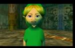
WindStrike - A lot of green in this screenshot. I don't think the palm trees would work well, though. The rock wall formation just above Link looks a little odd, as well. Otherwise, a nice pic.

Revfan9 - I see that you want the main focus of the picture to be the boss. But, uhh,... where is he? The PureZC logo is a little odd to put in the screenshot, though. Other than that, nice use of Pure (It looks mainly like Pure).

Sharon Daniel - Ooh, nice Game Boy-like screenshot. The texture of the water looks really good from this angle. I even like the player sprite. I do ask for at least one more type of enemy in the screenshot, though. I want to see what some other monsters look like.

Well, I have to say, I kinda have that decision between Sharon Daniel and NoeL. Both are really good in their own way. The textures of the environment really make up for the lack of color, and NoeL's designs are highly detailed. ARRGH!!! I SO WANT TO VOTE FOR BOTH, BUT I CAN'T!! icon_dead.gif

Ok, I think I'll vote for NoeL, only on the fact that he claimed his sprites were custom. But I'll say this: Sharon Daniel is in a very close second place, IMO.

UPDATE: Oh shoot, SD's sprites were custom, too! *shoots himself for voting for NoeL*

Edited by Animus01, 06 November 2006 - 04:22 PM.


#13 /M/

/M/

    6♣7♠8♥9♥10♥

  • Members
  • Location:Gotham City

Posted 06 November 2006 - 04:27 PM

QUOTE
.....Did you even read his post?


Umm... If I did read his post, I wouldn't have posted that. icon_sweat.gif

S.Daniel is known to imitate people work. ( Long history.) So, most of the time I cannot decide if its custom or not, since he copies the style by alot.

Edited by /M/, 06 November 2006 - 04:30 PM.


#14 Zemious

Zemious

    Magicite: Bahamut

  • Members

Posted 06 November 2006 - 04:57 PM

My vote goes to Noel, the only shot that used decent shadowing...
The graphics far surpass anyone elses.

I don't know much of what I should say about Blue Links except for just keep working in ZC. icon_smile.gif

I don't like the bridge, it changes the view alot.

#15 Nimono

Nimono

    Ultra Miyoa Extraordinaire!

  • Members
  • Real Name:Matthew
  • Location:Static Void Kingdom

Posted 06 November 2006 - 05:14 PM

QUOTE(Animus01 @ Nov 6 2006, 04:16 PM) View Post

Revfan9 - I see that you want the main focus of the picture to be the boss. But, uhh,... where is he? The PureZC logo is a little odd to put in the screenshot, though. Other than that, nice use of Pure (It looks mainly like Pure).

I feel like laughing now. If I'm not mistaken, the PureZC logo IS the boss! icon_lol.gif

Edit: Here's the proof, quoted from Revfan himself:

QUOTE
Revfan: Link fighting PZC lol

See? Link's fighting PZC in Revfan's screenshot. The disturbing thing? The caption reads "Link begins his final battle with that which threatens all of humanity!". PZC isn't threatening all of humanity! ...Is it? Oh the Whomanity! icon_lol.gif

Edited by Matthew, 06 November 2006 - 05:17 PM.


0 user(s) are reading this topic

0 members, 0 guests, 0 anonymous users