")
Good job
9/1o
4 *'s
Reviews

nicklegends

Posted 08 December 2005 - 12:52 AM
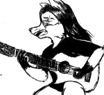
Heh, he looks a bit like a scarecrow because of his under-developed facial features. But as Radien mentioned, it must have taken a lot of work to shrink an absolutely enormous and detailed portrait image into a GIF a tiny fraction of its original size. For that, I commend you, but again, the face could be done better. 

Radien

Posted 06 December 2005 - 05:20 AM
Impressive that you managed to shrink one of the most detailed pieces of official Zelda artwork into the space of a few tiles. However, the decision to add two dots and a line to make a "face" was not a terribly good one. Due to the nature of this image, I highly recommend that you scrap the idea of capturing any of the details on the face, and instead focus on the shape of the face's outline. Then just darken the shading on the face's profile, and make it look like Link's features can't be made out from this "distance."
One thing you could do to accomplish this would be to draw a line that traces the the shape of his forehead, nose, and chin, and then color one half with a darker shade than the other.
One thing you could do to accomplish this would be to draw a line that traces the the shape of his forehead, nose, and chin, and then color one half with a darker shade than the other.