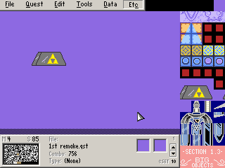
Master Sword Pedestal
")
About Reviews
Mr. Pimpy


Posted 02 May 2007 - 01:54 AM
The shading is off for that perspective. The edge should be a slight shadow, since the light source (the glare) is coming from the front right. It could use some detail, like some graininess or something, and some anti aliasing. Its not as bad as what some people are saying, and I think you tried your best so 4/5. 


Zeratul

Posted 25 April 2007 - 07:57 PM
Even though the tiles alone look somewhat decent, the perspective is awful. These tiles couldn't possibly look good if someone tried to put them to use.
I'd say to add some shading, and change the perspective, but that's probably more trouble than it's worth.
It's a good effort, but the tiles didn't turn out well enough to be worthy of use, or a high rating.
I'd say to add some shading, and change the perspective, but that's probably more trouble than it's worth.
It's a good effort, but the tiles didn't turn out well enough to be worthy of use, or a high rating.


