

So I cleared this quest in about 40 mins or so with no deaths. As an NES style quest, it's short and simple and the quest is quite straightforward. Screen design is quite simplistic and while there were quite a lot of tile errors located everywhere, I do see some effort with detail.
Though there are a lot of problems I found. For one, most screens were quite empty and not very interesting at all. There was a huge lack of secrets and the difficulty curve was all over the place. Going from Gibdos on the overworld to the huge difficulty spike of the Patra in Level 3, difficulty really needs to be worked on. For the most part though, the quest was too easy. There were other numerous oddities, like this, this, this and this. Besides those oddities, I also found the dungeons to be way too short and straight forward. There wasn't any puzzling rooms or a lot of backtracking where you explore more of the dungeon, everything felt more like just a straight line from Point A to Point B, and that made the quest quite boring to go through. I don't understand why you have the Map and Compass available if they don't even work, it's best to just remove them entirely. The final dungeon was also quite disappointing. I was expecting a big dungeon, but I was just greeted with an easy bomb Manhandla which I killed instantly.
I know you got 4 Temples 2 out already, but I might as well give some advice anyway. I'd suggest to add more secrets on the overworld to make exploring more fun and rewarding (and maybe you can hide some minidungeons around too). Also try to make dungeons more non-linear by having branching paths to different parts of a dungeon so that it won't look like a straight line from one place to another. Also try to keep difficulty consistent, keep the easier enemies near the beginning and gradually make them harder as you go along in the quest rather than mixing everything up together.
Overall, this quest wasn't that great to play, there's quite a lot of issues and I'm sure you've probably worked on some of this in the sequel (which I'll get to soon). I'll give this quest a 1.5/5 (which rounds up to a 2). It's a decent start, but there's a lot more that can be done.
4 Temples
Overview
Feature Quest
Creator:
Kivitoe
Genre: Miniquest
Added: 05 Jul 2016
Updated: 07 Jul 2016
ZC Version: 2.50
Downloads: 481
Rating[?]:
")
|
Download Quest (2.44 MB) |
Information
4 Temples (4T) is an NES-style miniquest with 5 dungeons. (4 temples, a the game boss's lair).
About Reviews Comments Forum Topics


Anarchy_Balsac

Posted 07 July 2016 - 07:20 PM
I got bored with this and beat it without fully exploring the content, however, a few things to note:
A) It's super easy, which is ok, but you may want to let users know in the description. Some people like easier quests, some, such as me, prefer super hard ones, but letting people know is good either way. How easy is it? Level 1 and 2 are easily done with the green tunic, 3 hearts, and wooden sword. In fact, you can completely avoid being damaged in level 2, which is oddly a lot easier than even level 1.
B). Some screens have no enemies, which, again, is ok, but there needs to be a reason for that. Is it a place that terrifies the monsters? A dungeon entrance? A place magic blocks them from going?
C). Music doesn't always loop properly, and some push block appear to have a mis-matched under-combo. It feels like there was no play testing at all. This may not be the case, but it feels that way. Because as previously noted, the map and compass don't seem to do anything.
zcbeadnik

Edited 07 July 2016 - 07:08 PM
A few notes:
A) You may want to put few triggers or item checks that appear before going into the dark world. I was able to get the magic sword with 4 hearts, 10 minutes into the game.
B) The dungeon map and compass do not appear in the subscreen.
C) The key counter does not count how many keys the player has.
D) There are a few typos (I don't hold that against anyone, especially ESL people, but it it's helpful to know).
E) Triggers need to follow convention (i.e. Gohma eye = arrow) in order to reduce player confusion.
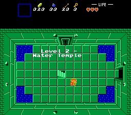
F) As Alucard said, Level 5 is a point of no return... and F6 - Save (and subsequently quit) is the only way to get out.
A) You may want to put few triggers or item checks that appear before going into the dark world. I was able to get the magic sword with 4 hearts, 10 minutes into the game.
B) The dungeon map and compass do not appear in the subscreen.
C) The key counter does not count how many keys the player has.
D) There are a few typos (I don't hold that against anyone, especially ESL people, but it it's helpful to know).
E) Triggers need to follow convention (i.e. Gohma eye = arrow) in order to reduce player confusion.
F) As Alucard said, Level 5 is a point of no return... and F6 - Save (and subsequently quit) is the only way to get out.
- coolgamer012345 likes this
coolgamer012345

Posted 06 July 2016 - 04:58 PM
So, I decided to play this and wanted to give some advice.
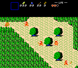
First off, a lot of the screen design is rather open and in many cases rather boring. For example, the starting screen:

There's a lot of empty space (especially in the top-center of the screen) and there's only a single row of mountain tiles in the top and bottom of the screen (which, in itself wouldn't be too much of an issue, but it's making the screen more open here, which really isn't helping). Making the mountains come into the screen a bit more would help. Also maybe some patches of small bushes rather than them just being placed haphazardly.
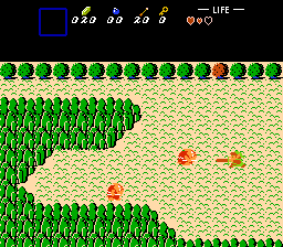
Another common thing I've noticed is screens with too much mountains, which is also problematic. For example:

When there's that much mountain, it looks very boring. I don't really have any advice on how to fix something like this without completely re-doing the screen.
And that leads me onto another issue, in that areas are bigger than they need to be, and makes it seem like a lot of the screens are there just to be there. Some examples:


I'd suggest redesigning the areas some rather than just putting stuff on the screens.
Something else I'd suggest doing is putting the Whistle in a dungeon, rather than a shop, since it's needed for progression and could be missed if someone didn't bother to grind for enough money for the shop (or just forgot that it was in the shop at all). I'd also suggest putting the Lens somewhere, since it might be used, though I suppose isn't technically needed to progress.
Also, a lot of screens have way too many enemies or enemies that are tedious to fight early on (Goriya's, Gidbo's, Likelike's). Speaking of Likelikes, why were they on the overworld? Also why was there only a single screen with them?
There's also some odd choices for secret triggers and such. First example I can think of is this:

It took me a while to realize that's a magic trigger.
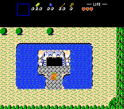
Another example:

I wouldn't say this is too big of an issue (the gohma's eye is a boomerang trigger), but it's still a bit odd. Also, the Gohma statue's eye turning into a rock looks kind of jarring. And the screen the cave-hole leads too is kind of odd:

The mountains look really weird when next to the dungeon walls like that. Also those arrows aren't needed at all, since the key is really obvious.
Lastly, like Alucard648 mentioned, in the 5th dungeon you can't go back out the bottom of the screen. If you save and quit, you go back to the overworld, though.
...
While I'd like to go through many more screens to give some advice on them, I can't really do that. I tried to be general with the critique (like, it could be applied to more parts of the quest than just the screen I mentioned) but I dunno how well I did that. Hopefully you take some of this into account.
(Also, I would of made this a review but I wanted to critique some of the stuff in the quest rather than review the entire thing).
First off, a lot of the screen design is rather open and in many cases rather boring. For example, the starting screen:
There's a lot of empty space (especially in the top-center of the screen) and there's only a single row of mountain tiles in the top and bottom of the screen (which, in itself wouldn't be too much of an issue, but it's making the screen more open here, which really isn't helping). Making the mountains come into the screen a bit more would help. Also maybe some patches of small bushes rather than them just being placed haphazardly.
Another common thing I've noticed is screens with too much mountains, which is also problematic. For example:
When there's that much mountain, it looks very boring. I don't really have any advice on how to fix something like this without completely re-doing the screen.
And that leads me onto another issue, in that areas are bigger than they need to be, and makes it seem like a lot of the screens are there just to be there. Some examples:
I'd suggest redesigning the areas some rather than just putting stuff on the screens.
Something else I'd suggest doing is putting the Whistle in a dungeon, rather than a shop, since it's needed for progression and could be missed if someone didn't bother to grind for enough money for the shop (or just forgot that it was in the shop at all). I'd also suggest putting the Lens somewhere, since it might be used, though I suppose isn't technically needed to progress.
Also, a lot of screens have way too many enemies or enemies that are tedious to fight early on (Goriya's, Gidbo's, Likelike's). Speaking of Likelikes, why were they on the overworld? Also why was there only a single screen with them?
There's also some odd choices for secret triggers and such. First example I can think of is this:
It took me a while to realize that's a magic trigger.
Another example:
I wouldn't say this is too big of an issue (the gohma's eye is a boomerang trigger), but it's still a bit odd. Also, the Gohma statue's eye turning into a rock looks kind of jarring. And the screen the cave-hole leads too is kind of odd:
The mountains look really weird when next to the dungeon walls like that. Also those arrows aren't needed at all, since the key is really obvious.
Lastly, like Alucard648 mentioned, in the 5th dungeon you can't go back out the bottom of the screen. If you save and quit, you go back to the overworld, though.
...
While I'd like to go through many more screens to give some advice on them, I can't really do that. I tried to be general with the critique (like, it could be applied to more parts of the quest than just the screen I mentioned) but I dunno how well I did that. Hopefully you take some of this into account.
(Also, I would of made this a review but I wanted to critique some of the stuff in the quest rather than review the entire thing).
- zcbeadnik likes this


