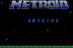


I'd really suggest choosing some better colors for the "METROID" title (or at the very least shading it better), as currently it looks bad, and working on some of the letter edges would help (M, I, and D especially. The edges of the letters look very "rough"). It would also help if it was centered more (horizontally mainly, more vertical centering may help too, though). The colors for the ground also look a bit odd, I'd suggest using just greens (Or just reds, or whatever the main color of the ground is supposed to be).
This could look pretty cool but currently it's.. eh. Hopefully some of my advice/critique might help.


