")
Umm... What?
I don't automatically consider something better than a nothing, and the original classic tileset wasn't even nothing. Hell, beautiful screens could be made with classic, but this? I'm not even sure Joel could do it.
Classic Cartoon
Overview
Creator:
Kivitoe
Updated: 07 Dec 2015
Downloads: 27
|
Download Tile (6.62 KB) |
||
| Tags: Overworld | |||
Information
This is a cartoon version of the original tileset.
About Reviews
Theryan


Posted 09 December 2015 - 05:23 PM
I'm not sure how you consider any of this to be an "upgrade" to another set. The mountains look like rivers of blood because you didn't add any shading or depth to a single custom tile. The non custom tiles look worse too because they don't fit the new palette and haven't been recolored at all. Other than that, there are a lot of issues with layers and tile errors that make this set less than preferable. If you're going to make a tileset, it takes a lot of work, especially if there's a lot of custom tiles that will be added.
- Kivitoe , Astromeow , KingPridenia and 1 other like this

KingPridenia


Posted 09 December 2015 - 12:40 AM
Sorry if this comes off as overly harsh, but the tileset is very boring looking as it stands. Honestly, the graphic quality looks like something I might have drawn in MSPaint as a kid. There is very little, if any, detail. Most objects are simply textureless shapes. The screens are just bare solid color tiles, and the poor quality of the screenshots doesn't help. Many of my thoughts are summarized by Lunaria's review. If I could critique each screenshot individually to help give you a better idea of what needs worked on:
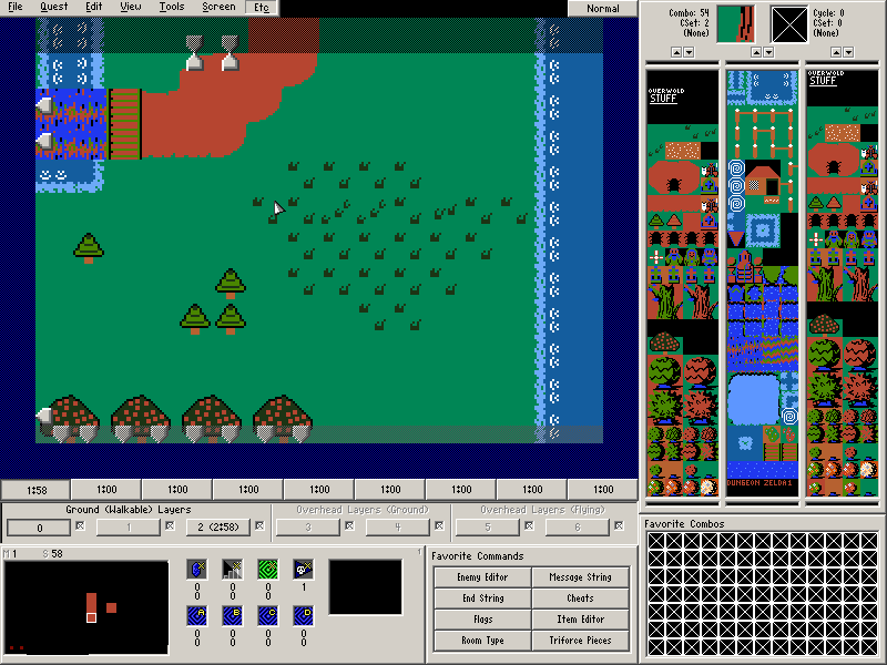
Screenshot 1: A lot of graphical clash. Also, is that supposed to be a mountain or a dirt path? The random clumps of grass aren't enough to save it; there simply needs to be more detail. Also, the waterfall is significantly more detailed than the water it empties into. There really needs to be more going on. Also, the misalignment doesn't help.
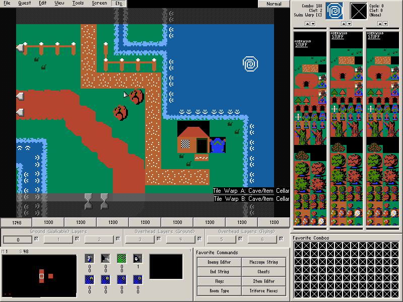
Screenshot 2: I see an empty corner in the upper left, fences too close to the screen's edge and a house with a terrible roof. It doesn't look good at all having a black background. You could have layered the roof onto another layer so it appears on top of the green. The black corners are ugly. Above all, the screen is VERY blocky.
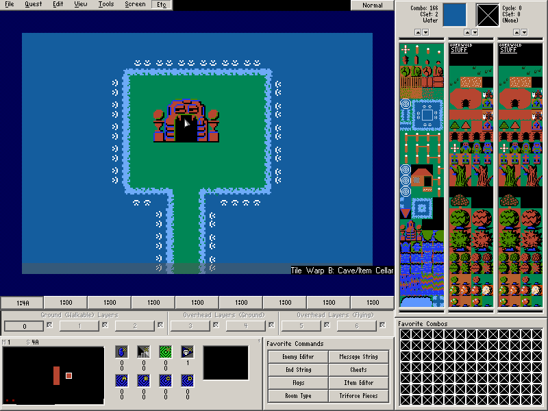
Screenshot 3: For what it's worth, it's passable, but there is no ground or water detail. That and the dungeon entrance clashes graphically. It is another very boring looking screen to be perfectly blunt.
In my honest opinion, if you want to get a higher rating than a 1/5, here are my suggestions. Make the tiles in general have more detail to them. Being a "Cartoon" doesn't mean solid colored tiles with zero detail. Like Lunaria stated, having some shading added can help add detail and make it look better. I also think that you should have more done before submitting it. As of now, it's a hybrid of your style and Classic, which clash really badly. The other tiles would need to be done in the same style. Just remember that you need to add detail. Again, I am sorry if I was overly harsh and possibly abrasive to some degree, but I want you to know what to do to improve on your work. I will still give you a 1/5 regardless as consolation.
Screenshot 1: A lot of graphical clash. Also, is that supposed to be a mountain or a dirt path? The random clumps of grass aren't enough to save it; there simply needs to be more detail. Also, the waterfall is significantly more detailed than the water it empties into. There really needs to be more going on. Also, the misalignment doesn't help.
Screenshot 2: I see an empty corner in the upper left, fences too close to the screen's edge and a house with a terrible roof. It doesn't look good at all having a black background. You could have layered the roof onto another layer so it appears on top of the green. The black corners are ugly. Above all, the screen is VERY blocky.
Screenshot 3: For what it's worth, it's passable, but there is no ground or water detail. That and the dungeon entrance clashes graphically. It is another very boring looking screen to be perfectly blunt.
In my honest opinion, if you want to get a higher rating than a 1/5, here are my suggestions. Make the tiles in general have more detail to them. Being a "Cartoon" doesn't mean solid colored tiles with zero detail. Like Lunaria stated, having some shading added can help add detail and make it look better. I also think that you should have more done before submitting it. As of now, it's a hybrid of your style and Classic, which clash really badly. The other tiles would need to be done in the same style. Just remember that you need to add detail. Again, I am sorry if I was overly harsh and possibly abrasive to some degree, but I want you to know what to do to improve on your work. I will still give you a 1/5 regardless as consolation.


