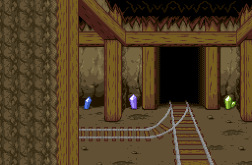
Believe it or not, my screenshot this week is indeed of a single screen. The animation in it is done with combo cycling, and made viable with the use of a piece of 1.92 combo cycling tech called a "bus stop" employed each time the player boards a minecart. This whole rail system is the game's form of fast travel; most areas are cave DMaps (or "interiors" in later versions) with distinct level numbers to make use of boss flags, plus the Triforce items are completely optional in BA3, so we can't make use of whistle warps for quick overworld traversal. Instead, every overworld section (plus a couple other areas) will have rail stations in them, each one becoming accessible with certain items/story flags to prevent sequence-breaking. Then, to actually travel between them, there's a minigame of sorts wherein the player must navigate the railway using a combination of the whole network map (which can be viewed in every station) or a number of informative signs on the tunnel walls (though not seen on screens with this particular angle). To reach their destinations, players will need to know which turns to take, and though it's slower than a more typical warp system, it's still faster than walking and should hopefully be a fun spectacle for those familiar with 1.92's limitations. The tileset and minecart animations were graciously custom-made for us, and these screens were constructed about 50/50 between Bikdip and myself, so while I can't guarantee who made this specific screen, I can at least say I made several others similar to it. One last thing to note is that the crystals in the tunnels have colours that match the area they're in - white for most of the prologue areas, green for Chapter 1, blue for Chapter 2, red for Chapter 3, purple for Chapter 4 and 5, and multi-coloured (like in this screenshot) for the screens near Quantum Quarry (shown in my SotW 857 entry), where the player first gets access to the minecart system, due to its colourful nature. If you're interested in seeing the minecart travel in action, it can be seen near the end of the Prologue preview video embedded on BA3's Quest Project page.
As for the other entries this week...
Jared - I like the sunbeams a lot, and the stark blue of the sky below contrasts nicely with the brown stone of the structure.
Alucard648 - Looks tough! I'm not one for Kaizo-type stuff but this screenshot certainly makes that tone clear while still having a nice level of detail.
Shane - Those buildings are very nice, I could easily see them fitting in an alternate version of Z1 that had towns, and the screen overall gives me a wild west vibe that I think is pretty cool. I especially like the detail of the rupee symbol above the door being a reuse of the one in the subscreen. I'm not crazy about the grey highlights, but I assume you were trying to work under some extra colour limitations for authenticity so that's fair enough.
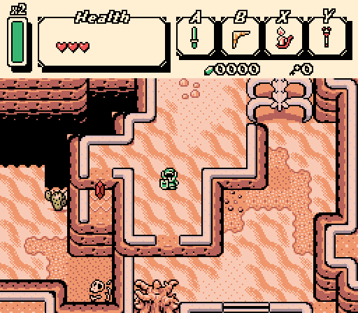
Moon - I never thought of myself as being a fan of the GB tilesets but a lot of the recent entries that use it have been great. I like the layering and the way it restricts the flow through the screen in particular ways. I like the palette, too, with everything feeling just a little dustier, including the white elements and the cactus. One small personal gripe I have is that I think while the big ribcage looks nice, it feels a bit awkwardly placed to me; it looks like the player should, if it were real life, be able to squeeze between the ribs on the left to move from the right section to the middle section, but it simultaneously feels like the intent of its placement is to be a tunnel that separates them completely, so that's a bit unclear to me, and I've been kind of a stickler for unambiguity in my own screen design when I can help it. It's ultimately a minor point though so I voted here regardless.
Edited by AutumnHaunted, 21 October 2025 - 08:08 AM.

 This topic is locked