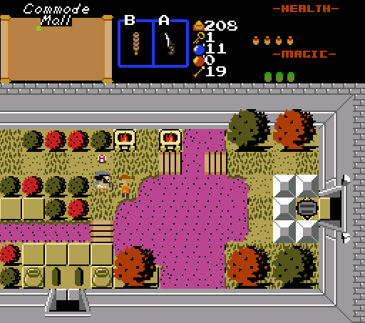
Working through my final playtest of Prometheus.
klop422
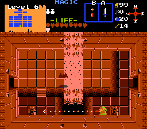
Just a little room on the way to the Boss.
Binx
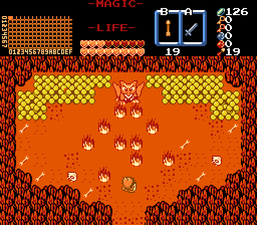
Maybe going off to fight a dragon wasn't Tag's best idea...

Posted 30 July 2018 - 05:16 PM


Posted 30 July 2018 - 06:11 PM
Posted 30 July 2018 - 06:23 PM
This week's SotW in a shellnut

Voted for Shoshon.
Posted 30 July 2018 - 07:22 PM
Yeah, I feel like maybe the three of us submitted just so the competition would go forwards. I know I did, and, while I can't speak for the other two, they were all submitted after there were no entries by Sunday.
I would have voted Shoshon - I like the purple liquid, and the room works well for me. Two small issues: I can't tell, is that a switch at the right? It took me a little bit to work it out from context. And I'm not sure I like that the tree trunks are the same colour as the foliage.
Binx, I do rather like the screen (though I note the tile error). I don't think it necessarily has to be that much more detail (though a little more floor detail couldn't hurt) since it's a boss room, but it's not visually 'impressive' the way some other screens are. Still like it, though.
klop: A very monochrome screen. There is a lot of empty space on that screen, as well as a pointless(?) corridor to the right. Some ground decoration or some pots would help.
What do you mean by 'corridor' on the right? Do you mean the higher floor beside the water, or the lower floor beside the door? I'm assuming you don't mean the door itself, because I don't see how that could be pointless ![]() .
.
btw, the colour is a little better when the rest of the enemies are there. I killed them to try and declutter the screen, now I'm thinking that was a mistake :/. In any case, would it help to use cset 0 for the water (i.e. make it blue?). I'd have to make the room no longer dark (meaning I'd also have to add torches), but I think that's probably fine.
Posted 30 July 2018 - 07:37 PM
Binx has a cute dragon, so that's where my vote is going.
Posted 31 July 2018 - 12:59 AM
Voted Shoshon for color variety, nicest subscreen, and chucklesome area name.
Posted 31 July 2018 - 01:27 AM
I voted for Shoson for his mall/nightclub screen. It is a very unique concept and the theme it has leads to a nice touch. However, you need to find ways to make the player and enemies pop out from the screen more - increasing the contrast between them and the environment is an easy way to accomplish it. It probably looks better in motion, but it still looks pretty difficult for the player to tell the sprites from the scenery.
Klop's screen is basic and effective in conveying what it needs to but it looks uninteresting as a whole. Look for ways to decorate the screen without breaking away from the Classic aesthetic - making effective use of the different types of floor tile in the tileset and breaking away from the monotone red will help a lot.
Binx' screen falls under much the same boat as Klop's, but some of the graphics need work. It took me a while to work out that the stuff at the back besides the dragon were piles of gold - they look more like bubbles than anything else.
Edited by Orithan, 31 July 2018 - 01:49 AM.
Posted 31 July 2018 - 02:30 AM
I also thought they were bubbles or eggs, if they're coins shading half of the circumference to make an edge could help
Posted 31 July 2018 - 11:28 AM
Binx: The first thing I notice is the tile error on the left pile of gold. The cave is very symmetrical and makes it look unnatural. If that's the intention, it looks fine. Not the best screen I've seen, but it's a screen that is bland but has not many flaws, so good job.
Yeah, I noticed that literally about 4 seconds after the contest went up and it was too late to fix.
Yeah, I feel like maybe the three of us submitted just so the competition would go forwards. I know I did, and, while I can't speak for the other two, they were all submitted after there were no entries by Sunday.
Binx, I do rather like the screen (though I note the tile error). I don't think it necessarily has to be that much more detail (though a little more floor detail couldn't hurt) since it's a boss room, but it's not visually 'impressive' the way some other screens are. Still like it, though.
Yeah, my screen was definitely meant only to get the contest off the ground and I threw it together in about 10 minutes. It's not even a real boss room, it's a mockup (although, it would have been real if I could have figured out a sprite layout that works).
Binx' screen falls under much the same boat as Klop's, but some of the graphics need work. It took me a while to work out that the stuff at the back besides the dragon were piles of gold - they look more like bubbles than anything else.
I'll take that under advisement. P-Tux is helping me polish the tileset, so if I can't make them look right, maybe he can.
Posted 31 July 2018 - 03:09 PM
What do you mean by 'corridor' on the right? Do you mean the higher floor beside the water, or the lower floor beside the door? I'm assuming you don't mean the door itself, because I don't see how that could be pointless
.
Posted 31 July 2018 - 03:29 PM
I've done something to make it a little better.
Posted 02 August 2018 - 09:11 AM
I don't think any of these shots are bad per se, just a little underwhelming. I love the NES tileset too so that doesn't really throw me off. My vote is going to Binx because the shot captures an environment really well and I like the custom tiles that still fit into the tileset well.
Posted 05 August 2018 - 11:27 PM
With 57.14% of the vote, the winner of Screenshot of the Week 672 is Shoshon the Elegant!

Working through my final playtest of Prometheus.
Congrats!!
Voting totals:
- Shoshon the Elegant - 20 votes [57.14%]
- klop422 - 10 votes [28.57%]
- Binx - 5 votes [14.29%]
0 members, 0 guests, 0 anonymous users