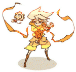
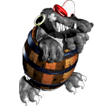
Shoshon the Elegant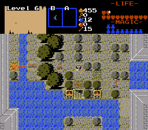
In Level 6, The Tortoise, Prometheus is stripped of all his weapons as he faces the challenge of finding Pan, the goat god.
Can he adapt to the trial of not being able to defeat enemies by normal means?
Sheik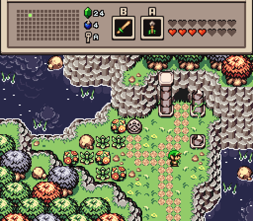
Jared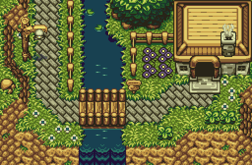
Kivitoe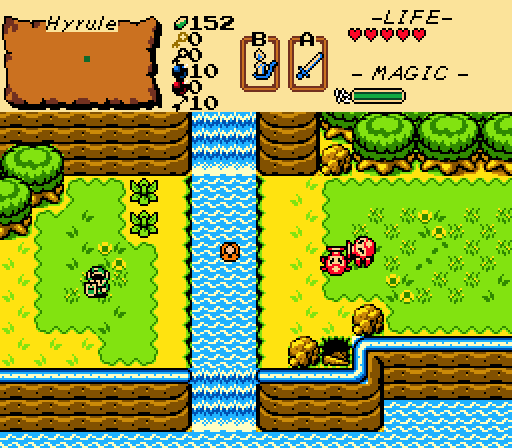
Another great day for adventure!
Octorockoncrack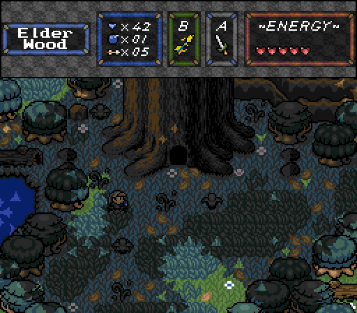
It is said that the Tree of Life is where all life began on Ondore.
Note: I don't have the software to resize animated pngs, and don't have time to research how to either at the moment.
EnnonFenom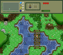
"Only layers, are overhead......There is a Creepy old dude, in... My... CAVE! Get's my Sword to be safe"

Screenshot of the Week 656
#1

Posted 09 April 2018 - 12:34 AM
#2

Posted 09 April 2018 - 12:40 AM
Very close, but I voted for Sheik. Was a tough decision to be sure. I don't think gray trees look that great but they didn't detract the screen for me. Good work everyone!
- Jared likes this
#3

Posted 09 April 2018 - 07:03 AM
Nulled
But wow, this round actually has some good, looking screens this round.
Info on my shot. Mostly All custom graphics. The dark grass, transparent water, the Bridge, large tree (with the exception of the branches) cliff tiles, flowers (not a big achievement) are Drawn by me.
The rest is heavily edited tile from the default tiles.
Good luck everyone
Note: I don't have the software to resize animated pngs, and don't have time to research how to either at the moment.
I guess if the want to see it bigger ctrl+scroll wheel or +
Edited by EnnonFenom, 09 April 2018 - 07:07 AM.
#4

Posted 09 April 2018 - 07:52 AM
2nd - I don't think the BS-mountains fit all that great into Firebird, maybe different colors to get closer to the stones in firebird? I also 100% agree with Shane about the grey trees. The water is breathtakingly beautiful to look at though.
3rd - got my vote, a wonderful screen. The bridge looks a bit odd, maybe some shadows on the water could help to make it fit in better? The white of the purple flowers is a bit too yellowish, maybe a cleaner white or a real yellow/orange? I am not a big fan of these bush-roots, they look like a tree with the leaves wrongly set a half combo too low. And you sure you need the shadow below the sign/lamp? It's a nice idea, but o don't see a need for it and the transparent shadow can't keep up with your stunning use of DoR in my opinion.
4th - a simple but nice screen. The palette is far too yellowish if you ask me.
5th - a great screen, but a bit too dark to see it well. I would say 2nd place together with Sheik.
6th - it's not exactly bad, but the colors and the animation are giving me a headache.
- Jared likes this
#5

Posted 09 April 2018 - 09:31 AM
Guys. Guys. The grey trees are blue.
Thanks for the feedback. The mountain and water tiles are for the most part Relic's work, so that's where all the credit belongs. As my old computer broke a few days ago all my stuff might be lost but oh well. I might be able to save some of the old data. This way I have a clean slate and can see wether I want to start any new projects. I'll keep you posted eventually.
Edited by Sheik, 09 April 2018 - 09:32 AM.
- Neppy and Jared like this
#6

Posted 09 April 2018 - 10:46 AM
Guys. Guys. The grey trees are blue.
Thanks for the feedback. The mountain and water tiles are for the most part Relic's work, so that's where all the credit belongs. As my old computer broke a few days ago all my stuff might be lost but oh well. I might be able to save some of the old data. This way I have a clean slate and can see wether I want to start any new projects. I'll keep you posted eventually.
yes, I knew I remembered those graphic's, Relic's art will always beat mine... No far you Cheated j/k It looks great though.
I am trying to make my own enhanced default graphics set with custom graphics too. I rushed this screen because I wanted to compete again.
And show of my non layered transparent water. That's too hard to see.
6th - it's not exactly bad, but the colors and the animation are giving me a headache.
No it was rushed.
I forgot to add the shadowed grass under the tall trees, next to the logs (which are one of the few non custom graphics on the screen)
forgot to calm down the foam/chop of the water.
Put the wrong ground to water transition tiles.
Forgot the dirt patches. ect.
All in all you know weeks worth of pixel art under the limits of zc palette system and screen shots from zc do make for a choppy animation.
I should have recorded it, then mass snapshot using exact frame rate as animation speed via VLC then animated them and resized them at ezgif were I made it.
But do to laziness and wanting to share I rushed my shot Sorry....
.
#7

Posted 09 April 2018 - 11:07 AM
I'm voting for Jared cause I like Jared's most.
Edited by Shoshon the Elegant, 09 April 2018 - 12:00 PM.
- Anthus likes this
#8

Posted 09 April 2018 - 12:42 PM
Shoshon - Pretty nice shot, the mist is definitely a cool addition. Though is it intended for the big trees to go over the mist like that? It looks a little weird to me IMO and probably would be better for it to be covered in mist too like everything else on the screen.
Sheik - Really good work here, the BS/Firebird mix works really nicely and it's cool to see the classic BS walls being used again. Also I really can't see blue trees, I just see grey too like the others lmao.
Jared - More great work here, I love the scenery and colours of the shot. This would make a really nice village area tbh.
Kivitoe - This looks good, I like the GB aesthetics you got going on here. As a small suggestion, I would try not to use so many grass tiles like you have here. One type of grass tile is enough IMO.
Octorokoncrack - Pretty interesting stuff. I like the setting and atmosphere you got going here. I don't really have any critiques with this one, so nice job!
EnnonFenom - This seems interesting, though I personally don't like how it looks like everything is animating all at once and at the same time, it comes off as a bit jarring for me. I'd probably try not to make every single thing animate, stationary tiles are fine too IMO. Though otherwise the custom spritework is pretty neat so far.
I voted for Sheik this week, but it was real close between that and Jared.
- Anthus likes this
#9

Posted 09 April 2018 - 01:01 PM
I voted for Jared. I really love the palette. I think I like Sheik's layout more, but Jared wins it with the colors. Substance abusing Octorock is a close runner up, but none of these are bad, so don't feel too bad!
I also like how Jared's kind of looks like it could run down into Kivitoe's shot.
- Jared and Kivitoe like this
#11

Posted 09 April 2018 - 08:16 PM
All in all you know weeks worth of pixel art under the limits of zc palette system and screen shots from zc do make for a choppy animation.
I should have recorded it, then mass snapshot using exact frame rate as animation speed via VLC then animated them and resized them at ezgif were I made it.
... there's got to be an easier way. Also I had no idea PNGs could be animated now. Shame I have no software that can view them. ![]()
How are you making your "pixel art" by the way? I had a look at it to see if I could fix up the palette a bit and the whole thing's such a mess I quickly gave up - lots of redundant colours, weird spikes in hue across your ramps, etc.. Are you drawing things at a higher bit rate then just reducing the colour count?
#12

Posted 09 April 2018 - 09:39 PM
... there's got to be an easier way. Also I had no idea PNGs could be animated now. Shame I have no software that can view them.
How are you making your "pixel art" by the way? I had a look at it to see if I could fix up the palette a bit and the whole thing's such a mess I quickly gave up - lots of redundant colours, weird spikes in hue across your ramps, etc.. Are you drawing things at a higher bit rate then just reducing the colour count?
All in zquest.
I believe it looks better in game. But I beta testing spriting and tileset making in the Alpha 23 build. And I am having alot of bugs.
As for the palette that is still in WIP fase...
#13

Posted 09 April 2018 - 09:47 PM
All in zquest.
Ah ok. I suggest you download a program called Graphics Gale - it makes spriting for ZC MUCH easier. I've got a few little tutorials in my signature to help you out with importing/exporting graphics.
- Jared likes this
#14

Posted 09 April 2018 - 10:20 PM
Ah ok. I suggest you download a program called Graphics Gale - it makes spriting for ZC MUCH easier. I've got a few little tutorials in my signature to help you out with importing/exporting graphics.
Graphics Gale should be your one and only image editor for Zelda Classic
Yeah, I remember Gg. I actually like Imageforge You can optimize 16 colours, or normal 16, or true 256.
Plus has the palette editor, transparent paper colour. You should check it out.
But as to the colour all my colors are in 8bit. I believe zc is reducing the colour count
https://imageforge.en.softonic.com/
- Jared likes this
#15

Posted 10 April 2018 - 02:43 AM
Whoa, the new one screen massacre quest looks pretty good. ![]()
- Nathaniel, nicklegends and Jared like this
Also tagged with one or more of these keywords: Shoshon the Elegant, Sheik, Jared, Kivitoe, Octorockoncrack, EnnonFenom
1 user(s) are reading this topic
0 members, 1 guests, 0 anonymous users

 This topic is locked
