

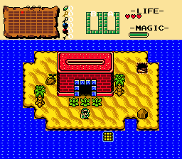
These are just two screens from the water mini-dungeon, (Deepsea Catacombs) which is at about the half-way point. I'll post screens from each mini-dungeon as I progress.

 This topic is locked

Posted 05 August 2015 - 04:32 PM
ringle

Posted 05 August 2015 - 04:36 PM
Looks pretty interesting. Reminds me of Mermaid's Cave from Ages for some reason. I also keep thinking that water is shallow water on the bottom screen since those are the tiles that are usually meant to be shallow water lel.
Addicted to Overwatch

Posted 06 August 2015 - 05:24 AM
Top screen, bottom right part there is a tile error, the mountain goes into nothing. Other than that looks good!
Posted 06 August 2015 - 09:08 AM
Looks pretty interesting. Reminds me of Mermaid's Cave from Ages for some reason. I also keep thinking that water is shallow water on the bottom screen since those are the tiles that are usually meant to be shallow water lel.
... Was the use of the Mermaid's Cave palette that obvious? >.> Also, I'll get to fixing the water. You'd think I'd know proper tile usage considering I was playing Ages to get puzzle ideas for this, but I guess I'm not actually paying attention to tiles when playing, eh? XD
EDIT: Actually, it looks better to use than the other ones, maybe if I darken it it'll look deeper? I'll try that.
Top screen, bottom right part there is a tile error, the mountain goes into nothing. Other than that looks good!
Ah! Thanks for pointing that out, I'll fix that right away. I always have trouble with the tiles on the edges because of that... uh... grid? Don't know what to call it, but I can't seem to find a setting to get rid of it.
Edited by Golden Warrior, 06 August 2015 - 09:15 AM.
~ Hope of Energy Nede ~

Posted 06 August 2015 - 10:17 AM
If you're referring to the arrows pointing to misaligned tiles, unchecking "Show Misalignments" in the ZQuest options ought to do the trick.
Posted 06 August 2015 - 10:22 AM
If you're referring to the arrows pointing to misaligned tiles, unchecking "Show Misalignments" in the ZQuest options ought to do the trick.
Ah, no, it's not that. It's the way it displays the connecting rooms. I have no idea how to describe it properly, but it's the... faded grid on all four sides of the screen and it just barely covers the tiles on all four sides as well.
ringle
Posted 06 August 2015 - 02:09 PM
... Was the use of the Mermaid's Cave palette that obvious? >.> Also, I'll get to fixing the water. You'd think I'd know proper tile usage considering I was playing Ages to get puzzle ideas for this, but I guess I'm not actually paying attention to tiles when playing, eh? XD
EDIT: Actually, it looks better to use than the other ones, maybe if I darken it it'll look deeper? I'll try that.
It was pretty obvious to me seeing how I kinda know all the palettes really well XD
And regarding the water, I guess making it darker could help. It would still look weird for me though since I'm too used to seeing it as shallow water, but it can work.
Tell all with glee, Argon's on PureZC

Posted 06 August 2015 - 03:58 PM
Ah, no, it's not that. It's the way it displays the connecting rooms. I have no idea how to describe it properly, but it's the... faded grid on all four sides of the screen and it just barely covers the tiles on all four sides as well.
I think I know what you mean. It's a feature of the 2.5 version of the editor (the large version). The only way to get rid of it as far as I know, is switch to the Classic interface. I actually use that all the time, because I'm used to it so much and the new version looks way too busy (with flashing things everywhere). I find it easier to focus on screen design when the interface is focused mostly on it.
Also, those screens look pretty neat. I didn't see the Mermaid Cave resemblance before, but now I do after Eddy pointed out.
Posted 07 August 2015 - 07:02 PM
I think I know what you mean. It's a feature of the 2.5 version of the editor (the large version). The only way to get rid of it as far as I know, is switch to the Classic interface. I actually use that all the time, because I'm used to it so much and the new version looks way too busy (with flashing things everywhere). I find it easier to focus on screen design when the interface is focused mostly on it.
Ah! Many thanks! And yeah, I like this interface better too. Lots easier to see what I'm placing.
0 members, 1 guests, 0 anonymous users

