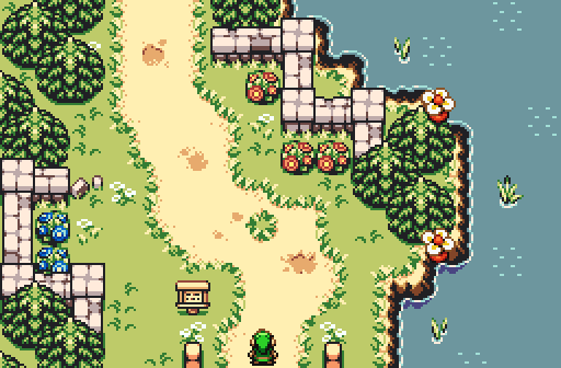
Shane, awesome even though it's firebird aka the new ezgb aka the new dor aka everyone hates it because it's awesome. My only critique is that I'd like to see people experimenting with fb palettes a bit more which I think is part of the reason the firebird look is getting stale. Not really a comment on your screen, but in general.
edit: i forgot to say, voted, although it was probably obvious.
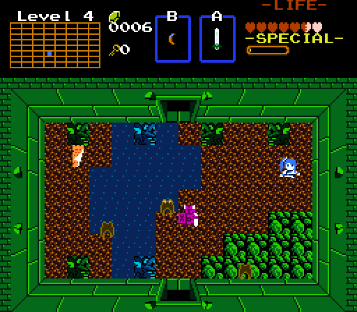
Lunaria, interesting look but not enough going on to make it standout versus any other classic 4 wall dungeon screen. Not sure I understand how it plays either, is that water walkable? because it looks deep.
Skylizardgirl, dayday dx
Seriously, I have no idea what this is. If this is the answer to firebird I don't know what the question is.
Joel, not bad, not as good as some of the other screens you've been featuring lately.
I went with the first one because it isn't terrible.
Can we stop this? I don't care who you are, being disparaging of another's work is just rude and unnecessary. Yeah, you don't need to give completely detailed criticism, or even much at all, but what's needed even less are outright damning remarks such as "the others are terrible." Disliking them is fine, that's common and expected, but I'm tired of seeing remarks in general from people that are generally tactless and offer nothing constructive. If you can't at least offer ways for creators to improve their work or say why you don't like them, it's probably better you said nothing at all.
Wow, I haven't done an SSOTW review in years and years.
Shane There is really nothing that is less than gorgeous in this shot. I love how the stone walls are both varied and occasionally end in rock rubble. I love how the dirt is varied and non-symmetrical, like everything else on the screen. I love how the trees are staggered, but not at all predictably so. I love how the peahats act as screenshot decorations! This screenshot has been given my vote, and it would do so again. Simply beautiful, and I thank you for it.
Lunaria The room is themed very well! I definitely get a feeling of dampness coming from it. The color of the statues sitting in the water, and the rocks in the corner... nice. I wonder what it would look like if the rocks were distributed a little more randomly around the room. I also don't know if the water is unwalkable and swimmable, but that's to be expected when I haven't actually played the quest. I can't wait to hear the music from the dungeon.
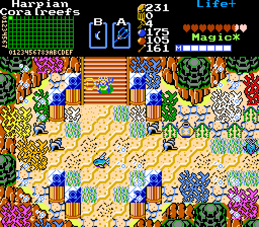
SkyLizardGirl The good news is that the screen definitely contains variation! There's no way that there wasn't a lot of effort put into the screen. If it was done to your liking, then I'm happy for you, and you can ignore everything that I'm about to say if you want because of it.
Spoiler
There are many reasons why I couldn't bring myself to vote for this screenshot. Although the style is a personal choice of yours, I also have to ask either you or myself the question "Why aren't many of these put on layers?" There is so very much going on in the screen in terms of various entities and colors and shapes; coral, statues, floors, seaweeds, ... but all of it is stuck right in the middle of some other combo without allowing that natural combo to shine through! It's like, imagine a picture of a human being, divided into a 5x5 grid. Now replace any of the pictures in the central 3x3 part of that with a completely random picture that still happens to have negative space in it. It creates a ridiculous amount of visual tension and confusion to the viewer.
Look at that coral in the lower left corner, for example. See how it's right in the middle of a mountain? Look at the negative space of the coral. Instead of being able to clearly see the mountain behind it, I see some odd shapeless orange thing with coral on top of it. This isn't a flaw of the TLOZ tileset. This is custom-made, and introduced manually with an apparently satisfactory intent for it to look like that. You're more than talented enough to allow it to be layered on top of a mountain for greater effect, but it didn't happen. Again, this is your choice, but I personally don't understand (literally, I don't understand it.) why it wasn't layered to be more appealing.
It's like how in any other tileset you're able to have tree tops with black backgrounds be layered on top of the trees that go on layer 0. Imagine if you just placed those tree-tops right on layer 0. That's how I feel about this. That's what I feel has happened. Do you think that would be fair to leave the player with a feeling like that? You're clearly very talented, so I'm sure you can understand my confusion. Thanks for reading. I look forward to future works from you!
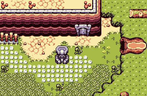
joelmacool12 It's strange. It's a great screenshot, but the farther from the center you get, the less happens, and less I'm able to bring myself to vote for it. Take a look at each corner. What do you see? Nothing? Exactly. I'm not saying that there needs to be a thing happening, but it's just really boring. The right third of the screen is a symmetrical entrance to a forest, which usually isn't all that symmetrical. That cliff in the top-left corner is all flat, and ends on a 90° angle. That's actually pretty boring, from a visual perspective. I think I'm actually overexaggerating my feeling, but if I am, then I do apologize, but I'm still not sure where they're coming from, but it's not necessarily eye candy that I'm looking at, I can't help but feel.
Very interesting turnout this week. There were some really good screens and other not so good screens. I eventually voted for Shane's screen though. Here are my reasons for that and also comments and critiques for each submission:
Shane-
This is an excellent screen once again, Shane. I like how the landscape migrates from land to water. I really like the structure of this screen, and visually, this screen does well. The details are really good. However, a variety of trees would be beneficial for this screen. Also, I feel like this screen could have a better palette to better fit the atmosphere. But otherwise, great job; I voted for this screen!
9.0/10 (Amazing)
Lunaria-
This is an okay screen. Atmospherically, the screen does really, really well. Unfortunately, this is really the only really strong point of the screen in my opinion. Everything else is slightly weaker, but still rather decent. Structurally, the screen doesn't do too well. The fact that the dungeon isn't freeform is acceptable due to the fact that this is using a version of the classic tileset, but other than that, the structure is off. I don't know if you noticed, but the door at the top is inaccessible (unless you have the two-way ladder or flippers) because of the water and statues blocking the way, and because of that, it just appears very strange. Visually, this dungeon screen also does okay. The green colors of the walls don't really match up with the brown colors of the floor in my opinion, and the corners of the water need to use the necessary corner water tiles so that the transition from the water to the land doesn't look so sharp. Also, if you look closely, the colors "below" the statues don't match with with the color of the floor around the statue. You have a little bit to improve here, but this is a decent start.
7.0/10 (Good)
SkyLizardGirl-
This screen is rather chaotic, in my opinion. To a small degree, it appears as if you just stuck a bunch of random tiles together to create a screenshot. Now, don't get me wrong, because I don't actually think you did that (because I still see effort in the screen) but just based on the screen itself, I could see that that's a possible reaction from some people. I do have to admit, though, it does look very colorful visually, but structurally, I would be very confused maneuvering around if that screen were in a quest. For your future screenshots, please try to make things look a bit less hectic if you can (you don't have to though). This is still a decent screen, and if you like this style, that that's completely fine, but I'm not the most fond of it. Still, good job with the screen!
7.2/10 (Good)
joelmacool12-
This is a very good screen, though mostly at the center. It seems that the further away you get from the center of the screen, the less detailing there is. You need to try to keep that detailing throughout the screen if possible. Otherwise, this is a great screen nonetheless. Structurally, the screen looks great and I already explained the visual side of things. Great job with the screen!
7.8/10 (Good)
Great job to all of the submitters! Also, please forgive me if I sounded a bit harsh sometimes, but I really do want to help people do well with their screens.
Location:State Of Love And Trust, The United State Of Amorica.
Posted 01 February 2015 - 08:32 PM
sure, TS. the second one is a hodgepodge of clashing styles and palettes, the third one is a collection of random unblended tiles that makes me feel like I should be careful or I might have a seizure, the fourth one is pretty but doesn't look like anything identifiable at all. I don't think it is wrong to imply that they are terrible when they are terrible. the fourth one has potential, but those other two should be scrapped. I can't imagine that made it any better, but I do believe I should be allowed to express strong dislike for screenshot-of-the-week submissions, with or without detailed critiques.
Shane, looking more at your screen I noticed some new detail tiles, the path "holes" and grass flowers. I assume they're custom, I know they are not in the old version of firebird, but maybe I overlooked them in the new version. Either way they are fantastic, and if I could vote again I would.
Thanks for all your support and critique, truly appreciated!
justin: I have been wanting to make custom Firebird palettes for a while now. So far all I have made is a bunch of colours that make want to never open my eyes again. I'm getting the hang of it recently however, so that's good, I think. Also regarding the flowers and dirt, they came from the bonus folder in the "outdated" section.
I guess I might as well finally give proper reviews rather than just "I voted here because..." and leave out the other shots. Therefore...
Shane: Your FireBird work is magical and this is no exception. I really love the design and it looks like a pretty peaceful place to visit. Voted here.
Lunaria: This shot looks like a typical Z1-style dungeon screen which looks pretty neat. I can't really say anything else though, besides the fact that I really like the strong Z1 vibe to it.
Joelmacool: Really nice shot, but like everyone else said, there seems to be more happening in the centre rather than on the sides and the corners. Good shot anyways.
SkyLizardGirl: I can't say I really like this shot. It honestly looks really confusing and convoluted. I don't dislike it though, and I do appreciate the style you're going for, but it all looks way too packed up and too hard to comprehend. What makes matters worse is that there's quite a bit of style clashing between the Z3 rocks and the Z1 mountains which makes it look really off.

 This topic is locked