Jump to content

Zodiac: Story of the Guardian

Photo

Possible Box Art


  • Please log in to reply
9 replies to this topic

#1 C-Dawg

C-Dawg

    Magus

  • Members

Posted 28 January 2015 - 11:02 AM

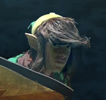
Since the gameplay is done, I've been taking a break from improvements and bug fixes to do some work on other assets. I've roughed out an instruction manual that is basically a parody of the manual from The Guardian Legend, I've contacted some chiptune artists about music, and I'm working on some artwork for the manual. Here's my current sketch of the box art:

Zodiac_Sketch.jpg

What I'm going for here is a bit of a nod to the design of The Guardian Legend's box art, but with an emphasis on the character rather to avoid being as abstract as that was. The character's expression is supposed to convey the feeling she knows you, the player, are going to cause her to explode numerous times -- this game is HARD.


I've gone through quite a few resigns of the game logo, and I think I like this one the best.  It needs a little cleaning up, but I really like the asteroid/comet tail completing the Z and the fact that the rest of the letters are simple shapes.  I can play with that and use those shapes in-game or in other artwork as kind of a code for the Zodiac. The final version will have color and the subtitle on it as well.


Edited by C-Dawg, 28 January 2015 - 11:04 AM.

  • ShadowTiger, Moosh and newstarshipsmell like this

#2 C-Dawg

C-Dawg

    Magus

  • Members

Posted 29 January 2015 - 02:06 PM

Here's the finished version.  I may change the starfield, as I should ask the creator for his permission to use it.


Zodiac_Box_Art_copy.jpg


  • Lightwulf and newstarshipsmell like this

#3 Bourkification

Bourkification

    Magus

  • Members

Posted 29 January 2015 - 10:34 PM

I almost prefer the original hand drawn version, I think its the hand drawn textures on it as apposed to the almost pillow shading on the colour version that make it look better. I think it would look cool if you could overlay the original on the colour version to blend the two.


  • strike and Lightwulf like this

#4 C-Dawg

C-Dawg

    Magus

  • Members

Posted 30 January 2015 - 10:42 AM

Ya think?  I dunno, the original one has some charm to it, but you have to remember that because this is a digital product, the end user is going to see it at varying sizes.  Shrunk down very small, as it might be, the crosshatched sketch loses much of it's detail.  The vector-shaded version looks fine even at very small sizes.  Plus, I'm irrationally happy with how the asteroid came out looking.  Like I said, it's been years since I fired up photoshop to vectorize something of mine, and I kind of like how it turned out.  


Does it look too "soft" to you?


#5 newstarshipsmell

newstarshipsmell

    Musky Pawgazer

  • Members
  • Location:Skure, Dezoris

Posted 30 January 2015 - 12:08 PM

I think the color version looks fine.

#6 TheLegend_njf

TheLegend_njf

    Deified

  • Members
  • Real Name:Grant

Posted 30 January 2015 - 02:05 PM

The coloured version looks great.

#7 strike

strike

    life is fragile, temporary, and precious

  • Members
  • Real Name:Olórin

Posted 30 January 2015 - 02:56 PM

I actually like the one without color. O.o

Whatever though

-Strike

#8 Old-Skool

Old-Skool

    Hero of Time

  • Members
  • Location:Missouri

Posted 30 January 2015 - 03:17 PM

In my opinion, it has too much to do with the actual game. :P  It looks lovely, it really does, but if it were me, considering the subject matter, I'd make something considerably off-model. Just me though. I'm not saying "convey a side-view shmup by having your boxart be an old man with a banjo" levels here, but maybe Megaman-ish.


#9 C-Dawg

C-Dawg

    Magus

  • Members

Posted 30 January 2015 - 03:28 PM


In my opinion, it has too much to do with the actual game. :P  It looks lovely, it really does, but if it were me, considering the subject matter, I'd make something considerably off-model. Just me though. I'm not saying "convey a side-view shmup by having your boxart be an old man with a banjo" levels here, but maybe Megaman-ish.


Like the original Mega Man?  So you want something like this?


Alternate_Art.jpg


#10 Old-Skool

Old-Skool

    Hero of Time

  • Members
  • Location:Missouri

Posted 01 February 2015 - 09:08 AM

ROFL actually the second one was on my mind, more. Or maybe some of the fake boxart they made for 9 and 10. This is totally just me, though. I figure it'd boost the retro feel some (seriously it seems like any time you have hand-drawn box art on an NES cart, there's at least SOMETHING about it that is just completely off! :P )


Edited by King Aquamentus, 01 February 2015 - 09:11 AM.


0 user(s) are reading this topic

0 members, 0 guests, 0 anonymous users