Jump to content

Photo

Screenshot of the Week 457

Xenix Avataro Orithan Zecora EpY SirKazuma Fireblast124

  • This topic is locked This topic is locked
22 replies to this topic

Poll: Screenshot of the Week 457 (56 member(s) have cast votes)

~

You cannot see the results of the poll until you have voted. Please login and cast your vote to see the results of this poll.
Vote

#1 The Satellite

The Satellite

    May the way of the Hero lead to the Triforce.

  • Members
  • Real Name:Michael
  • Pronouns:He / Him

Posted 25 May 2014 - 02:31 PM

Avataro

Avataro.png

I don't think I ever used these mountains this way!


Orithan

Orithan.png

An eternal night falls upon Estoria.


Zecora

Zecora.png

You guys haven't change much at all since 1988 have you?


EpY

EpY.png

Nothing special.. but hey why not


SirKazuma

SirKazuma.png

A kingdom of ice-olation, and it looks like I'm the king...


Fireblast124

Fireblast124.png

Get outta my sight, Octo-meat, or I will have to slaughter you!


Xenix

Xenix.png

And so our true adventure begins.


#2 Dawnlight

Dawnlight

    My name is NOT Jason!

  • Members
  • Real Name:Justin
  • Location:Chicago, IL

Posted 25 May 2014 - 02:46 PM

I voted for Avataro: The Last Airbender this week. I have a feel for Pure.
  • Avaro and Lightwulf like this

#3 Demonlink

Demonlink

    Lurking in the shadows...

  • Members
  • Real Name:Miguel
  • Location:Wouldn't you like to know?

Posted 25 May 2014 - 02:53 PM

Weekly reviews as always:


Avataro: A pretty solid shot, you used Pure Remembrance right? I like the nice layout you gave to these mountains, it seems that you wanted to go for a canyon type of area right? I like it :D The palette also makes this feel canyony :lol:


Aevin: Toy box? Hmmmm, it's pretty unique I have to say! :D The Link I suspect has to do something with your story right? As for the screen itself, I like the rainbow color aspect to it, "but", the only flaw could be the red blocks. I see they have some nice detail to it, but it's barely noticeable. I suggest adding a bit more contrast to the darkest red. Other than that, a good screen I should say :)


Orithan: A pretty good GB style screen. A flaw I noticed are the purple trees. If it's nightfall, they seem a too bright for the palette. I could suggest to darken them a bit, as it's too distracting for the eye. 


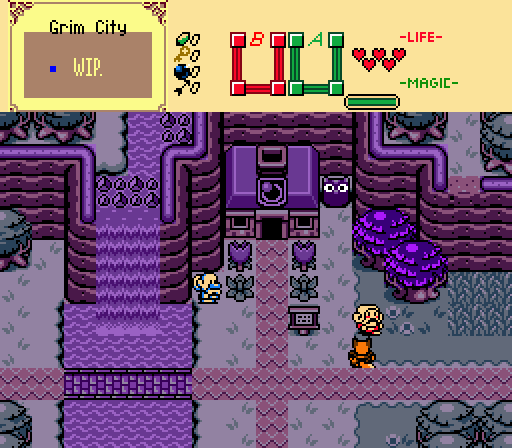
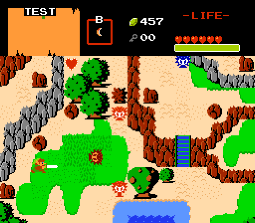
Zecora: I like the Zelda 2 enemies and feel you implemented in it, are you going for a sequel? :lol: (JK). Anyway, I also like how your dungeon structure wants to go further than the "squarish" NES dungeon which I think everybody has seen enough a bit. Also, are those blue enemies Armos?


Epy: Why not? I agree. I think it's a pretty solid screen yet simple. A few details here and there would help a bit. The default palette, well, it may have been a personal choice but... hmmmm, nah forget it. I think you could improve it a bit for adding another tree there in the top left corner. But again, it's simple and a good way to use DoR :) 


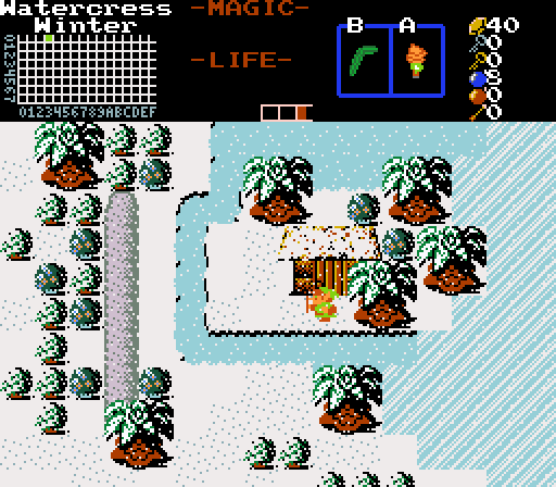
SirKazuma: I loved the way you represent Winter in classic, especially by importing the falling snow and customizing Shiek's classic Palm Trees to fit to the feel. As I said through private the other day, I pretty much like the style you're going for in a few words. You don't see a classic shot every now and then that can actually surprise us! My vote went here. 


Fireblast124: Hmmm, I like the way you want to improve the Classic mountains and I support it, but hmmmm, the only thing you're missing is a bit of details here and there. Other than that, it's a good screen as well. 


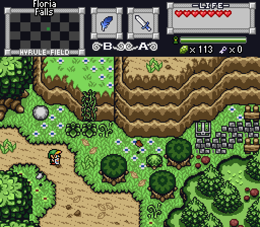
Xenix: A good way to surprise us with GM! :D I see progress is still being done as well. For the actual screen, I can't seem to find any flaw it it. I love the palette, screen structure and layout. Good job! :D 


  • Avaro, Aevin, SirKazuma and 1 other like this

#4 Eddy

Eddy

    ringle

  • Moderators
  • Real Name:Edward
  • Pronouns:He / Him
  • Location:London, United Kingdom

Posted 25 May 2014 - 03:02 PM

Went for Xenix, that's some amazing top quality screen design there!


  • Avaro likes this

#5 SubconsciousEye

SubconsciousEye

  • Members

Posted 25 May 2014 - 03:11 PM

When I saw these screens, I knew my screen is going to be the odd one out.


#6 David

David

    Fallen leaves... adorn my night.

  • Administrators
  • Real Name:David
  • Pronouns:He / Him

Posted 25 May 2014 - 04:02 PM

Oh boy, lots to write about:

  • Avataro- I really like this shot! There is a great atmosphere and the screen design is great. One thing though, at the bottom right corner, where the mountain connects with the other mountain, you can see the small patch of grass between the connecting mountains, while in all other places where the mountains connect, this doesn't happen. (8/10)
  • Aevin- This is a pretty creative screen. However, it does seem a bit bland (even though I'm assuming that it is supposed to be that way). (7/10)
  • Orithan- A pretty good and nicely design screen. The purple trees seem a bit too dark, however, and maybe you can use a bit less purple too? (8/10)
  • Zecora- This is a decent dungeon room, and I like how it doesn't have the normal rectangular rooms that the original LoZ had. (8/10)
  • EpY- This is a pretty decent DoR screen. However, it is pretty bland as you should have more details considering this is the DoR tileset. Also, the place where the mountains end near the top left corner looks weird because it looks like the mountain is being "cut" off or something. (7/10)
  • SirKazuma- That is a really neat winter screen right there. Looks pretty good. One thing I can note is that the transition from the snow to ice looks a bit weird as there is no "separation markings" between them. (8/10)
  • Fireblast124- Nicely structured screen. I love how you changed the mountain tiles like that. It looks good. However, you could have a few more details. (8/10)
  • Xenix- Wow, this is an excellent screen! I love the design and structure of it. The palette is also really nice and it's also nicely detailed! Great job! (9/10)

As you can see, I voted for Xenix this week. Great job to him and everyone else! :)


  • SirKazuma likes this

#7 Aevin

Aevin

  • Members
  • Pronouns:He / Him
  • Location:Oregon

Posted 25 May 2014 - 04:38 PM

Sorry for the confusion, but I've withdrawn my screenshot. It was less of a competitive shot and more of a project in the very early stages and didn't really belong here.


The rest of the shots look great, by the way. I think I'll also have to vote for Xenix, on account of that gorgeous palette and tree arrangement.


#8 Mero

Mero

    Touch Fluffy Tail

  • Banned
  • Real Name:Tamamo No Mae
  • Location:Rainbow Factory

Posted 25 May 2014 - 04:57 PM

Those blue statues in my shot are Ironknuckles.


#9 Demonlink

Demonlink

    Lurking in the shadows...

  • Members
  • Real Name:Miguel
  • Location:Wouldn't you like to know?

Posted 25 May 2014 - 05:04 PM

Those blue statues in my shot are Ironknuckles.

Do they behave similar to Darknuts? Or did you manage to recreate them from Z2?


#10 Haylee

Haylee

    ~ The Ragin' Cajun ~

  • Members
  • Real Name:Haylee
  • Pronouns:She / Her
  • Location:Italian Restaurant in Koorong

Posted 25 May 2014 - 08:25 PM

Sorry for the confusion, but I've withdrawn my screenshot. It was less of a competitive shot and more of a project in the very early stages and didn't really belong here.

I liked it. D:


The beauty of SotW is when you post a non-competetive shot, and it gets a relatively high amount of votes. That's how the vast majority of my SotW entries are. To be honest, it was my third favorite out of this week's shots.


Back on topic, I voted for Xenix. Wonderful screen design.


  • Aevin likes this

#11 Shane

Shane

    💙

  • Moderators
  • Pronouns:He / Him
  • Location:South Australia

Posted 25 May 2014 - 10:59 PM

I voted for Orithan.


#12 EpY

EpY

    Recipient of Ways

  • Members

Posted 26 May 2014 - 01:58 AM

Really liked sirkazuma shot, bringing winter to classic in a really good way :)


  • Avaro, Demonlink and SirKazuma like this

#13 Rastael

Rastael

    Wizard

  • Members
  • Real Name:Raphael
  • Location:Austria

Posted 26 May 2014 - 08:53 AM

Wow, great screenshot that week :D


Orithan got my vote. Very nice GB-pic. ^^


#14 Avaro

Avaro

    o_o

  • Members
  • Real Name:Robin
  • Location:Germany

Posted 26 May 2014 - 10:54 AM

  • Avataro- I really like this shot! There is a great atmosphere and the screen design is great. One thing though, at the bottom right corner, where the mountain connects with the other mountain, you can see the small patch of grass between the connecting mountains, while in all other places where the mountains connect, this doesn't happen.

True. Thanks for mentioning this, I am really bad at noticing stuff like this, but I really wouldn't want to have those errors in a quest. xD


  • David likes this

#15 Dawnlight

Dawnlight

    My name is NOT Jason!

  • Members
  • Real Name:Justin
  • Location:Chicago, IL

Posted 26 May 2014 - 09:52 PM

I'm glad you guys liked our preview of what the newly revamped Golden Memories is gonna look like. Xenix's partnership has been a huge benefit! :)


  • Shane and Demonlink like this


Also tagged with one or more of these keywords: Xenix, Avataro, Orithan, Zecora, EpY, SirKazuma, Fireblast124

0 user(s) are reading this topic

0 members, 0 guests, 0 anonymous users