Is that an ocarina? Finders keepers!
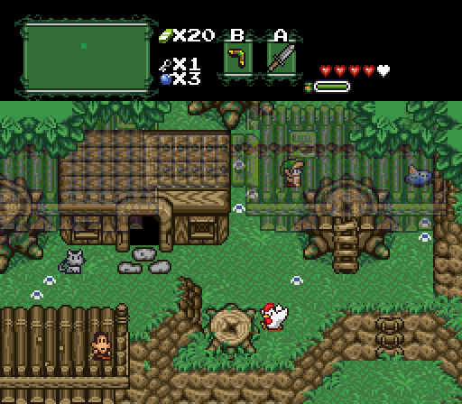
Goriya
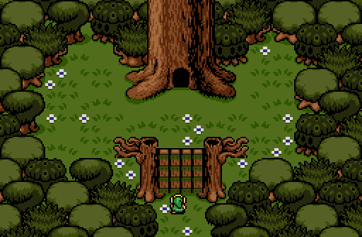
A Link to the Treehouse.
Demonlink
I've decided to go simple this time... enjoy!
My apologies on being late with this weeks SotW.

 This topic is locked
Grand Overlord Empress

Posted 10 September 2013 - 10:09 PM
💙

Posted 10 September 2013 - 10:24 PM
I nulled.
Peteandwally's just confuses me as to what is going on. Also some tile errors with the base of the mountains near the ladder. The perspective with the southern LttP perspective mountains next to the GB perspective mountains on the right just look odd. And to top of it off, the ground is mostly empty and the palette is generic at best.
Goriya's is... okay, but all that variety that should be on the ground is with the trees instead. And the tree choices are rather odd and don't explain what kind of environment is it meant to be (forest, swamp, snow top trees).
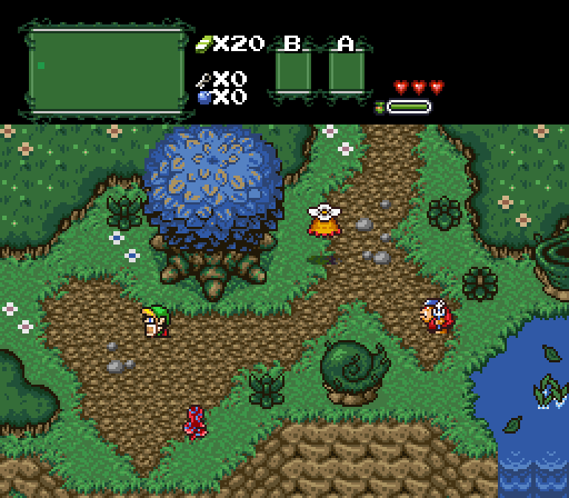
Demonlink's is simple, just like he said. It's nothing too amazing. I would have voted here regardless for neat screen design... but this shot just peeves me. Grass edges looking like they're floating above the water with no shadow to a blue tree with brown highlights. It's a very nice screen with average execution.
I'm not a fan of these shots, sorry. ![]()
The Hoff :)

Posted 11 September 2013 - 12:17 AM
Blue tree(demonlink) got my vote!
Anyway, I kind of agree with Shane here, and I wasn't really sure what to vote on...
Wizard

Posted 11 September 2013 - 02:51 AM
Goriya's is... okay, but all that variety that should be on the ground is with the trees instead.
Where does it say the detail variety has to be on the ground instead of the trees? I cannot find that rule anywhere, help
💙
Posted 11 September 2013 - 03:05 AM
I said it was a rule...? When and where did I say that? Because I reread and I can't where I stated it.
What I said was an opinion/preference to my knowledge. I just thought the ground was bland and that Goriya should have put more thought into the ground instead of the trees (since the variety looks odd to me). Easy now. ![]()
Edited by Shane, 11 September 2013 - 03:10 AM.
Fallen leaves... adorn my night.

Posted 11 September 2013 - 05:24 AM
O.o This is definitely a hard group of screenshots to pick from...
I eventually went with Demonlink's because I just like it's simpleness and truly there is nothing for me to dislike about it. Peteandwally's screenshot is slightly confusing to me; why is a layer transparent? Can you go on it and then it solidifies or something? ![]() (You see, hard to tell what's going on). Goriya's screenshot is very decent as well with nice variety, but I can say there could be a few more details on the grass. But solid screen anyways!
(You see, hard to tell what's going on). Goriya's screenshot is very decent as well with nice variety, but I can say there could be a few more details on the grass. But solid screen anyways! ![]()
So congrats to Demonlink! ![]()
Hero of Time

Posted 11 September 2013 - 07:20 AM
I voted for Goriya because it had no subscreen.
Oh and the rest of the shot was pretty good too.
~ Hope of Energy Nede ~

Posted 11 September 2013 - 07:48 AM
Holy crap, it's a tie so far. o.o
My name is NOT Jason!

Posted 11 September 2013 - 08:54 AM
I voted for peteandwally for creative use of transparent layers.
o_o

Posted 11 September 2013 - 10:12 AM
Goriya's screen is the only one with a good palette and peteandwally's screen is creative but lacks ground detail. In the end I voted for demonlink.
Trofessional Pransposer

Posted 12 September 2013 - 08:25 PM
Grand Overlord Empress
Posted 15 September 2013 - 10:22 PM

0 members, 0 guests, 0 anonymous users