Sheik got my vote. It's not that the others were bad, his just blew the competition out of the water.

Screenshot of the Week 298
Started by
Mitchfork
, Oct 25 2010 11:36 PM
-
 This topic is locked
33 replies to this topic
#16

Moo2wo
-

- Members
-

Yes, you're seeing this.
- Location:The Mushroom Kingdom
Posted 26 October 2010 - 05:36 PM
#17
Geoffrey
-

- Members
-

Chosen One
Posted 26 October 2010 - 10:54 PM
Sheik, I love your screen, but I'd suggest adding in some plain one colour grass tiles, if done right, you could make it look like the grass was worn down where people had walked, and I think it would add a nice finishing touch.
#18
Radien
-

- Members
-

Courage
- Real Name:Steve
- Location:Oregon
Posted 27 October 2010 - 02:46 AM
Avataro: It's not bad, but I have this pet peeve about interior tiles being used as exterior. For comparison, even in Minish Cap's Sky Temple, they had different tiles and palettes for the outdoor parts of the dungeon. And why are there torches in daylight and cobwebs outside? Use caution when using interior tiles outdoors. Also, Sheik is right; the leftmost column of tiles shouldn't be visible on this screen. Map consistency is less important than screen consistency. In other words, it's more important what the player sees on the current screen, than what they see on the map. But you can kill two birds with one stone by just moving those tiles over.....
Lithium: I don't see what's so bad about this screen. It's a pretty standard GB Zelda screen. The only question I have is: why is Mermaid Suit Link on dry land?... Though it is a Zora village, the coast suggests it's on an island...
Sheik: I like this shot. I voted for it. I think the colors come together nicely. I also disagree with some other voters; I think the mountain tiles look good with Minish Cap, especially in this palette.
Also, is that the DoR edit of that house?... I know, even if that is the one that was in DoR, it's still a Minish Cap rip. But I just feel happy with the DoR edit.
Lithium: I don't see what's so bad about this screen. It's a pretty standard GB Zelda screen. The only question I have is: why is Mermaid Suit Link on dry land?... Though it is a Zora village, the coast suggests it's on an island...
Sheik: I like this shot. I voted for it.
Also, is that the DoR edit of that house?... I know, even if that is the one that was in DoR, it's still a Minish Cap rip. But I just feel happy with the DoR edit.
#19
Sheik
-

- Members
-
Deified
Posted 27 October 2010 - 03:17 AM
Thank you Radien. I'm quite proud of that palette myself. Unlike the light palette from the last SotW, I actually like it. As for the house, I don't know either. I ripped that version out of Evile's MZC-tileset. It might be the DoR house but I don't know for sure.
#20
Shane
-

- Moderators
-

💙
- Pronouns:He / Him
- Location:South Australia
Posted 27 October 2010 - 03:57 AM
QUOTE(MoscowModder @ Oct 26 2010, 08:12 AM) 
QUOTE
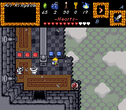
and the big items in the subscreen how do you do that sheik is it scripting?
You can't script anything in the default subscreen. It's actually not that complicated, just tedious. The heart meter is done with the life meter piece subscreen part, not the premade gauge. Everything else unusual seems to be simple tile blocks... except the boomerang?! How did you do that??
I was referring to the boomerang myself. Sheik if it is not a test-screen then place a tree near the lonely top right tree.
#21
Aslion
-

- Members
-
End Fascism
- Real Name:Ryan
- Location:Plug One's spectacles
Posted 27 October 2010 - 06:33 AM
QUOTE(Radien @ Oct 27 2010, 02:46 AM)
Lithium: I don't see what's so bad about this screen. It's a pretty standard GB Zelda screen. The only question I have is: why is Mermaid Suit Yarg on dry land?... Though it is a Zora village, the coast suggests it's on an island...
It's underwater, though it looks a lot more like it while the screen's animated.
The 'coast' is just deeper water. That's how oceans work. They're not all one level of land. They get really deep. And dark.
Which is why there's a coast of sorts, and why the water is black. So I do this for a small bit of realism.
that and because im too lazy to put in constructive ways to block off the next screens
#22
Avaro
-

- Members
-

o_o
- Real Name:Robin
- Location:Germany
Posted 27 October 2010 - 12:17 PM
normal--------------------------------------------------------better
 --
--
Now the whole dungeon is so fresh and windy! I just want to show, that I can do better!
Dont vote on the new screen, as always
Now the whole dungeon is so fresh and windy! I just want to show, that I can do better!
Dont vote on the new screen, as always
Edited by Avataro, 27 October 2010 - 12:30 PM.
#23
MoscowModder
-

- Members
-
Sometimes lurking. Rarely posting.
- Location:Wisconsin
Posted 27 October 2010 - 12:49 PM
^^That's way better. It really gives the impression of being up high and outdoors now. BTW, what is that blue flame counter on the subscreen? Is it a scripted magic counter?
Edited by MoscowModder, 27 October 2010 - 12:49 PM.
#24
Avaro
-
- Members
-
o_o
- Real Name:Robin
- Location:Germany
Posted 27 October 2010 - 12:52 PM
Yes thats right. But I will change the subscreen anyway.
#25
Radien
-
- Members
-
Courage
- Real Name:Steve
- Location:Oregon
Posted 27 October 2010 - 02:22 PM
QUOTE(Sheik @ Oct 27 2010, 01:17 AM)
Thank you Radien. I'm quite proud of that palette myself. Unlike the light palette from the last SotW, I actually like it. As for the house, I don't know either. I ripped that version out of Evile's MZC-tileset. It might be the DoR house but I don't know for sure.
It's probably the one from DoR since the logs are brown. But it doesn't matter much.
Oh, one thing I just noticed: I think the blue door frame looks better when it goes in front of the rooftop. That's how it was designed in MC.
QUOTE(Lithium @ Oct 27 2010, 04:33 AM)
It's underwater, though it looks a lot more like it while the screen's animated.
The 'coast' is just deeper water. That's how oceans work. They're not all one level of land. They get really deep. And dark.
Which is why there's a coast of sorts, and why the water is black. So I do this for a small bit of realism.
that and because im too lazy to put in constructive ways to block off the next screens
Hmm. I understand that having deeper water is realistic, but I wouldn't use surface-level water tiles to denote the change in depth. After all, you don't have ocean surf beneath the surface.
QUOTE(Avataro @ Oct 27 2010, 10:17 AM)
normal--------------------------------------------------------better
--
Now the whole dungeon is so fresh and windy! I just want to show, that I can do better!
Dont vote on the new screen, as always
Now the whole dungeon is so fresh and windy! I just want to show, that I can do better!
Dont vote on the new screen, as always
This is definitely an improvement. Making it misty and dark means that the coloring doesn't look quite so unusual. I'd still lighten the palette in outdoor areas, but it's not such a big deal now.
Did you remove the birds( Keeses)? I understand the shadow looks weird when they fly over open air, but there's nothing you can do about that (besides remove the birds -- or their shadows -- entirely) so I didn't criticize it.
#26
Sheik
-
- Members
-
Deified
Posted 27 October 2010 - 04:20 PM
QUOTE
Sheik if it is not a test-screen then place a tree near the lonely top right tree.
No.QUOTE
Oh, one thing I just noticed: I think the blue door frame looks better when it goes in front of the rooftop. That's how it was designed in MC.
Radien, I will try out overlapping the roof with the door frame. Thanks for the input. And on a sidenote: it's not blue but rather grey on this screenshot. I'm using coloured door frames only for special houses. For example, the shop has a green rupee-symbol and also gets a green door frame. The library has a blue book-symbol and also gets a blue door frame. This makes it visually easier for the player to tell apart which houses are running a 'business' of sorts and which he'd like to visit for sure.QUOTE
normal--------------------------------------------------------better
Avataro, this is much better. I think you should try out blue carpents instead of the brown ones. Or red. I'm guessing this is a blue block /red block dungeon and the design (also the colours) should support this theme. Also, might I suggest trying something like this?:
Do you notice how there's everywhere clouds where the ground would touch the sky? I think this supports the idea of a floating area. You might want to try it out and see how it works.
Edited by Sheik, 27 October 2010 - 04:21 PM.
#27
Aslion
-
- Members
-
End Fascism
- Real Name:Ryan
- Location:Plug One's spectacles
Posted 27 October 2010 - 05:34 PM
QUOTE(Radien @ Oct 27 2010, 02:22 PM)
Hmm. I understand that having deeper water is realistic, but I wouldn't use surface-level water tiles to denote the change in depth. After all, you don't have ocean surf beneath the surface.
yeah well gameboy tileset
#28
Hawkmask20
-

- Members
-

Junior
- Location:Kokiri Forest
Posted 27 October 2010 - 05:37 PM
I chose Sheik I don't know why I just thought it was a good screenshot but the other two were good too.
#29
Avaro
-
- Members
-
o_o
- Real Name:Robin
- Location:Germany
Posted 28 October 2010 - 04:11 PM
It seems like Sheik is winning again.
The "tileset?" he's making is kick-ass!
Radien, I never made or changed a palette. I'm afraid of making a big mistake or something. I believe I'll never get my hands on palettes!
The "tileset?" he's making is kick-ass!
Radien, I never made or changed a palette. I'm afraid of making a big mistake or something. I believe I'll never get my hands on palettes!
#30
Radien
-
- Members
-
Courage
- Real Name:Steve
- Location:Oregon
Posted 28 October 2010 - 05:02 PM
QUOTE(Sheik @ Oct 27 2010, 02:20 PM)
Radien, I will try out overlapping the roof with the door frame. Thanks for the input. And on a sidenote: it's not blue but rather grey on this screenshot. I'm using coloured door frames only for special houses. For example, the shop has a green rupee-symbol and also gets a green door frame. The library has a blue book-symbol and also gets a blue door frame. This makes it visually easier for the player to tell apart which houses are running a 'business' of sorts and which he'd like to visit for sure.
That's a great idea, and you can totally have whatever color of door frame you want.
QUOTE(Lithium @ Oct 27 2010, 03:34 PM)
yeah well gameboy tileset
*shrug* I dunno, be creative?... Single-color tiles that are a darker shade of blue might even be enough. Just an idea.
QUOTE(Avataro @ Oct 28 2010, 02:11 PM)
Radien, I never made or changed a palette. I'm afraid of making a big mistake or something. I believe I'll never get my hands on palettes!
Aha, I see. You are simply using an interior palette outdoors. It has an outdoor CSet, but that's for interior plants and such.
Are you having trouble figuring out how to change the palette for an area? Or how to edit a palette? If so, I'd be happy to help. There is a lot in the tileset for you to choose from; don't be afraid of trying things out.
0 user(s) are reading this topic
0 members, 0 guests, 0 anonymous users

