Welcome to Screen Rebirth 8!
The base screen was:
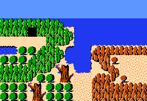
And the recreated shots are:
notmichaeljfox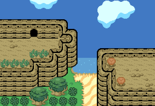
Orithan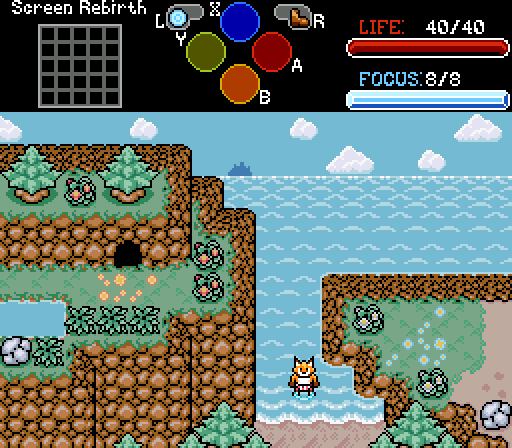
Hal has important matters to attend to, but no adventure is complete without a goofy beach episode.
Twilight Knight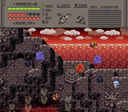
Foggy

Screen Rebirth 8! The Contest!
#1

Posted 25 March 2024 - 07:34 AM
- Twilight Knight, Shane and Matthew like this
#2

Posted 25 March 2024 - 11:59 AM
I'll admit I was thrown off by the "Pure but not quite" aesthetics of notmichaeljfox's entry. It has a nice old school ZC vibe which I'm fond of. I'd say the mountains could be reworked a little; mainly the mountain layer with the cave and the bottom right with the repeating "corner" tile.
The custom graphics in Orithan's entry have come a long way. I love the transition from the ocean backdrop to the shoreline. Coupled with the greenery, this screen strikes a lot of personal notes that I like. I'd keep stabbing away at those boulder graphics; I think they're still the weak link of the graphics and could stand to be more "rounded".
Twilight Knight's volcanic screen is immaculate. The contrast of the dark barren wasteland with the harsh red lava makes for a very unique set piece. My only real issue is the readability of the mountains; the top edges layered on the dirt makes it a bit hard to read.
- Twilight Knight and Taco Chopper like this
#3

Posted 25 March 2024 - 01:16 PM
notmichaeljfox: I like what it's going for, but I do think the tile errors in the mountains detract from it a little bit.
Orithan: I'm digging the custom graphics and the layout of screen. I like how you managed to capture a tiny hill on the right and a large mountain with cliffs going into the water on the left. Bonus points for goofy beach episode
Twilight Knight: I really like how you worked the shot into a totally different environment. The lava ocean looks incredible. Definitely the further departure from the base shot.
- Twilight Knight and Taco Chopper like this
#4

Posted 01 April 2024 - 08:24 AM
My vote also went to Twilight Knight - the lava ocean has already been mentioned, but I think the way the mountains are tiered is really what makes this screen just work. Definitely channeling exactly what Screen Rebirth is all about, but also what I've come to expect from a Twilight Knight shot - intricate and hinting at something majestic.
notmichaeljfox's screen definitely channels the "Pure as filtered through the lens of Yoshi Story", which I think is attributed to the simpler ocean and sky graphics, and the lack of black outlines over the trees and bushes. The tile errors have already been mentioned by Shane and Russ so I won't go down the same path; rather I think the near 1:1 remake of the screen, particularly with that left mountain/cave is what holds it back in a sense.
Orithan's screen is the vibiest, which doesn't necessarily get votes in a poll as much as it gets street cred. The custom spriting is really cool, the palette feels unique - warm, almost. I do ponder if it's a little cramped with the left-most mountain - opening the shoreline up just even a little bit more in that direction would make this great screen into a really great screen.
- Russ likes this
#5

Posted 01 April 2024 - 09:40 PM
Notmichaeljfox - I enjoy the very soft shaded pastel look of the tileset but the screen doesn't feel particularly interesting. It being a near 1-1 port of the screen to the tileset detracts quite a bit from it due to lacking enough focal points to direct the eyes to, as does the mountain tiles that cut off on the top of the left side mountain. Don't be afraid to deviate from the base screen more if it means adding focal points to lay your eyes on and if it means you can avoid the issues of the mountain tiles on the top left cutting off.
Twilight Knight - I don't have much to add that others haven't already said, it's a lovely looking screen. That said the walkable spaces of the screen are hard to parse due to the dark palette and lack of contrast between the rocky dirt and the mountain tiles.
Myself - Good grief he's (half)naked! ![]() . I wanted to evoke the feeling of being on the shoreline in the hottest months of summer, it's good that I managed to nail that feeling. Sadly this screen is all a mockup - I have no place to put a summery beach vacation screen in Soul Hunter. But the outfit might be real...
. I wanted to evoke the feeling of being on the shoreline in the hottest months of summer, it's good that I managed to nail that feeling. Sadly this screen is all a mockup - I have no place to put a summery beach vacation screen in Soul Hunter. But the outfit might be real...
Edited by Orithan, 01 April 2024 - 09:58 PM.
- Twilight Knight, Taco Chopper, Russ and 1 other like this
#6

Posted 03 April 2024 - 08:09 AM
Thanks everyone for the feedback! I'll look into increasing the contrast for the brown tints in that palette. It should help making stuff easier to see.
NotMichaelJFox:
I like this shot, a nostalgic throwback for sure. My nitpick is that I'm not a big fan of the lack of black outlines on the trees and bushes, it clashes with the mountains for example. Otherwise a solid screen rebirth!
Orithan:
The custom graphics are gorgeous! My only possible critique here is that the backsides of the mountain are "too fat" if that makes sense. I feel they should be half a tile tall, instead of a full tile. But I reckon that's quite the adjustment for the entire quest. Great screen rebirth!
#7

Posted 08 April 2024 - 10:35 PM

Forgotten
Congratulations!
Voting Totals:
- Twilight Knight - 13 (72.22%)
- Orithan - 3 (16.67%)
- notmichaeljfox - 2 (11.11%)
Also tagged with one or more of these keywords: notmichaeljfox, Orithan, Twilight Knight
0 user(s) are reading this topic
0 members, 0 guests, 0 anonymous users

 This topic is locked


