Wow that's quite the turnout this week. Pretty good shots overall
ywkls - Pretty neat shot here. Nothing too much to comment on, but the structure is quite nice. I like the different levels of elevation here.
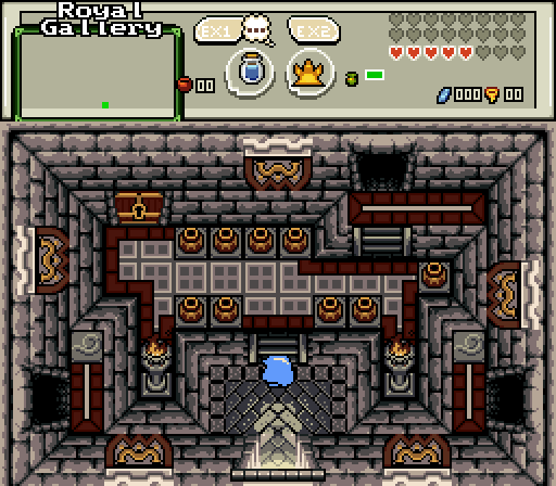
Avataro - Very nice and clean, I definitely like this one a lot. You probably already know about how I don't like trees being vertically stacked like you did on the bottom-right, but that doesn't bother me too much here. Good job with this one, haven't really got any critiques for this.
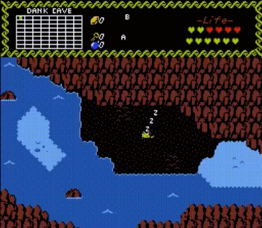
Dimentio - Cool gif, but yeah like you said, quality is a bit bad. The screen looks nice though, and it seems to be leading into some kind of story sequence, so that's neat.
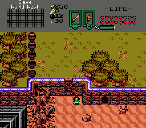
TheRock - Seems neat, though there it does look a bit plain IMO. Probably try to fill up the emptiness of the screen, by maybe adding tall grass in the plains area at the top, and probably add cacti or something in the desert area to the south. You could also try and alternate between grass tiles and ground tiles in the northern part, just to make things look less empty.
Orithan - Nice mines area here, I assume with that description we're gonna get mine carts going at Minish Cap speeds of fast  But anyway, looking forward to seeing how this is going to function in-game.
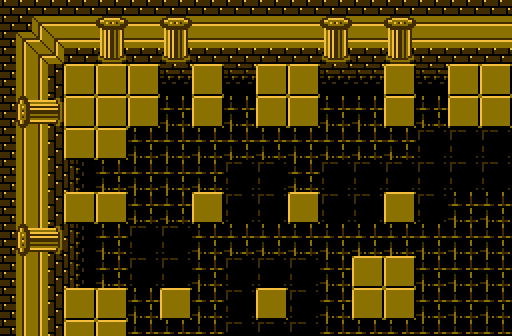
Anthus - I can definitely see what you're going for here, but I think the depth could be worked on a bit more. Maybe try to make the lower darker layer a bit smaller, just so it looks like it's lower down. Other than that, interesting concept here.
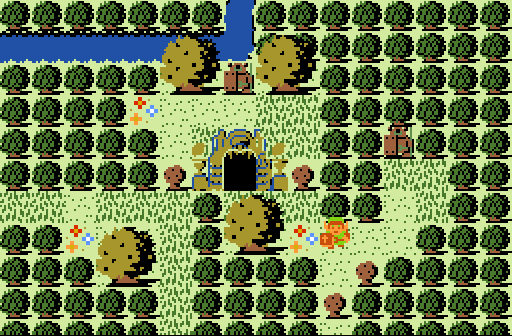
Shoshon - Definitely agree with nicklegends about allowing a bit more space maybe around the dungeon entrance if possible, but it looks good anyway. I would try to fix up the dungeon entrance since it doesn't look right (probably need to fill up the transparent parts). I would also personally use a different kind of tree tile, unless it's intended that this is some kind of forest with cracked trees everywhere lol. Good work anyway though.
I voted for Avataro this week, but good job to all entrants.

 This topic is locked