Cukeman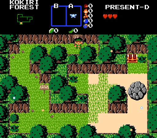
Who says Classic can't look nice?
Shane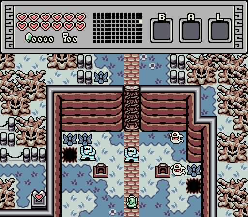
Octorockoncrack
Manji
Ganondorf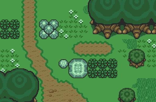
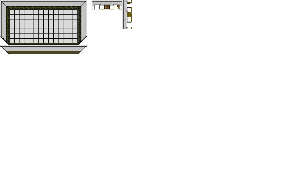
No link here, only the beauty of link to the past in ZC.
Shoshon the Elegant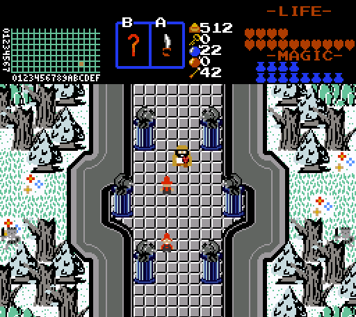
Prometheus explores the rooftops of level 7, The Penguin.
Anthus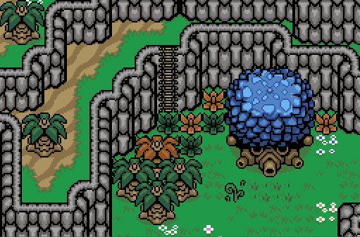
Guess how old this is. Hint: More than 10 years.
Jared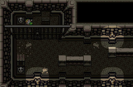
W-where am I?

Screenshot of the Week 658
Started by
Neppy
, Apr 22 2018 10:31 PM
Shane Cukeman Octorockoncrack Ganondorf Shoshon the Elegant Anthus Jared
-
 This topic is locked
12 replies to this topic
#1

Neppy
-

- Members
-

Grand Overlord Empress
- Real Name:It's dangerous to go alone. Take Nep!
- Pronouns:She / Her
- Location:Minnesota
Posted 22 April 2018 - 10:31 PM
- Anthus, Rastael, Matthew and 1 other like this
#2
Cukeman
-

- Banned
-

"Tra la la, look for Sahasrahla. ... ... ..."
- Location:Hyrule/USA
Posted 22 April 2018 - 11:01 PM
Some really nice screens this week!
Shane
I'd like to play this. The blue stripes on the Gibdos is an interesting look for them, they are usually tan and brown on GB as I recall.
Octorockoncrack
BS is nice, I always feel like I don't see it very often.
Ganondorf
I feel like a player might walk into solid objects coming into this screen from almost any side, but apart from potential screen edge bugs it's a nice through-screen.
Shoshon the Elegant
Loving the cool minty look and palette. The walls seem either too thick or under-detailed. Otherwise fantastic.
Anthus
Not sure what I could comment on other than the tileset design. The colors are nice, the mountain borders look a little odd though (but you probably didn't design them). The layout works, but I'd say it's a little on the cramped side, a whole lot of the screen is taken up with rock walls.
Jared
Looks solid.
- Anthus, Shane and Matthew like this
#3
EnnonFenom
-
- Banned
-
Why, must I clean out Old Lady Simmon's Cave?
- Real Name:Eric Dethel
Posted 23 April 2018 - 07:13 AM
Nulled nothing that great.
I could sit here and point out All the flaws in each screen. But no. I just either not a fan of the graphic or over seen the tileset,
Good luck
Edited by EnnonFenom, 23 April 2018 - 07:14 AM.
#4
Sheik
-

- Members
-
Deified
Posted 23 April 2018 - 07:18 AM
Aha! Cukeman is back on OoT2D business! I respect that. Though I really do think the way you use Classic mountains goes too much against the grain of what they are after all. I prefer the classic way of setting them up.
Voted for Shane in the end. I think Ganondorf's is a good example of tile consitency and I think Jared's screen has a nice layout and is most interesting in terms of storytelling.
Edited by Sheik, 23 April 2018 - 07:34 AM.
- Shane likes this
#5
strike
-

- Members
-

life is fragile, temporary, and precious
- Real Name:Olórin
Posted 23 April 2018 - 08:29 AM
Man I'm surprised more people aren't voting for Cukeman. He is the clear winner to me. His lift of the classic set doesn't feel like too much, like most redesigns of classic. And he has a lot of good detail in his screen. And it's a faithful recreation of OoT.
- Cukeman likes this
#6
Deedee
-

- Moderators
-

Bug Frog Dragon Girl
- Real Name:Deedee
- Pronouns:She / Her, They / Them
- Location:Canada
Posted 23 April 2018 - 09:00 AM
none.
voted for Jared.
#7
Architect Abdiel
-

- Members
-

Kingdom Builder
- Real Name:Michael
- Location:Florida
Posted 23 April 2018 - 10:58 AM
all
Spoiler
voted for no one.
- Rambly, Shane and Cukeman like this
#8
Octorockoncrack
-

- Members
-

Crystal Warrior
- Real Name:Tyler
- Location:walking The Path
Posted 23 April 2018 - 01:14 PM
Wow guys, we got a great selection this week!
Cukeman: I liked the layout here. It was just a minute ago that I realized it said Kokiri Forest in the map, and that its a re-creation like everyone else said. Now I like it even more lol. You did a good job transitioning the 3d environment into just 1 screen. The tiles for the boulder look nice, but the grey really stands out against the greens. I understand that it should stand out because its supposed to be a moving object that can hurt Link, but maybe darkening the grey just a bit would help it fit better? On the other hand, the chest and the sign are bit hard for me to see at first, probably because the colors are similar, and the complex pattern in the grass. I really like how they look though. All in all, I really like this screen!
Shane: Good looking GB screen. I get the feeling that this is the entrance to whatever graveyard/spooky area that you have, judging how the gravestones are used in more of a landmark style rather than just another object. I also like that the trees arent as "filled in" as they usually are in the GB style. By that, I mean theres an obvious effort to space them out just a little bit, and they dont take up every single square of the areas that you cant walk in. The subscreen is also a really nice touch, I like the way the hearts look.
Ganondorf: This is a really nice use of the Alttp tiles, because the objects are more spaced out to help it stay true to the Alttp theme. However, the bushes that are on the end of the screen can cause walkability issues, as other people have pointed out. The tall grass tiles seem a little cut off as well. Overall it just needs a couple touch-ups to look solid.
Shoshon: Nice design, good choice of colors. My only real criticism here is that the walls dont provide any sense of height. It makes the screen seem flat. I think itd look a lot better if you had some walls on the bottom of the roof, or something to compare the height of the trees to where the character is standing. Other than that, looks great.
Anthus: Vintage shot? Lol. I really like when people use grey for mountains instead of just the average brown. I think the colors look pretty good as a whole. Though I think the top of the big tree looks a little strange. It looks more like there are stones on the top rather than more leaves, as it looks a little flat. Maybe adding a little more detail to them to look closer to the leaves would work, like using black for the outlines like the other leaves do. Im gonna go ahead and guess that this was older than my PureZC profile, and say 12 years old?
Jared: This, is really well done. Perfect spacing of the torches, nice light effects for them as well. Very ominous feel to it.
I nulled due to entering, but my vote would have gone to Jared this week. Really good stuff guys!
- Rambly, Anthus, Shane and 1 other like this
#9
Eddy
-

- Moderators
-
ringle
- Real Name:Edward
- Pronouns:He / Him
- Location:London, United Kingdom
Posted 23 April 2018 - 02:14 PM
Cukeman - This is a really nice OoT re-creation shot and your use of classic here is very unique and cool. I love the way you used the mountains and the custom tiles are an amazing addition. Really good work here.
Shane - Very solid work here, the graveyard setting is well done and the custom spritework is very nice. I pretty much like everything about this shot.
Octorokoncrack - Nostalgic BS tile usage here, I like very much ![]() This is a pretty neat re-creation of Level 3's entrance from Z1. The palette is also pretty nice.
This is a pretty neat re-creation of Level 3's entrance from Z1. The palette is also pretty nice.
Ganondorf - Really nice work with the ALTTP tiles here, very accurate use of them too! I don't have much to comment on, but I think the tall grass tiles below the line of big trees to the right side looks a bit out of place IMO, since it looks like the tall grass is randomly cutting off into nothing. Same can be said with the bottom-right corner but it's not so bad there. I would also advise not putting grass tiles on the edges of screens like that, since with some quest rules not enabled, you can get yourself stuck in there.
Shoshon - Very interesting shot here, the palette is very suited for the setting, I like the chilling environment here. I'll admit though, I would've never thought those walls on either side of the middle section were walls. I keep seeing them as large pipes, and I just can't see them as walls at all lol. I agree with Octorokoncrack on how to improve that. Other than that, solid work.
Anthus - This gives me a lot of Hero's Memory vibes for some reason, probably is because of the walls and colour used. The screen is pretty nice though, and I'll make a random guess and say 13 years ![]()
Jared - The spooky atmosphere here is done very well IMO. I like the dark setting you got going and I sense a lot of mystery in this screen. Very nice details, and another solid DoR shot from you ![]()
Very tough one for me this week, but I'm going to go for Cukeman. Really nice work this week!
- Anthus, Shane and Jared like this
#10
runa
-

- Members
-

uwu
- Pronouns:They / Them
- Location:comfy
Posted 24 April 2018 - 01:34 AM
Was a really tough one this week, ultimately went with Shane.
- Rambly and Shane like this
#11
Architect Abdiel
-
- Members
-
Kingdom Builder
- Real Name:Michael
- Location:Florida
Posted 24 April 2018 - 11:26 AM
Worked on the walls some as the critique recommended.
Screen changed quite a bit also, since this was also for SS:CR.
Spoiler

- Cukeman likes this
#12
EnnonFenom
-
- Banned
-
Why, must I clean out Old Lady Simmon's Cave?
- Real Name:Eric Dethel
Posted 24 April 2018 - 04:15 PM
Edit: Shoshon, this is just a simple example,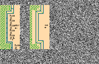 you could go as far as ff style walls, but see how the doors look off just rotating.
Shoshon, What really the "Main" issue. That you are using extremely different perspectives....
look at your Mountain tiles. the are in the perspective of from slightly up but facing them.
the wall's, are as if you are looking straight down from above. That looks odd. But don't feel down many do it.
But if you where to bring back the bottom tiles it would help.
later i will make a simple example qst.
second advice, more shading, and some texture at least a little bit..
Worked on the walls some as the critique recommended.
Screen changed quite a bit also, since this was also for SS:CR.
Spoiler
Edited by EnnonFenom, 24 April 2018 - 07:26 PM.
- Jared likes this
#13
Neppy
-
- Members
-
Grand Overlord Empress
- Real Name:It's dangerous to go alone. Take Nep!
- Pronouns:She / Her
- Location:Minnesota
Posted 29 April 2018 - 08:59 PM
With 36.36% of the vote, the winner of Screenshot of the Week 658 is Shane!
Congrats!!
Voting totals:
- Cukeman - 12 votes [27.27%]
- Shane - 16 votes [36.36%]
- Octorockoncrack - 1 vote [2.27%]
- Ganondorf - 1 vote [2.27%]
- Shoshon the Elegant - 3 votes [6.82%]
- Anthus - 2 votes [4.55%]
- Jared - 9 votes [20.45%]
Also tagged with one or more of these keywords: Shane, Cukeman, Octorockoncrack, Ganondorf, Shoshon the Elegant, Anthus, Jared
 |
Matthew
PureZC Events →
Screenshot of the Week →
Poll Screenshot of the Month 202Started by Taco Chopper , 05 Aug 2024 |
|

|
|
|
|
Shane
PureZC Events →
Screenshot of the Week →
Poll Screenshot of the Week 817Started by Taco Chopper , 04 Jul 2024 |
|
|
|
|
|
Jenny
PureZC Events →
Screenshot of the Week →
Poll Screenshot of the Week 812Started by Taco Chopper , 15 Apr 2024 |
|
|
|
|
|
Matthew
PureZC Events →
Screenshot of the Week →
Poll Screenshot of the Week 811Started by Taco Chopper , 01 Apr 2024 |
|
|
|
|
|
Shane
PureZC Events →
Screenshot of the Week →
Poll Screenshot of the Month 200Started by Taco Chopper , 01 Apr 2024 |
|
|
1 user(s) are reading this topic
0 members, 1 guests, 0 anonymous users

