Jump to content

Photo

I've updated my screenshot from SSOTW


  • Please log in to reply
8 replies to this topic

#1 lord_jamitossi

lord_jamitossi

    Wizard

  • Members
  • Real Name:Jamie
  • Location:In your blind spot

Posted 03 October 2004 - 03:20 PM

I guess the main thing wrong with my pic in SSOTW is the water and lava thing, as well as the bridge looking REALLY bad. I updated both.

user posted image

Tell me what you think!

#2 Shoelace

Shoelace

    The Shaman of Sexy!

  • Members
  • Real Name:Michael
  • Pronouns:He / Him
  • Location:Arizona

Posted 03 October 2004 - 03:47 PM

It looks good, lord jamitossi! I love the smoke that comes out from under it. However, maybe you could make the smoke go over the bridge. But that's just me. Great job. icon_thumbsup.gif

#3 Neppy

Neppy

    Grand Overlord Empress

  • Members
  • Real Name:It's dangerous to go alone. Take Nep!
  • Pronouns:She / Her
  • Location:Minnesota

Posted 03 October 2004 - 11:27 PM

That is a very good improvement. I agree with Shoelace here. Adding some steam/smoke above the bridge would help improve it more.

#4 Radien

Radien

    Courage

  • Members
  • Real Name:Steve
  • Location:Oregon

Posted 04 October 2004 - 03:12 AM

I think he does have steam in that shot. icon_smile.gif You probably can't see it because it's not animated. It also might need a little more work in order to get the shape right.

It looks pretty good, although I'm wondering whether the lava and the water are both pouring into a basin in the center, as they appear to be raised above the hardening magma... Actually, a basin isn't an entirely bad idea, since the water and lava have to go somewhere.

This looks like a good place to post that second shot of my SOTW entry...

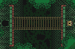
user posted image

I took a snapshot of the screen with no rain, and then increased the brightness a little bit so you could see some stuff which wasn't visible before.

#5 Shoelace

Shoelace

    The Shaman of Sexy!

  • Members
  • Real Name:Michael
  • Pronouns:He / Him
  • Location:Arizona

Posted 04 October 2004 - 04:14 AM

Hey Radien, now I see what you were talking about. icon_smile.gif It looks really good. Hey, maybe, you can make the rain thinner also. That is what I did and in my opinion it looks better. Furthermore, I just have to say, it looks great. icon_thumbsup.gif

#6 LinktheMaster

LinktheMaster

    Hey Listen, Kid

  • Members
  • Real Name:Matt
  • Location:United States

Posted 04 October 2004 - 06:18 AM

lord_jamitossi, this looks MUCH better. icon_thumbsup.gif Great job on this. The side falls for both the lava and water look great, and the mix of the two looks superb. My only problem is that the water hitting the lava would make the lava harden, then it would just build up. icon_shrug.gif But, who ever goes into the big details. icon_heh.gif
Radien: Yep, I noticed the fine detail in it, except for what was at the middle (the forest), but that's pretty much what I'ld figure it would be. icon_shrug.gif But, I don't vote on tilework alone. icon_shrug.gif

#7 SwordOfSeals

SwordOfSeals

    Peace now, food later

  • Members
  • Real Name:Akai, really...
  • Location:Xenia, OH

Posted 04 October 2004 - 07:07 AM

It looks good. Maybe some of that mist goes on the floor too and over both water and lava?

#8 Radien

Radien

    Courage

  • Members
  • Real Name:Steve
  • Location:Oregon

Posted 04 October 2004 - 07:38 AM

Shoelace:

Hey, thanks. icon_smile.gif I wouldn't really worry TOO much about the rain being too thick, because the simple fact that it's in motion makes everything behind it twice as visible as it is in stills. Besides, other than the branches and the bridge, there's only one dungeon tile on this screen that you won't see elsewhere.

LTM:

This... isn't an "appeal." icon_shrug.gif It's merely a shot to show what it will look like in game, for the people who said they couldn't see it in the screenshot.

As for the branch shadows, even without the rain, there was no way you could have seen them with the naked eye until I raised the brightness on the pic. They're just way too dark. I'm going to change their color on that screen at some point.

Edited by Radien, 04 October 2004 - 07:39 AM.


#9 lord_jamitossi

lord_jamitossi

    Wizard

  • Members
  • Real Name:Jamie
  • Location:In your blind spot

Posted 05 October 2004 - 03:55 PM

Thanks for the tips, everyone!
I tried putting the mist over the bridge instead of under it, but the transparencies between the gold and silver tiles makes a milky beige, and it's not very appealing. If I ever feel like it, I might add some colours into one of my unused c-sets (i've still got one blank one) to fix this.
I'm gonna keep it like this for now though.

Note: if my picture isn't showing up, right-click it and try again. If not, come back in a few minutes. I think filespace.org is having some problems or something...


0 user(s) are reading this topic

0 members, 0 guests, 0 anonymous users