legend27
I haven't done a Sotw in a while so here.
Hubydweyer
Joelmacool
Screenshot of the Week: 5.. 6.. 7..
Tree
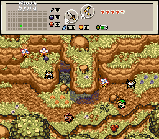
Northern Hylia is much more mountainous~!
Cereal Guy
Flyin' pots~

 This topic is locked
May the way of the Hero lead to the Triforce.

Posted 10 July 2016 - 07:34 PM
legend27
I haven't done a Sotw in a while so here.
Hubydweyer
Joelmacool
Screenshot of the Week: 5.. 6.. 7..
Tree
Northern Hylia is much more mountainous~!
Cereal Guy
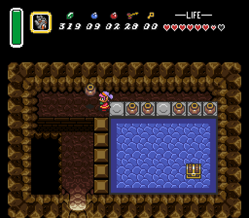
Flyin' pots~
"Tra la la, look for Sahasrahla. ... ... ..."

Posted 10 July 2016 - 08:01 PM
legend27
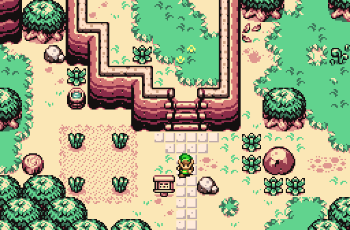
I like the spacious forest vibe going on here a lot. The far right edge of the screen gets a bit straight- just a minor thing to watch out for. My only real complaint is the color temperature conflict. The tree foliage is warm green and warm reddish brown; make the green cooler (more bluish) or make the reddish brown cooler (more chocolate).
You can have warm colors in the light and cool colors in the shadows (common in reality)- or you can have it the other way around (less common in reality but still possible). What you have here is warm colors in both light and shadow.
*end science lesson*
Hubydweyer
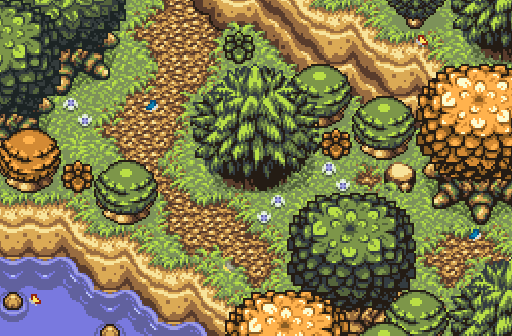
I really like the layout and the way the amount of greenery feels very natural. The ground is very bright though- unless this is a really bright sunny day and/or an unusually arid area, I'd recommend making the ground less bright. Voted here for design.
Joelmacool
Normally I dislike huge trees next to 2x2 trees, but it's actually working here. Makes me wish the screen size was larger though.
Tree
It took me a while to realize what's going on here- I didn't realize it was an overhang at first glance. I like how you're layering the hillside! This is probably the most appealing screen this week.
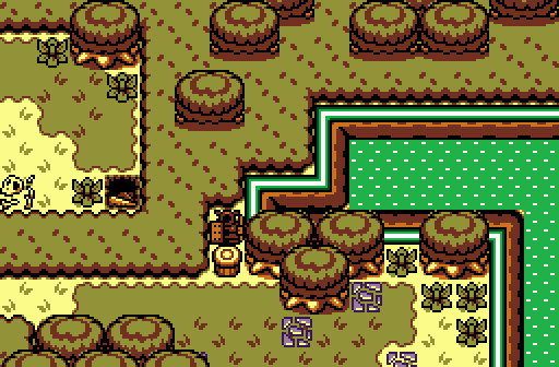
Cereal Guy
Looks nice except for the elevation error. The blocks are on the same level as the entrance floor, but they are also on the same level with the higher walking space and pool of water. The cave walls have a similar error on the left screen edge- the floor elevates, but the wall does not. Also, it seems like Link would need a stairway to get up there.
Edited by Cukeman, 10 July 2016 - 08:02 PM.
Everything must go away

Posted 10 July 2016 - 08:23 PM
I made my screen, edited tiles to make it make more sense, and submitted it all today. I should get extra credit
Nah, good luck, everybody~! Your screens are all beautiful ^ -^
Deified

Posted 10 July 2016 - 08:50 PM
legend27 - Not a legendary screen, but not a bad one either. That armos is onto something.
Hubydweyer - A close second for me. Well done.
Joelmacool - Fantastic variety of trees while remaining in good taste.
Tree - Ironically has the fewest trees of all the outdoor shots. Great work on that overhang. The shadowing below it really pulls it off. My favorite for this week. It really elevates among the competition.
Cereal Guy - It's a room with pots, a chest, a pit, and shallow water. All I can state is facts.
Fallen leaves... adorn my night.

Posted 10 July 2016 - 09:20 PM
Hubydweyer
Joelmacool
Tree
Cereal Guy
Parsnip

Posted 10 July 2016 - 10:25 PM
I should have nulled because i'm in it but i saw so many great screens. My vote went to Joelmacool.
ringle

Posted 11 July 2016 - 04:03 AM
legend27 - Looks like a fairly standard forest shot. I like the look of it though and it seems interesting. I dunno if that water is deep or what, but if it is, I'd suggest to use a different water combo so that it doesn't look like shallow water.
Hubydweyer - Been a while since I last saw a Firebird shot. This looks pretty good and I like the attention to detail here. Nice job.
Joelmacool - I really love this shot. There's a lot of awesome stuff going on here and everything fits together so nicely.
Tree - Another really amazing shot. I don't think I've ever seen an overhang like that before and you pulled it off really well. Good job on that!
Cereal Guy - Looks like a decent cave shot. There isn't anything too interesting though and I can also see elevation errors like Cukeman pointed out, but other than that, it's a decent shot.
It's very hard to choose between Joel and Tree, but I guess just because of that really nice overhang, I gotta go for Tree.
🩶

Posted 11 July 2016 - 02:34 PM
It was between Joelmacool and Tree but I voted Joelmacool in the end since it has less oddities (such oddities probably are only noticeable if you pay close attention). DoR's a messy tileset and I'm really not a fan of it nowadays but both were the most structurally pleasing this week.
Everything must go away
Posted 11 July 2016 - 04:23 PM
DoR's a messy tileset and I'm really not a fan of it nowadays
At least it's not most used tileset of 20xx Bl
OOOOOOOOHHHHHHHHHHHHHHHHHHHHHH
Deified

Posted 12 July 2016 - 06:47 PM
Tree, your image just gave me an idea of something I wanted to test in TRIFORCE. I have tiles in that quest that overhang, but with no really defining detail that makes that clear to people. Moosh made the same mistake in LQftH2:Q being inspired by my design. However, I see here that your "overhang" tiles include a black outline. I wonder how well this effect would work in TRIFORCE if that's possible. It's only worth a try.
With that said though, I nulled this time because I felt they were all pretty good.
Yes I'm that guy who dreamt Dani was Zelda. LOL Cimfam/zelda

Posted 12 July 2016 - 07:02 PM
I voted Cereal Guy. I'll give my reason when I get a chance
End Fascism

Posted 12 July 2016 - 11:19 PM
ok heres the TRUTH
the first guy (forgot name) - I like it it's atmospheric and neat but it feels a little cramped, I feel like you should put more of the walking room on the lower half of the screen at the expense of some of the openness of the area with the staircase. Otherwise I really like it and the gets the patented Aslion Silver Trophy
Zack - mmmmmmmm this shot is delicious, like, the subtle symmetries of the ground detail and the variation I Like It A Lot wow damn and the farm ughhh the farm so so good and it's a nice open playable screen good flippin pancakes buddy
the only thing that gets me is that stump near the edge of the screen so so close but WhOO CarEs When You're Farms This Goodtm
<marquee>VOTE FOR HUBYDWEYER ALSO HES COLORBLIND AND THE GROUND AINT EVEN THAT BRIGHT ANYWAY</marquee>
i didnt realize those were code tags and thought it would just insert html but im leavin it fuck it onto the next one lmao
Joelmandingo - I'm really biased against this ugly tileset all the trees are completely clashing styles and so is everything else (not really yr. fault I know but bleh) and not a fan of the colors here either it's like vomit green and vomit orange
Anyway I like the layout of this screen a lot but I think you wen't a little overboard with the trees and could benefit a lot from removing the big green alttp edit one at the bottom and the pine tree in the middle and then padding out the space with more smaller details I think that would look a lot better and less tight it does not look fun to navigate past those trees as they are right now and it really makes them be the focal point of the entire screen when they shouldn't be
SPEAKING OF TREES - that mountain is MAd weird. Mad Weird Mountain the shadows on the overhang make it look more like the mountain is still solid there but just made of like a transparent sapphire or something also on the left side of the mountain the transition looks really wonky but other than that it's a pretty nice screen overall and I'd put this in The Big Third Place
ceral guy - it's lttp wow cool
"Tra la la, look for Sahasrahla. ... ... ..."
Posted 12 July 2016 - 11:41 PM
Don't drink and post, kids.
End Fascism
Posted 13 July 2016 - 12:39 AM
I ain't drunk and also that's terrible advice
Tell all with glee, Argon's on PureZC

Posted 13 July 2016 - 07:42 AM
Joelmandingo -
I lost it here ![]()
I voted for Tree, but it was very close to Huskydweyer! Joel came in third, but like Aslion meant to say the screen feels a bit cramped, I think mainly because of the many tree overheads. Legend and Cereal Guy were pretty decent, but the screens lack some creativity or eye catcher.
0 members, 1 guests, 0 anonymous users