Architect Abdiel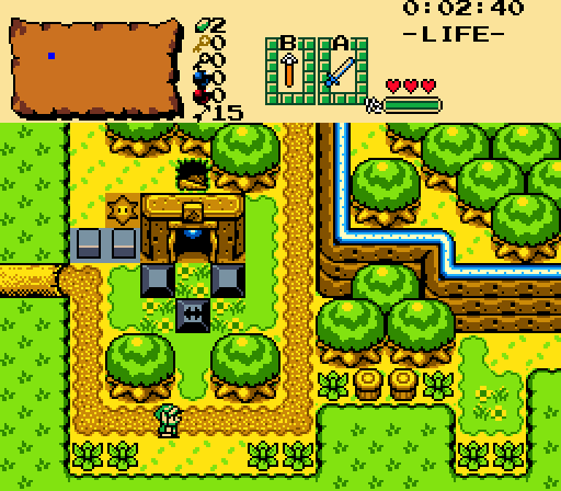
Link passes by an optional mini dungeon.
Again, do not mind the blocks and the floor switch. That is something that can use some sprucing up.
Joelmacool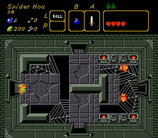
Spider Hou
se
Phosphor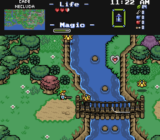
The bridge into town just had to be guarded by the most annoying enemies in the game.
xanadude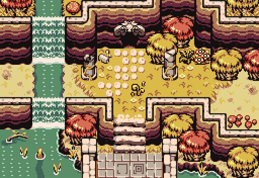

Screenshot of the Week 782
Started by
Taco Chopper
, Jun 18 2023 11:01 PM
Joelmacool Architect Abdiel Phosphor xanadude
-
 This topic is locked
8 replies to this topic
#1

Taco Chopper
-

- Administrators
-

protector of the darn forum
- Pronouns:He / Him
- Location:South Australia
Posted 18 June 2023 - 11:01 PM
- Twilight Knight, Joelmacool and Matthew like this
#2
Shane
-

- Moderators
-

💙
- Pronouns:He / Him
- Location:South Australia
Posted 19 June 2023 - 06:50 AM
Great screens this week, but I have to go with Joelmacool. I enjoy how those webs are used.
- Taco Chopper, Joelmacool and xanadude like this
#3
Architect Abdiel
-

- Members
-

Kingdom Builder
- Real Name:Michael
- Location:Florida
Posted 19 June 2023 - 08:24 AM
By the way, if anyone has suggestions on what to do with the out of place dungeon stuff, let me know on mine. The hammer pegs I think blend in fine. I can also move the push blocks inside the mini dungeon. But, the step switch and barrier blocks are a bit more complicated.
#4
Taco Chopper
-
- Administrators
-
protector of the darn forum
- Pronouns:He / Him
- Location:South Australia
Posted 19 June 2023 - 08:27 AM
Yeah, when Joel's screen was submitted, I was of two minds. The caption made me chuckle, and the design of the room was really clever, particularly with the Classic-Cambria hybrid aesthetics (correct me if I'm wrong I may have no idea what I'm talking about). I can't see anything that screams for improvement either, it's a really strong screen. It knows what it wants, it tells you, and importantly:
Spider hou
se
It was a tough choice between voting for this screen and xanadude's.
Architect Abdiel's screen is a decent GB screenshot. I feel like there's foundations there to make this into a really strong screen. Ground detail, a less blocky forest border, and changing the dungeon entrance colour to be a grey instead of a brown are just a few things I'd look to edit if this was my screen. The GB palette - Labrynna present - is a pretty difficult one to work with in my opinion, and I think the oversaturated colours - specifically the yellows and browns - tend to detract from any screens that use them, rather than help them. That's definitely not a criticism of the screenshot though as much as it is one with that specific palette, though.
By the way, if anyone has suggestions on what to do with the out of place dungeon stuff, let me know on mine. The hammer pegs I think blend in fine. I can also move the push blocks inside the mini dungeon. But, the step switch and barrier blocks are a bit more complicated.
Yeah, I think the dungeon stuff could just be changed up to be appropriate overworld counterparts. For instance the blocks should definitely go inside the dungeon, it'll just allow the screen to breath a bit more. The hammer pegs just need to have a plain ground tile underneath them so the grass patterns aren't clashing with the pegs so much.
The step switch itself is probably just as much a thing of swapping it for a GB switch instead of the LTTP ones. My suggestion for the barrier blocks would be to do something like this:

The grey walls on the top of the screen act the exact same as those barrier blocks. I think the main thing to consider is how certain objects suit an overworld/interior screen, and how they clash with the screen design as well. It's a tricky thing to balance with gameplay design as well.
My guess is that Phosphor's screen is a showcase of the Pure tileset update that they've been posting in the Discord! It looks nice, and it's good to see the Pure tileset get some new love and attention after 20 years. I do feel like the tree placement could've been better - specifically, maybe shifting the two trees on the centre-left side of the screen down a bit to balance the screen more. There's a great open space beneath those trees; moving things around slightly to work with that space would help improve the screen design overall.
Ended up voting for xanadude though, because I've got a thing for Firebird at the moment apparently. It's a pretty screen, it has ruins and a waterfall, it's Firebird, it ticks all my boxes.
In saying that, I think the cliff at the base of the waterfalls could benefit from having some kind of water transition - even just a touch of blue on the tiles - to make it look smoother. That, or even using the water/ground borders to help with that transition.
- Joelmacool, xanadude and Matthew like this

#6
FieryBirdyThing
-

- Members
-

Junior
- Location:UK
Posted 21 June 2023 - 11:05 AM
I, too, found it difficult to choose between Joelmacool and xanadude, this week. But choose, I did, and so I voted for Joel's spoopy spider house.
Sorry, I mean spider hou
se.
- Taco Chopper and Joelmacool like this
#7
THEMDODO
-

- Members
-

~Gloomy Pictures, Yellow Eyes~
Posted 22 June 2023 - 03:32 AM
Love xanadude's screen. love seeing a good use of firebird. Joelmacool's screen is also very cool, but im not a huge fan of square rooms. cool webs though.
- Taco Chopper likes this
#8
notmichaeljfox
-

- Members
-
Initiate
- Real Name:Michael
Posted 25 June 2023 - 04:13 AM
It's too tough a choice between Joelmacool and xanadude. I need two votes.
- Joelmacool likes this
#9
Taco Chopper
-
- Administrators
-
protector of the darn forum
- Pronouns:He / Him
- Location:South Australia
Posted 27 June 2023 - 12:35 AM
With 48.15% of the vote, the winner of Screenshot of the Week 782 is Joelmacool!
Spider Hou
se
Congratulations!
Voting totals:
Spider Hou
se
Congratulations!
Voting totals:
- Joelmacool - 13 (48.15%)
- xanadude - 10 (37.04%)
- Phosphor - 4 (14.81%)
- Architect Abdiel - 0 (0%)
Also tagged with one or more of these keywords: Joelmacool, Architect Abdiel, Phosphor, xanadude
PureZC Events →
Map of the Month →
Poll Map of the Month 150Started by Shane , 02 Mar 2024 |
|

|
||
 |
Twilight Knight
PureZC Events →
Screen Rebirth →
Poll Screen Rebirth 7! The Contest!Started by Taco Chopper , 26 Feb 2024 |
|
|
|
|
|
Phosphor
PureZC Events →
Map of the Month →
Poll Map of the Month 149Started by Shane , 02 Feb 2024 |
|

|
|
|
|
Anthus
PureZC Events →
Screenshot of the Week →
Poll Screenshot of the Year 2023 - Blue BracketStarted by Taco Chopper , 22 Jan 2024 |
|
|
|
|
|
Joelmacool
PureZC Events →
Screenshot of the Week →
Poll Screenshot of the Month 199Started by Taco Chopper , 07 Jan 2024 |
|
|
2 user(s) are reading this topic
0 members, 2 guests, 0 anonymous users

