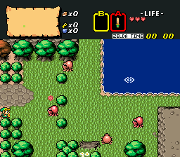
Thanks. The artistic inspiration I took back then was that I wanted to make a "Zero Mission" of The Legend of Zelda. Something that wouldn't look out of place or hard to see on the GBA. Some of the darker greens might have caused problems before they had backlit screens.
I think your screenshot is very successful at fulfilling your stated goal. As far as judging the shot based on the period of time it was submitted, I'm not sure what the exact vintage on these shots are, I played a lot of ZC quests from 04-07 and posted on the forums here sporadically under a forgotten account, but thinking back to the quests I was playing back then, most of them were either pure, classic, or BS (I sort of wish people still worked in the BS format, even if it is janky), and stylistically your tilework reminds me of a sort of GBC/BS Hybrid. (maybe Just getting the BS part from your Link sprite.
So from that, I can try to assess this working within the context of that time period, and taking the prevalent style trends into account:
I don't recognize those trees from anything: not a single other quest, nor do I know what game they are from. If this is your original work, then you did an excellent job; if it is not your work, then you still did a tasteful job picking your assets. All of the foliage tile work has a consistent style to it, and definitely fits into the GBA aesthetic. I'm trying to think back to quests that I had played in this time period that had a uniform style with entirely custom tiles, and I'm drawing a blank--- either it was chopped and screwed assets from the quest-maker's rom collection added to ZQuest based entirely on whim, without any regard to a uniform style; or it was poorly done custom job; or it was stock from whatever tileset they were running.
As far as screen composition is concerned, I like the simplicity of it all. There is some light symmetry in the screen layout, but that seemed to be a common trend at the time, and as you said this was a LoZ "Zero Mission" it fits in with the style, so I can't really complain. The ground detailing is simple, and it works with the mono-colored ground; my eyes are drawn to the way the tall grass pops out---it has a ton of depth for such a simple design--- I honestly would have this in a more central location of the screen if I were to make this screen today. Looking at this shot also reminded me that layered transparent water where you can see the surface underneath it is a.) a thing you can do; b.) a thing you should do; and c.) always really cool --- seriously my next zquest session project is going to be trying to make this style of water work in a classic-style quest.
I am ambivalent about the Link's sprite-work. The darker green GBA-style palette contrasts very well with him: he's really easy to see in that color space which is an excellent thing; but there's just something off about the actual way he is drawn... I know that is vague and unhelpful: I'm trying to put it into words, but I'm drawing a blank. I guess I would just be shooting for something a little closer to GBC than BS, to match the style of the rest of your tile work.
Hope that was helpful!
Edited by TheManHimself, 06 May 2021 - 01:49 PM.