Shoshon the Elegant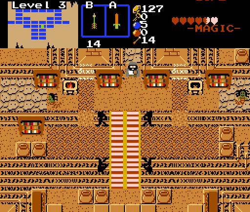
Prometheus explores The Ankh, aka The Den of the Gorgons.
Castelia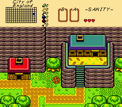
England is my city.
Russ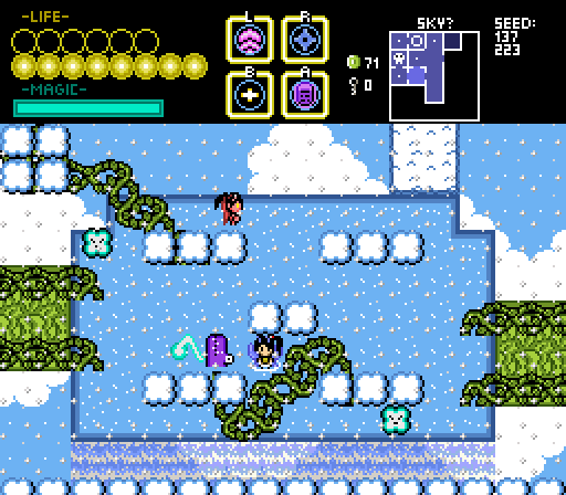
Lumen's brief moment of contemplation is abruptly ended by a nosy crocodile.
Dimentio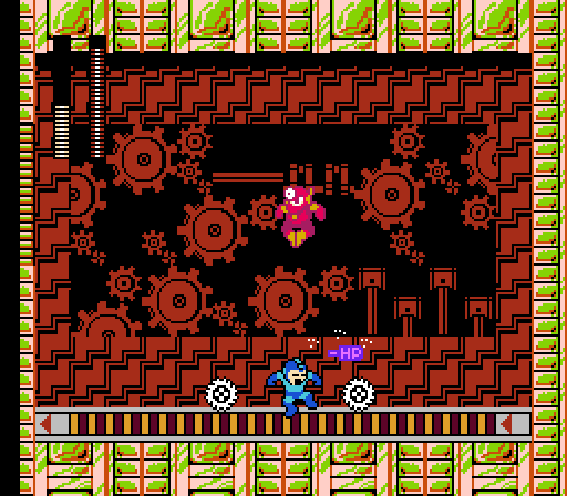
Getting mega hurt by meta man, winning contests and being meta, cause this statement is false, you betcha!

Screenshot of the Week 648
Started by
Neppy
, Feb 04 2018 11:19 PM
Russ Shoshon the Elegant Castelia Dimentio
-
 This topic is locked
16 replies to this topic
#1

Neppy
-

- Members
-

Grand Overlord Empress
- Real Name:It's dangerous to go alone. Take Nep!
- Location:Minnesota
Posted 04 February 2018 - 11:19 PM
#2
Architect Abdiel
-

- Members
-

Kingdom Builder
- Real Name:Michael
- Location:Florida
Posted 04 February 2018 - 11:35 PM
Shoshon:
I like the aesthetic this dungeon wound up having.
Castelia:
Pretty normal shot, but still nice composition.
Russ:
Gave my thoughts in S:CR.
Dimentio:
Love it. It looks great and my vote is going here.
I like the aesthetic this dungeon wound up having.
Castelia:
Pretty normal shot, but still nice composition.
Russ:
Gave my thoughts in S:CR.
Dimentio:
Love it. It looks great and my vote is going here.
#3
Evan20000
-

- Members
-

P͏҉ę͟w͜� ̢͝!
- Real Name:B̵̴̡̕a҉̵̷ņ̢͘͢͜n̷̷ę́͢d̢̨͟͞
- Location:B̕҉̶͘͝a̶̵҉͝ǹ̵̛͘n̵e̸͜͜͢d҉̶
Posted 04 February 2018 - 11:46 PM
tfw Lumen is becoming 2.5's bicycle; she's showing up in every quest now! (Voted Russ)
Shoshon: The black cracks don't look good with the lack of black outlines on every other sprite on the screen. Aside from that, it's not a bad screen, but those cracks are an eyesore.
Castella: I hate the term "generic shot" because it really doesn't help the creator improve, but I'm struggling to find other words to describe this one. It's not doing anything particularly ambitious aside from the item(?) in the middle of the grass. One thing I would recommend is to not tower up a single pillar of mountains like that; GB mountains don't look very good when stacked straight up to a lot of people. Make like a cake-layer effect by stacking 3-tall pillars on top of each other for a little more visual variety to accomplish the same result.
Russ: Fak u venserlan
Dimentio: Wrong contest bruh.
#4
Shane
-

- Moderators
-

💙
- Pronouns:He / Him
- Location:South Australia
Posted 05 February 2018 - 12:07 AM
I voted Castelia because Nick Cromptom's legacy has finally reached Zelda Classic. 
#5
Jenny
-

- Members
-

Hero of Time
- Real Name:Jennette
- Pronouns:She / Her
Posted 05 February 2018 - 12:20 AM
Voted for Castelia, easily my favorite this week.
Shoshon's is interesting as well, although I'm having a bit of trouble figuring out what's supposed to be going on.
#6
Castelia
-

- Members
-

Fred Durst stan
- Location:down under
Posted 05 February 2018 - 12:41 AM
Haven't reviewed screenshots in a little while, so let's do that.
Shoshon: Kinda cluttered with all the text on the walls, but I still really like it. It fits the Classic style well.
Castelia: Maybe a bit generic in terms of content, but I dunno. By the way, the thing on the floor there is the player. This screen's from a (mostly) joke quest I'm making (as you might be able to tell from the name).
Russ: I'm a little confused as to what's happening here. Is this a pond in midair? Either way, the graphics do look nice, and the screen is well-made.
Dimentio: You can't just take a screenshot from another game and claim to have scripted it in ZC If this actually plays like Mega Man, it's pretty good. If it's just a scene made using tiles, then I'm not too sure what to say about it. Well-made either way.
If I had to vote, I'd have voted either Shoshon or Russ.
Edited by Castelia, 05 February 2018 - 12:46 AM.
#7
Architect Abdiel
-
- Members
-
Kingdom Builder
- Real Name:Michael
- Location:Florida
Posted 05 February 2018 - 12:51 AM
The black cracks are supposed to be people kneeling. I think the text messes that up. I'll probably either remove them or test the look without them being layered over the text.
And yeah. It is a little cluttered. My shots tends to be a little cluttered. I try to make up for clutter with enemy placement. And with the wall designs I just prefer covering the walls entirely over trying to place them randomly or in any sort of pattern.
And yeah. It is a little cluttered. My shots tends to be a little cluttered. I try to make up for clutter with enemy placement. And with the wall designs I just prefer covering the walls entirely over trying to place them randomly or in any sort of pattern.
- Jenny and Castelia like this
#8
Deedee
-

- Moderators
-
Bug Frog Dragon Girl
- Real Name:Deedee
- Pronouns:She / Her, They / Them
- Location:Canada
Posted 05 February 2018 - 01:28 AM
Dimentio:
You can't just take a screenshot from another game and claim to have scripted it in ZCIf this actually plays like Mega Man, it's pretty good. If it's just a scene made using tiles, then I'm not too sure what to say about it. Well-made either way.
Actual gameplay shot™.
#9
Eddy
-

- Moderators
-
ringle
- Real Name:Edward
- Pronouns:He / Him
- Location:London, United Kingdom
Posted 05 February 2018 - 04:21 AM
Shoshon - Pretty interesting shot. I admit, it was a bit hard to see what was going on at first with the insane amount of detail everywhere, but now I understand it fairly well. I agree with Evan on the cracks complaint but other than that, nice job.
Castelia - As somebody who lives in England I can confirm this is exactly my current location. Don't mind the random Bombos on the floor there, it was a design choice to make my house look great. By the way, pretty nice screen you have here. It's a bit weird to see the mountains use CSet 3 instead of 4, but that's a personal preference and isn't a problem. Now you just need a cheap Big Ben knockoff and you're good to go.
Russ - I assume this is part of the expansion for Yuurei Randomiser? I don't have any complaints for this one, it generally looks like a really good shot. I also like the sky theme you got going here too.
Dimentio - megamang is yes. I'd love to see this in action. I know Saffith recreated Crash Man's stage at one point, so it would be interesting to see how Metal Man's stage could be recreated ![]()
I voted for Dimentio this week.
#10
Moosh
-

- ZC Developers
-

Tiny Little Questmaker
Posted 05 February 2018 - 07:18 AM
Shoshon:
This screen seems a bit too noisy to tell what's going on. I think it would be improved by making the hieroglyphs on the walls a lighter shade than the black you're currently using...
Castelia:
Who the heck is Castelia?
>Checks name history.
>Bombos medallion on the screen.
Clever girl.
Anyways, it's a nice gameboy screen. Not so fond of the memes.
Russ:
This is not fair. Please, cease your winning at once.
Dimentio:
I always upvote Megaman. Unless Russ enters with freaking floating freaking sky garden. Excited to see how this plays.
#11
Deedee
-
- Moderators
-
Bug Frog Dragon Girl
- Real Name:Deedee
- Pronouns:She / Her, They / Them
- Location:Canada
Posted 05 February 2018 - 08:33 AM
Sreenshot of the Week.
Also the palette on Bombos's bugs me, but otherwise all good screens except mine because why the hell owuld you make mega man in Zelda classic especially without giving credit to Saffith.

#13
Cukeman
-

- Banned
-

"Tra la la, look for Sahasrahla. ... ... ..."
- Location:Hyrule/USA
Posted 06 February 2018 - 06:47 PM
Had to vote Shoshon for creativity, even though it's busy. As others said, try making the lettering black a dark brown instead, should make the whole thing easier to see.
- Architect Abdiel likes this
#14
Architect Abdiel
-
- Members
-
Kingdom Builder
- Real Name:Michael
- Location:Florida
Posted 06 February 2018 - 07:24 PM
Had to vote Shoshon for creativity, even though it's busy. As others said, try making the lettering black a dark brown instead, should make the whole thing easier to see.
I actually made a new version of the shot addressing that in the post above yours.
Thanks for the critique.
- nicklegends likes this
#15
Cukeman
-
- Banned
-
"Tra la la, look for Sahasrahla. ... ... ..."
- Location:Hyrule/USA
Posted 06 February 2018 - 09:38 PM
Ah, that does look better, nice
Also tagged with one or more of these keywords: Russ, Shoshon the Elegant, Castelia, Dimentio


0 user(s) are reading this topic
0 members, 0 guests, 0 anonymous users

