I spent some time yesterday making a hill that stands out and looks Link is actually climbing it. I added some texture so it didn't just look like a flat rocky area. Do you think they look good?


Recipient of Ways

Posted 23 May 2020 - 12:18 PM
I spent some time yesterday making a hill that stands out and looks Link is actually climbing it. I added some texture so it didn't just look like a flat rocky area. Do you think they look good?
Caelan, the Encouraging

Posted 23 May 2020 - 01:51 PM
I think they look as good as they can possibly be. Any change in elevation in the classic set involves perspective trickery, as the mountains are rather flat. So long as you design your screens cleverly, these tiles should convey a sense of elevation gain.
Scripter / Dev

Posted 23 May 2020 - 01:54 PM
Aye, the classic set is not designed to have such a look, so it's very difficult; having said that, it still does give the feel of what you're going for, despite being something hard to convey in that tileset, so I'd call that a great success.
Recipient of Ways
Posted 23 May 2020 - 03:27 PM
Wow. Thanks for the feedback! I do also have them as Slow Walk combos. If only I had a way to make Link walk faster as he walks down....
Scripter / Dev
Posted 23 May 2020 - 03:48 PM
What version are you using? If 2.55, scripts to affect step speed are not THAT hard to write.
Tiny Little Questmaker

Posted 23 May 2020 - 08:08 PM
I'd suggest making the diagonals on those mountains a little less straight, add a bit of variation in the slope to make it look like a more natural rock formation. This could also fix the misalign between screens 2 and 3 in your example. And yeah, like Russ said, depicting elevation in Classic will always be a bit wonky. These screens look nice, though. Loving the train tracks.
ZC enthusiast

Posted 26 May 2020 - 07:37 AM
IMO this is sufficient to convey what you want to convey, but the classic tileset will always be rather "flat" looking, unless you use NewJourneysFire's shading technique (see his screenshots for his TRIFORCE project). This is not easily done, so probably not an option unless you're willing to give the whole quest a lengthy graphics overhaul. Maybe add a buffer screen, if possible, between the upward slope and the downward slope, so you don't have to deal with combining both visual effects in the same screen.
Recipient of Ways
Posted 27 May 2020 - 02:20 PM
I'd suggest making the diagonals on those mountains a little less straight, add a bit of variation in the slope to make it look like a more natural rock formation. This could also fix the misalign between screens 2 and 3 in your example. And yeah, like Russ said, depicting elevation in Classic will always be a bit wonky. These screens look nice, though. Loving the train tracks.
Thanks. I feel much better about it now. 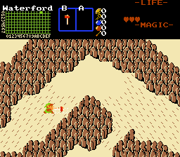
0 members, 1 guests, 0 anonymous users

