Nice, six shots, and Jared's
seventieth time entering the contest. Wow!
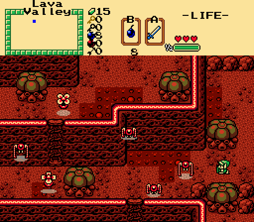
EddyTheOliveiraA pretty convincing lava land shot. Nothing stands out as particularly good or bad.
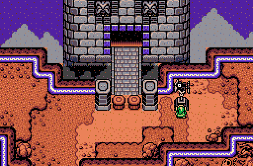
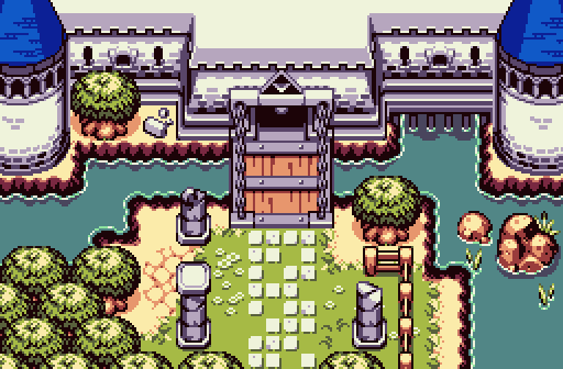
MudkipzI hate to bring up the P word here--perspective--but I did find it a little confusing at first glance. The tower has a different perspective than its posts, which is different than the cliffs, which is different than the background... I know what the shot is trying to accomplish and yet it feels a bit awkward.
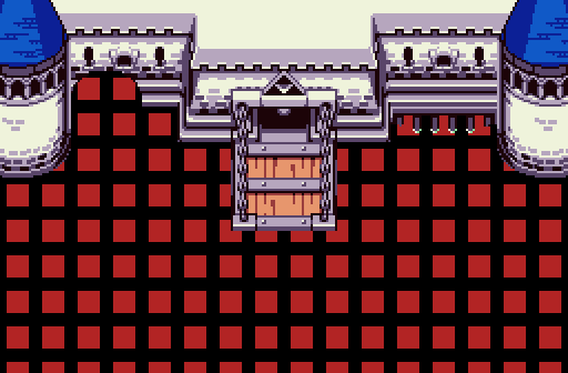
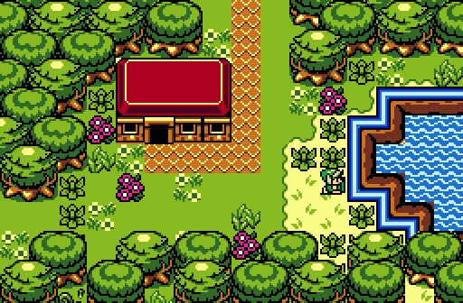
MigokalleIt's a nice castle indeed, but I'm not gonna vote for it without some ground tiles.
JaredThe shot feels a little overprocessed, too shiny, like it's plastic or something. With that said, the solid design and vibrant palette are big pluses.
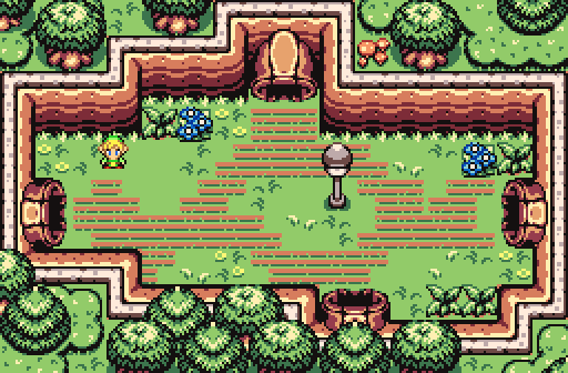
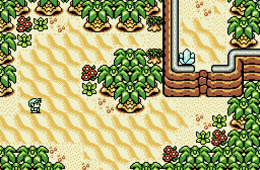
ShaneA solid desert shot with a nice open design. The ice crystal bugs me a bit seeing as this shot's in the desert, but I'll let it slide. (EDIT: OK, I get it; it's a timeshift stone.

)
DemonlinkA pretty GB-style shot, for sure. Some of the details seem like they were sprinkled on for the sake of detail only, like the sets of identical flower plants and flower... flowers.

There are a number of good shots this week, but I'll vote for Shane. I really like the composition of his shot.

 This topic is locked