Jump to content

Link's Hangover

Photo

Eye-burning Colors -- Need to know.


  • Please log in to reply
11 replies to this topic

#1 Anthus

Anthus

    Lord of Liquids

  • Members
  • Location:Ohio

Posted 24 May 2013 - 08:35 PM

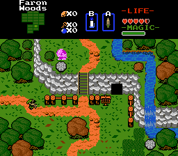
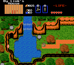
Okay, so as it stands, the palette for the OW is about 90% faithful to the original pirated ROM, and they are bright. Even for my taste. It is hard to even edit path, and mountain tiles :P But I seriously want honest opinions on if the palette is too faithful. It's bright, especially for people with newer, brighter screens. I think it is too much but I am having trouble coming up with an alternative.

On a side note, I'm pretty content with the greens, it's mostly the yellow/ orangy path mountain colors I am having trouble with. However, if you feel that the greens are too bright, let me know.


EDIT: On another side note, I am getting closer to putting together a demo which will show the first dungeon, and the beginning areas. Maybe about 30-45 minutes of gameplay depending on your playing style, and speed :) I could have it ready to go in a few hours of work, and I hope to release the demo within the next week.

#2 kurt91

kurt91

    Follower of Destiny

  • Members
  • Real Name:Kurtis
  • Location:Eastern Washington University

Posted 25 May 2013 - 03:09 AM

Some things work better in motion. Why not release the demo, and then see what people think? Also, you're saying that you want it to be faithful to the original pirated ROM, but it's still too bright. Could you give us some comparison shots? Let us see a screenshot of the original ROM, a screenshot of your quest as-is, and a screenshot of the same screen but with the palette modified to what you're thinking of doing with it. That might help decide.

#3 Anthus

Anthus

    Lord of Liquids

  • Members
  • Location:Ohio

Posted 25 May 2013 - 12:15 PM

That's a good point. I should have shown a comparison, but for some reason, I thought it was obvious >.> Probbaly cause in an old thread before the update, I posted a video of the game. However, I agree about letting people see it in motion. I'm not really messing with the palettes that much anymore, at least not until I decide to tackle it, and use something like graphics game to reorganize them, assuming you can do that.

Here's a video of the original game, showing the colors.

http://www.youtube.c...d&v=tctv207pNqo
And here's a screen from the quest, showing the current, slightly edited palette.

Posted Image

#4 RetraRoyale

RetraRoyale

    Doyen(ne)

  • Members

Posted 26 May 2013 - 10:11 AM

I honestly think the palette is gaudy and distracting. I don't understand the need to keep the original ROM colors if you aren't trying to accurately reproduce the original ROM. If you are trying to recreate the feel of the original, a "throwback to old tech" style, you can achieve that without exactly reproducing the colors.

I will say that the colors in the video look fine, though. The big difference is that there are usually only a few different tiles in view at the same time. The extra tree types, ground details, and meandering cliff lines don't work as well with the contrasting palette. If you kept everything in straight lines with minimal detail like that, it might work better for you. Otherwise, I think you should make everything a little more brown.

#5 Anthus

Anthus

    Lord of Liquids

  • Members
  • Location:Ohio

Posted 26 May 2013 - 01:07 PM

That's a good point. The more detail you make with something simple, the odder it can look with bright colors. The truth is, I suck at making palettes.

I think it's mostly the browns, and there's only two. I might make a make a palette today, and see how it looks, but we're having a cookout today, so I don't know if that will happen.

#6 Theryan

Theryan

    Burrito

  • Members

Posted 26 May 2013 - 01:37 PM

It seems like your biggest concern with changing the palette is deviating from the original palette in the ROM. There's no shame in tweaking things if it makes it look better on newer computer screens. Take LttP for example, they changed the hell out of all the palettes in the GBA port because the GBA screen would make the game look like hell otherwise. I'd say tweak the palette to fit the hardware you're dealing with. On another note, most people aren't even that familiar with the original ROM's palette and probably wouldn't notice a little bit of difference even if they have seen it.

#7 Anthus

Anthus

    Lord of Liquids

  • Members
  • Location:Ohio

Posted 26 May 2013 - 02:26 PM

I'm fine with there being a difference, I'm just worried my alternative isn't any better :P I messed with the browns, but due to ZC's color picking system, I can only come up weird, over saturated orangy browns.

Do you know of a program that allows you to look at palettes, and arrange/ pick them outside of ZC, and then have them import into ZC?

#8 Theryan

Theryan

    Burrito

  • Members

Posted 27 May 2013 - 08:15 PM

Graphics Gale is pretty good for that.

#9 Sheik

Sheik

    Deified

  • Members

Posted 30 May 2013 - 01:32 AM

Well, I have tried to make the colors a little less blinding and a little more like aLttP. Here's what I've come up with

Posted Image

You have by far the messiest palette structure I've worked in yet. :>

#10 Avaro

Avaro

    o_o

  • Members
  • Real Name:Robin
  • Location:Germany

Posted 30 May 2013 - 10:53 AM

That colours from your palette looks very nice sheik. This should be used!

#11 Moonbread

Moonbread

    Playing With Psychos

  • Members
  • Pronouns:They / Them

Posted 30 May 2013 - 06:37 PM

Strangely enough, the colors don't bother me as much as I thought they would. Honestly, I prefer the old one over Sheik's, his just feels kind of washed out. It's a nice palette, but feels more like a generic Pure/DoR type of palette, and the old one feels, well, more old-school, which seems to be what you're going for.

#12 Anthus

Anthus

    Lord of Liquids

  • Members
  • Location:Ohio

Posted 31 May 2013 - 12:57 AM

@TheRyan: I will look into that. I've been meaning to get this program for a while now. I won't know how hard it is to redo the palettes if I don't learn.

@Sheik: That palette is awesome. And yeah, my palette structure is pretty nightmare tier. It stems from this set starting as Classic, then having other c-sets ripped into the main palette, then even more tiles brought in that then use other palettes, so it get's crazy. As you could probably tell, that's why the mountains and paths use c-set 4, and the rest of the greens use c-set 2, and 3 for the orange trees. The water is also c-set 4. It's a mess, but there's not a ton of tiles to work with, so its manageable. I will say that the dungeon palette structure so far is a lot more organized, though it could still use some improvement. It would just be such a huge undertaking to redo the whole thing. Would you mind me using the palette? I do like it quite a bit :)

@Avataro: I agree :P


0 user(s) are reading this topic

0 members, 0 guests, 0 anonymous users