Map of the Month 36
#1

Posted 01 January 2013 - 05:34 AM
i'm watching a movie on lifetime and the bald guy from lost is in it
Dragonite
-FILLER MAP FILLER MAP NOT FROM A QUEST-
Jared
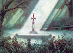
Hyrule Highlands.
Hergiswi
here's my map
#2

Posted 01 January 2013 - 05:42 AM
That said, Ebola got my vote. It's amazing. Dragonite's is nice, although a bit sparse in details in a few spots, and Jared's is great too, but it just... it feels like I've seen it before. How about you show us something besides fields and forests Jared? We get it, you're great at making them. Now wow us with something else that'll catch us off guard and impress us.
#3

Posted 01 January 2013 - 09:09 AM
Dragonite: A good DoR map. I think I like it better then Jared's tbh.
Jared: Another good DoR map. I think a few tiles are placed just a little too messy. Maybe it just looks like that because it's a full map and not screen-by-screen.
Hergiswi: Pretty realistic. Is it classic?
#4

Posted 01 January 2013 - 10:24 AM
It was a close competition between Jared and Dragonite but I voted for Jared. Although I really liked Dragonite's pallets, too much of his map looked like filler. Jared had a good creative map. Good job!
-Strike
#5

Posted 01 January 2013 - 10:33 AM
I voted for Jared, the field does have some things never seen before in a standard ZC field area.
Edited by Shane, 01 January 2013 - 10:34 AM.
#6

Posted 01 January 2013 - 11:00 AM
Ebola Zaire: There's nothing flashy about this map, but I love the palette. To me, it looks like this would be a very believable swamp labyrinth, except prettier than a normal swamp.
Dragonite: As somebody who failed an assignment on shading in middle school art class, I very much appreciate the shading in your forest. I can tell that there has been a lot of thought put into the details of this map.
Jared: I'm not sure why, but purple trees look natural in this map. I love the castle/temple/thingy and I would love to see what goes on inside it.
This was really tough for me, but I'm gonna vote for Dragonite. There is a great level of detail that doesn't look contrived, and the outcome looks great.
#7

Posted 01 January 2013 - 01:00 PM
I don't mean to be rude, but I don't get whats's so great about Ebola's map. It doesn't seem to have any creative content or much content at all for that matter. Most of the screens look virtually identical. The entire map seems to be made of the same 60 tiles used over and over again. It looks like it was made by an algorithum. Maybe it's just me?
A few thoughts why I voted for Ebola's map: The design is very solid and it's overall a very clean work. There's no needless, messy stuff here. It looks purposeful. Also, the map has a wonderful atmosphere. Personally, I approove of the consitency in this map (and design choices such as always having trees "root" in the blank tiles or the way the flowers are placed on layer 1 and/or 2). Moreover, if you cared to pay attention to the details you will notice things such as the stone tables that are scattered throughout various screens that obviously serve some kind of game mechanic. I'm not sure, but I prefer a gameplay-oriented approach such as this much more in screen/map-design.
Edited by Sheik, 01 January 2013 - 01:05 PM.
#8

Posted 01 January 2013 - 01:24 PM
Jared's is great too, but it just... it feels like I've seen it before. How about you show us something besides fields and forests Jared? We get it, you're great at making them. Now wow us with something else that'll catch us off guard and impress us.
My dungeons are boring and look all the same.
#9

Posted 01 January 2013 - 02:22 PM
#10

Posted 01 January 2013 - 09:42 PM
Dragonite: Winner on grounds of reasonable size, acceptable flow, and prettiness. Sue me. My only gripes have to be shadows being cast on cave entrances and wave tiles used in ponds, but you know what? I don't care, Luke. I simply do not care. I voted for a standard forest map by Dragonite...I certainly didn't see that one coming...
Jared: ...
I put my clouds down on the ground sometimes,
Saying AYO! Screw the rules, yo!
I clash perspective with my castle tiles,
Saying AYO! Gonna win, bro!
I came to spread, spread, spread, spread,
Flowers like jam on bread, bread, bread, bread,
Gonna cause a headache in your head, head, head, head,
Dem forests and fields, inspiration's dead, dead, dead, dead,
Ye, ye,
'Cause it goes on and on and on...
And it goes on and on and on...
This map!
I make my maps a little big some times,
Saying AYO! Full DMap, yo!
I transition grass to sand sometimes,
Saying AYO! Don't need dirt, bro!
'Cause we gon’ rock this contest,
We gon’ go all night,
We gon’ light it up,
Like it’s dynamite!
'Cause I told you once,
Now I told you twice,
We gon’ light it up,
Like it’s dynamite!
So in the form of Taio Cruz I guess what I'm saying is your rocks look too much like clouds, your castle entrances have a different perspective from the rest of the walls and towers (which I said before already had a slight perspective clash with the walls), your ground detail is a bit off (you only have two colors of flowers repeated over and over again), as Russ said, you really need to expand your horizons when it comes to types of areas, your map feels a little big (this might just be me being used to the Gameboy tileset, feel free to ignore this one), and there's my problem with the grass to sand transitions. Maybe this makes more sense with surrounding areas providing context, I just feel grass should transition to dirt and dirt should transition to sand. Other than all that I really like this map, especially how its openness defies a lot of typical screen design patterns and how despite this openness, each individual section seems to stand out. Good job, I'd give this a solid second place.
Hergiswi: SotY 2013. Nothing can ever beat this.
Edited by Moosh, 01 January 2013 - 09:45 PM.
#11

Posted 01 January 2013 - 09:47 PM
#12

Posted 02 January 2013 - 03:09 AM
One thing to keep in mind about Map of the Month is that in ZC, the player never sees your map (unless you enable the the map button, which I generally think is sort of tacky). They only see one screen at a time, so repetitiveness across screens is not a huge deal in my opinion as long as you have a few landmarks. In this map the landmarks are the save points (owl statues), dungeon entrances, and the stone plates. These (hopefully) help build a mental map of the area, where the player easily remembers where key screens and objects are because there are relatively few unique things to memorize.
And now I am going to be impolite and not talk about anybody else's map, except Hergiswi's, which looks like an awful place full of awful people.
#13

Posted 01 February 2013 - 07:04 PM
Ebola Zaire!
Congratulations! It was a close contest.
Map of the Month 37 will begin shortly.
0 user(s) are reading this topic
0 members, 0 guests, 0 anonymous users

 This topic is locked
