well, I need help because I want to do better than I did last time. I didn't feel Ganon's Claim was that good so I took it down. (if you hadn't noticed) and I'm 'planning' on replacing it with something else. But no promises yet. (so don't get excited)

EZGBZ 2.0 (by Akkabus)
Started by
DarkFlameWolf
, Jul 20 2010 12:37 AM
41 replies to this topic
#17
: post #17")
Evile
-

- Members
-

Dolphinslayer
Posted 28 July 2010 - 09:34 PM
Here's some crap I've made with the EZGBZ tileset:
http://i81.photobuck.../zelda013-4.png
http://i81.photobuck...at/ruinsmap.gif
http://i81.photobuck.../zelda013-4.png
http://i81.photobuck...at/ruinsmap.gif
#18
DarkFlameWolf
-

- Members
-

Murana Wolford
Posted 29 July 2010 - 12:14 AM
fair enough, thanks for the examples. So I guess there will be some inconsistancies throughout the set, but it seems people are okay with that. The only thing I just can't take are the blocky high grass tiles. I have to make a few rounded edges here and there.
EDIT: I reuploaded a new version of my previous village image. Go check out the first page for the new updates!
EDIT: I reuploaded a new version of my previous village image. Go check out the first page for the new updates!
Edited by DarkFlameWolf, 29 July 2010 - 04:08 AM.
#19
SpacemanDan
-

- Members
-

- Location:Ontario, Canada
Posted 30 July 2010 - 02:33 PM
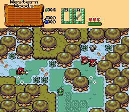
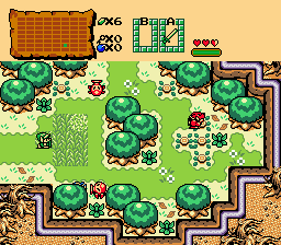
They look good.  I thought Ganon's Claim looked pretty good, to be honest. But I do understand the idea of trying to 'step up your game', if you will. My only suggestion would be to add a little more tree variety. Not crazily, I mean, but maybe those and another kind, just for a little bit of variance among the trees. Just a suggestion, of course.
With Ganon's Claim down, does that make it a collector;s item? Just kidding, of course.
With Ganon's Claim down, does that make it a collector;s item?
#20
DarkFlameWolf
-
- Members
-
Murana Wolford
Posted 30 July 2010 - 05:29 PM
I'm keeping the tree variance to a minimum, because there will be 16 different unique overworld areas (more than 1 overworld), so that should be more than enough areas to allow for just about all the tree variations.
EDIT: Ganon's Claim, I guess you could say that.
EDIT: Ganon's Claim, I guess you could say that.
Edited by DarkFlameWolf, 30 July 2010 - 05:30 PM.
#21
Akkabus
-

- Members
-

Illustrious
Posted 30 July 2010 - 06:19 PM
dfw, your expectations are too high! ganon's claim was a very nice quest.
#22
Zemious
-
- Members
-
Magicite: Bahamut
Posted 31 July 2010 - 02:25 AM
QUOTE(Akkabus @ Jul 23 2010, 10:44 PM) 
hi dfw, i'm flattered you're using my tileset! i wish i could give you some examples, but i'm still trying to figure out the set, too. however, if you want some bad examples, just ask, i'm quite skilled!
hint: one thing you might want to try, for overworlds, is to treat the green grass as a type of border for other objects. also, if you have a wall of mountains, try breaking it up into smaller sections with waterfalls or those thin-mountain tiles, which seem to be used a lot in the official gb games.
also, try blindly copying the real game maps to get a feel for the set:
http://www.vgmaps.co...aLinksAwakening
though for some reason, the screens look good in the real games, but they look plain when i draw them out in zc. maybe because of the screen dimensions...?
why are you flattered that he/she is using it and no one else?
#23
DarkFlameWolf
-
- Members
-
Murana Wolford
Posted 31 July 2010 - 02:25 AM
I guess so, I just never considered it as such, it had a lot of flaws going for it. Regardless, I feel good about this next endeavor(sp?) and if the feedback I'm getting from the village is any indication, I think I'm on the right track.
#24
Moosh
-

- ZC Developers
-

Tiny Little Questmaker
Posted 31 July 2010 - 04:34 AM
QUOTE(DarkFlameWolf @ Jul 28 2010, 06:06 PM)
well, I need help because I want to do better than I did last time. I didn't feel Ganon's Claim was that good so I took it down. (if you hadn't noticed) and I'm 'planning' on replacing it with something else. But no promises yet. (so don't get excited)
Funny you say that because Ganon's Claim was one of my favorites. Maybe I have bad GB design taste, but I think you have it down pretty good. My only problem with it was that the overworld felt too flat. I've noticed that a lot of my favorite GB screenshots have two or three levels of elevation.
#25
DarkFlameWolf
-
- Members
-
Murana Wolford
Posted 31 July 2010 - 10:22 PM
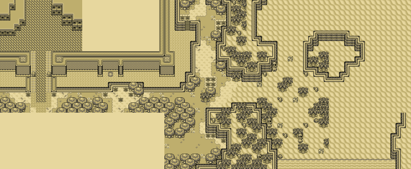
Too flat? I can rectify that. That's for sure. There is at least 4-5 mountainous areas anyway with what I'm planning. It is dungeons I'm truly worried about.
#26
Shane
-

- Moderators
-

🩶
- Location:South Australia
Posted 31 July 2010 - 10:47 PM
QUOTE(DarkFlameWolf @ Jul 31 2010, 09:22 PM)
Too flat? I can rectify that. That's for sure. There is at least 4-5 mountainous areas anyway with what I'm planning. It is dungeons I'm truly worried about.
Are you going to make the dungeons square or freeform?
#27
Akkabus
-
- Members
-
Illustrious
Posted 01 August 2010 - 01:20 AM
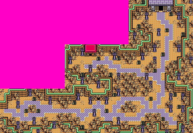
dungeons are easy. the hardest part is getting used to the walls. plus you can always msg me for help! *wink*
edit: here's some examples.
1. two-level dungeon.

2. one chest, many colors.

3. mixing overworld with dungeon tiles.

4. standard style dungeon.

edit: here's some examples.
1. two-level dungeon.
2. one chest, many colors.
3. mixing overworld with dungeon tiles.
4. standard style dungeon.
Edited by Akkabus, 01 August 2010 - 03:37 AM.
#28
DarkFlameWolf
-
- Members
-
Murana Wolford
Posted 02 August 2010 - 08:37 PM
Great examples. I can utilize these as templates on how to properly do various types of dungeons. I guess walls in GB dungeons are one tile high compared to the traditional two tiles high.
#29
DarkFlameWolf
-
- Members
-
Murana Wolford
Posted 08 August 2010 - 06:04 AM
My life has been pretty busy, but I've been slowly but surely working on my town, I'm two screens away from completing this area and once its finished, I'll upload what I have as a screenshot and see what you all think.
EDIT: All right everyone, the town: Valhalla is finished. Tear it apart and tell me what you think:
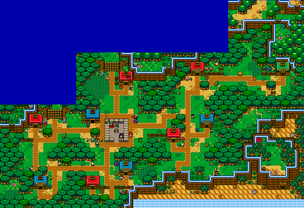
I made it so there is enough mystery involved in just the town itself, revolving around HC Pieces teasing you straight from the start, two magic upgrade locations, a dungeon location and various paths leading out of the village and that mysterious bird statue/windvane. Lots of stuff crammed into this small area, you just have no idea yet.
I still feel like I'm struggling to make these screens as detailed as possible. Like I'm not doing enough to make them interesting. Maybe it is just me and my high expectations of myself now. I'm still not sure I have it in me to create a full quest anymore. But we'll see, I'll keep working on it slowly, bit by bit.
EDIT: All right everyone, the town: Valhalla is finished. Tear it apart and tell me what you think:
I made it so there is enough mystery involved in just the town itself, revolving around HC Pieces teasing you straight from the start, two magic upgrade locations, a dungeon location and various paths leading out of the village and that mysterious bird statue/windvane. Lots of stuff crammed into this small area, you just have no idea yet.
I still feel like I'm struggling to make these screens as detailed as possible. Like I'm not doing enough to make them interesting. Maybe it is just me and my high expectations of myself now. I'm still not sure I have it in me to create a full quest anymore. But we'll see, I'll keep working on it slowly, bit by bit.
Edited by DarkFlameWolf, 08 August 2010 - 07:37 AM.
#30
Peteo
-

- Members
-
Back in Business!
- Real Name:Pete
- Location:Finland
Posted 08 August 2010 - 08:32 AM
Wolfie honey, I can help you with the detail. I can make you custom tiles etc. Just give me a call when it's time for graphical help. 
However, why is you village so small? I hope there will be other villages, and bigger than that... :/
However, why is you village so small? I hope there will be other villages, and bigger than that... :/
1 user(s) are reading this topic
0 members, 1 guests, 0 anonymous users

