everyone says that I need more detail...
but on WHAT!?!?!?
I always try to add many things on to one screen, and people says that I still need more detail... but what do u mean by detail?
How could I make it better? I'm not a type of questmaker with perfect making-sense areas and I am not so patient working on one screen for about an hour or so.
How could I make it better? I'm a lazy type of quest maker, but what do u guys mean by detail!?!
this is ticking me off. what a bad year.

how could I do more detail?
Started by
NineLives
, Feb 21 2006 10:42 PM
41 replies to this topic
#1

NineLives
-

- Members
-

Boom. Zoom. Dakota.
- Location:Los Angeles, California
Posted 21 February 2006 - 10:42 PM
#2
nicklegends
-

- Contributors
-

Trofessional Pransposer
- Real Name:Ed
- Pronouns:He / Him
Posted 21 February 2006 - 11:13 PM
XdragonSB, there's honestly no need to ruin your year over some simple, friendly advice. 
Let's take this screenshot for example:

So in this shot, there are a total of eleven different non-sprite tiles, which some people could consider too few for good variety, but I don't really see a screen and see the different tiles; I see the screen as a whole and how the tiles are used. What would work better for me in this shot is if you broke up that rock field with something else, like a few trees, or special grass detail (which at least the PTUX has), or even just a giant boulder. My eyes just like seeing something interesting on every area of the screen, but when I look to the bottom-right corner, for example, I fall unimpressed. You could also put something along the walls of the castle,like those shieldy-thingies or a wall torch if you so desired.
Don't take any feedback too seriously. I'm just trying to give some constructive criticism. I like your work, but there are a few details to work on.
For me, detail equals
Let's take this screenshot for example:
So in this shot, there are a total of eleven different non-sprite tiles, which some people could consider too few for good variety, but I don't really see a screen and see the different tiles; I see the screen as a whole and how the tiles are used. What would work better for me in this shot is if you broke up that rock field with something else, like a few trees, or special grass detail (which at least the PTUX has), or even just a giant boulder. My eyes just like seeing something interesting on every area of the screen, but when I look to the bottom-right corner, for example, I fall unimpressed. You could also put something along the walls of the castle,like those shieldy-thingies or a wall torch if you so desired.
Don't take any feedback too seriously. I'm just trying to give some constructive criticism.
For me, detail equals
- Variety
- Interest
- Effort
- Creativity
Edited by nicklegends, 18 March 2006 - 12:09 AM.
#3
Anthus
-

- Members
-

Deified
- Pronouns:He / Him
- Location:Ohio
Posted 21 February 2006 - 11:19 PM

Let's use this shot for example. see how you make your cliffs square and unnatrual looking? Add some variation in your cliffs. Add more flowers and stuff, and tress wouldn't hurt either. On the outdoor screens (In TBB) you should add some cliffs or water/ a river, not just have rocks and a gaping hole
How natrual is that? Using some rocks is okay but it looks wierd to have rocks being used as your primary solid object. You should use something else as a border for your screen like a river or some cliffs
EDIT: The water in this shot ain't half bad though.
Edited by Rex Zemenheart, 21 February 2006 - 11:22 PM.
#4
SwordOfSeals
-

- Members
-

Peace now, food later
- Real Name:Akai, really...
- Location:Xenia, OH
Posted 21 February 2006 - 11:47 PM
Variety is my number one killer. I look at my own screen shots and think, "Ugh. It's so dull and lifeless." What's wrong with it? It doesn't look natural or inspiring. How is this remidied? Follow the advice posted above. I know what I should do in my quest, but it's the making the world alive that screws me over.
#5
ShadowTiger
-

- Members
-
The Doctor Is In
Posted 22 February 2006 - 10:39 AM
Note that this topic would be better served in the ZQuest Design Help Forum, as it relates to design, rather than on fixing a technical problem. Thanks for remembering this for the future.
Now, take a look at this image I designed last year.
See how "real" that is? It's not just an area. It's not just a group of combos plastered together with Elmers© Glue. Whatever details I needed to fit the mood, I put down. You'll be hardpressed to find an area that doesn't actually resemble the real area it looks like, unless you design it so that it looks bland and uninteresting.
IMHO, there are two rules for basic eye-candy.
1) Don't use the same combo over and over again.
2) Don't allow for more than half the screen to be "empty" grass/dirt/rock etc. Put doodads there, and scatter them randomly, but not clumping masses of them together.
There are yet more rules for better design habits:
1) Don't stop adding detail when you want to stop. The first time you want to stop adding detail, it's probably because you're lazy and want to stop, because your body tells you to stop because it's too tired to add anything else. Just keep adding detail where something seems empty, or you can walk around excessively in that area.
2) Modify the colors for the area. Don't stick to the default, or your quest will be seen as being no different from any other quest out there. The colors are one of the first things anyone else sees. When they see your colors are different, they'll begin to look for other differences between -your- quest, and -everyone else's- quest. Also notice how I differentiated between yours and everyone elses. That's the first step to greatness. ;-D
3) Use a variety of different combos. Just because there's a "theme" to your method, doesn't mean that you have to stick to only swamp tiles. Maybe you can use a few dungeon tiles here or there, recolor them for the overworld, and cover them in vines or something. In ZC, you're really not as restricted as you think you are if you're clever.
* Moves *
Now, take a look at this image I designed last year.

See how "real" that is? It's not just an area. It's not just a group of combos plastered together with Elmers© Glue. Whatever details I needed to fit the mood, I put down. You'll be hardpressed to find an area that doesn't actually resemble the real area it looks like, unless you design it so that it looks bland and uninteresting.
IMHO, there are two rules for basic eye-candy.
1) Don't use the same combo over and over again.
2) Don't allow for more than half the screen to be "empty" grass/dirt/rock etc. Put doodads there, and scatter them randomly, but not clumping masses of them together.
There are yet more rules for better design habits:
1) Don't stop adding detail when you want to stop. The first time you want to stop adding detail, it's probably because you're lazy and want to stop, because your body tells you to stop because it's too tired to add anything else. Just keep adding detail where something seems empty, or you can walk around excessively in that area.
2) Modify the colors for the area. Don't stick to the default, or your quest will be seen as being no different from any other quest out there. The colors are one of the first things anyone else sees. When they see your colors are different, they'll begin to look for other differences between -your- quest, and -everyone else's- quest. Also notice how I differentiated between yours and everyone elses.
3) Use a variety of different combos. Just because there's a "theme" to your method, doesn't mean that you have to stick to only swamp tiles. Maybe you can use a few dungeon tiles here or there, recolor them for the overworld, and cover them in vines or something. In ZC, you're really not as restricted as you think you are if you're clever.
#6
Kite
-

- Members
-
Posted 22 February 2006 - 11:09 AM
What I'm going to suggest involves more than just detail. It involves the art of taking screenshots, in general.
Combine this with the screen improvements being suggested and you'll have a rather nice screenshot.
- Showing solely screenshots from ZQuest for publicity (and SotW) is a big no-no on my list. There are few exceptions to this.
- Title screens.
- Cutscenes that don't have the player character (who can move) visible.
- Make sure some action is going on in the screen. I don't care how pretty a forest is (unless it's created by Gashin): if there is nothing going on, I won't be all that interested in the shot. Note that my definition of stuff happening just involves Link having a purpose for being visible, whether it be to stroll around in a town or fighting an octorok.
- Speaking of action, position the player character well. Randomly throwing him on the screen makes it look sloppy.
Combine this with the screen improvements being suggested and you'll have a rather nice screenshot.
#7
LJ Bad
-

- Members
-

Junior
- Real Name:Leif Eric
- Location:USA
Posted 22 February 2006 - 02:23 PM
How would you go about making a desert look interesting? I ask because I think this queston goes along with the topic and I have lots of open stretches of desert in the quest I'm making. I'm having trouble making this desert interesting looking, because it's supposed to be kind of empty and desolate. I know you can use things like cacti and cow bones, but I hate to put a cow skull on every other screen, becaue that gets boring too... any suggestions?
#8
nicklegends
-
- Contributors
-
Trofessional Pransposer
- Real Name:Ed
- Pronouns:He / Him
Posted 22 February 2006 - 02:34 PM
QUOTE(LJ Bad @ Feb 22 2006, 11:23 AM)
How would you go about making a desert look interesting? I ask because I think this queston goes along with the topic and I have lots of open stretches of desert in the quest I'm making. I'm having trouble making this desert interesting looking, because it's supposed to be kind of empty and desolate. I know you can use things like cacti and cow bones, but I hate to put a cow skull on every other screen, becaue that gets boring too... any suggestions?

I've run into the same problem too, where deserts go a bit undetailed. What I have been doing to mine is making slightly modified sand tiles to break up the repetitive tiling of the standard combo, which has worked well to make the place more interesting. Also, it works like a charm to include a sandstorm or another type of environmental effect to draw the character into the environment more. The last thing I did to make my desert more interesting was place a few gigantic plateaus around the area for some variety in landscaping.
I don't know if what I'm doing will look good to everybody else, but it is certainly an alternative to cactus and carcass.
#9
Skipper
-
- Members
-

Magus
- Real Name:Austin
- Location:IA, USA
Posted 22 February 2006 - 07:49 PM
USE BIG OBJECTS. What I mean by big objects is, for example, LttP trees, houses with closed doors, maybe a couple of cliffs, some sprites, litle trees, dead trees, wacky trees, leafy trees, and such. Try not to use those little trees too much(Bushes, ect) Put down a couple of plants, flowers, ect. If usiong the DoR tileset, make good use of those cool dirt tiles. You could use them as paths, mountain terrain, volcanoes, ect. Or add a couple of objects or houses to a few screens, like a windmill, MC log cabin(Like the sword master's house in Hyrule town), and instead of using those old, LttP house interiers, try ripping those MC houses from the incomplete minish cap tileset. Or maybe Freedoms tileset. Try not to have just 1 undercombo per page. Have many different plants with many different undercombos(Use secret tiles).
Along with this, use BH4's example too. Make the screen fit with the mood. Like, if you want to have a cutscene between, lets say, crushes, and they are alone, make something like a cliff, and make it look like dawn. Have a peacefull setting, somewhat relaxing.
Hope that helps.
Along with this, use BH4's example too. Make the screen fit with the mood. Like, if you want to have a cutscene between, lets say, crushes, and they are alone, make something like a cliff, and make it look like dawn. Have a peacefull setting, somewhat relaxing.
Hope that helps.
#10
Shoelace
-

- Members
-

The Shaman of Sexy!
- Real Name:Michael
- Pronouns:He / Him
- Location:Arizona
Posted 22 February 2006 - 11:13 PM
So now I want to hear from Xdragon. Did any of this info help you? We are not saying to spead an hour on one screen but you have to put some effort into it. Because I will be honest, if I see that there isn't that much detail put into the screens, I will think you didn't put any effort into the game. Thus, I won't even play the game. But I am being honest.
If you still don't understand about the detail please provide one of your newest screens, and I will tell you how to make it better.
If you still don't understand about the detail please provide one of your newest screens, and I will tell you how to make it better.
#11
NineLives
-
- Members
-
Boom. Zoom. Dakota.
- Location:Los Angeles, California
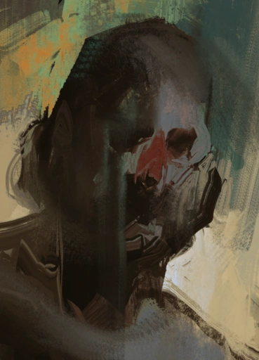
Posted 23 February 2006 - 11:44 PM

heres an image of a quest MY FRIENDS AND I are currently making....
well, its a title screen of...
SPAWN
--------------
UNLEASHED
#12
Lemon
-

- Members
-
Legend
Posted 24 February 2006 - 01:32 AM
Detail is just what the leaves, grass cliffs, and other crap are all for. For a game you really dont have to make a screen reallly complicated to make it detailed, but for like some of the shots you entered in SOTW... ones like that do need a higher level of quality... all the advice I can give has already been said (other than that I suppose) so good luck..
#13
nicklegends
-
- Contributors
-
Trofessional Pransposer
- Real Name:Ed
- Pronouns:He / Him
Posted 24 February 2006 - 02:30 AM
QUOTE(XdragonSB @ Feb 23 2006, 08:44 PM)
heres an image of a quest MY FRIENDS AND I are currently making....
well, its a title screen of...
SPAWN
--------------
UNLEASHED
What's tough for me about this picture is not that it's undetailed, but that I can't tell exactly what's going on. There is a lot of layered color which makes it difficult to understand--at least for me. Besides, it's a bit difficult to rate title screens because they are generally unrelated in artistic style to the rest of the quest's overworld and underworld.
#14
Shoelace
-
- Members
-
The Shaman of Sexy!
- Real Name:Michael
- Pronouns:He / Him
- Location:Arizona
Posted 24 February 2006 - 05:03 AM
Yeah, if you show me a picture of a title screen is won't help me help you. The title screen is fine and all but if you really want my opinion another shot maybe overworld would help.
#15
ShadowTiger
-
- Members
-
The Doctor Is In
Posted 24 February 2006 - 09:30 AM
lol; Xdragon, what you did there is show us something that's basically "Your best stuff." Of COURSE your best stuff will have quality; It's YOUR BEST STUFF! However, it doesn't really help us because it's not your best stuff that needs improving, (Hopefully.) but the other stuff of yours. Show us both active and inactive screens from your overworlds and dungeons. (By "active and inactive," I mean they have things happening on them, or that they're just places you can walk by without doing much on them.)
0 user(s) are reading this topic
0 members, 0 guests, 0 anonymous users

