
OMG!!
CastChaos

"After corruption, before invertion."
Nuvo

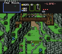
A switch and a stone door... hm... how the crap did I get up here anyway?
Plissken

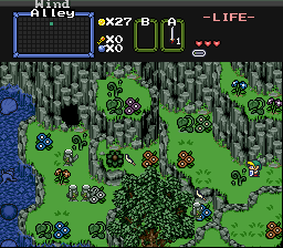
I think I'm lost...
billy ronald

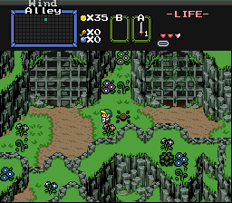
Billy climbs the neer by mountain in search of the 3 Pendants of Twilight

 This topic is locked
6♣7♠8♥9♥10♥

Posted 13 January 2008 - 01:53 PM
Magicite: Bahamut

Posted 13 January 2008 - 02:21 PM
Coblin the Goblin

Posted 13 January 2008 - 02:25 PM
Dolphinslayer
Posted 13 January 2008 - 02:39 PM
Love and Peace

Posted 13 January 2008 - 02:43 PM
What's with these homies dissing our girls?

Posted 13 January 2008 - 03:06 PM
Caelan, the Encouraging

Posted 13 January 2008 - 03:29 PM
My name is NOT Jason!
Posted 13 January 2008 - 03:47 PM
Edited by TriMaster001, 13 January 2008 - 03:49 PM.
Deified
Posted 13 January 2008 - 03:49 PM
I'm back sorta.
Posted 13 January 2008 - 03:52 PM

My name is NOT Jason!
Posted 13 January 2008 - 03:52 PM
Justice is served!

Posted 13 January 2008 - 03:57 PM
Coblin the Goblin
Posted 13 January 2008 - 04:15 PM
Edited by Nuvo, 13 January 2008 - 04:18 PM.
0 members, 0 guests, 0 anonymous users


