Hmm... I like it but Links head looks like the Boomerang Flower from Mario...

2D Zelda Higher Resolution Community Project
Started by
Koh
, Apr 10 2016 04:06 PM
53 replies to this topic
#31

Matthew
-
- Administrators
-

- Real Name:See above.
- Pronouns:He / Him
- Location:Ohio
Posted 15 April 2016 - 11:15 AM
- Koh likes this
#32
Koh
-

- Members
-

Tamer Koh
- Real Name:Dominic
- Location:Monsbaiya, Virginia
Posted 15 April 2016 - 11:50 AM
Hmm... I like it but Links head looks like the Boomerang Flower from Mario...
Loled hard after googling that. I'll have to see if there's anything I can do to round that out better; I already changed a lot of pixels when filling the vertical space XD.
- Matthew likes this
#33
Matthew
-
- Administrators
-
- Real Name:See above.
- Pronouns:He / Him
- Location:Ohio
Posted 15 April 2016 - 12:07 PM
Maybe you could round out Link's Chin and make his ears thinner!
#34
Koh
-
- Members
-
Tamer Koh
- Real Name:Dominic
- Location:Monsbaiya, Virginia
Posted 15 April 2016 - 02:39 PM
Seems to be at a strange sweetspot. If you add two pixels to that row, it looks like he has no chin and has chubby cheeks, and if you take two pixels away, it looks too small.
#35
Koh
-
- Members
-
Tamer Koh
- Real Name:Dominic
- Location:Monsbaiya, Virginia
Posted 16 April 2016 - 09:50 AM
Cleaned up his ears and tried fixing his chin a bit.


I should mention that another one of the reasons I'm staying close to the original, besides the addition of extra detail making it look awkward on such a simple sprite, is to give off the enhanced PC version vibe from the days of old. You know, how games that also got DOS or Windows ports when they were also available on the older systems; the graphics were at a x2 resolution compared to their console/arcade counter parts, but were mostly the same, just finer looking. For example, compare the title screens of the Arcade/Megadrive version of Puyo Puyo Tsu, to the Windows Version.
-title.png)

They didn't add any extra details, they just cleaned up the existing ones and made the title look finer overall.
Same for the ingame graphics.

That's the sort of approach I want to take with my own high res graphics, so it can still feel like the original, but not feel so boxy and stout, lol.
Edited by Koh, 16 April 2016 - 09:57 AM.
#36
Koh
-
- Members
-
Tamer Koh
- Real Name:Dominic
- Location:Monsbaiya, Virginia
Posted 17 April 2016 - 12:31 PM
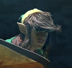
Well, seeing is believing, so why don't we just try a bit of everything, with proof that it doesn't look good.
First, the base with no changes.

Alright, so lets try some fingers.

Looks awkward doesn't it? It's just one pixel for the right hand (on the left) and three on the left hand (on the right). Maybe a poor choice of color, perhaps? Would it look better if it were the green instead of the black?

Sort of, but you can barely tell they're even there. And in the world of spriting, if that's the case, it's the same as it just not existing at all, so those are out.
Well, how about we try a mouth?

Now his expression looks less neutral and a bit different, even though it's just two pixels. We can try changing the color again.

Not as dreadful as before, but once again, it's not adding anything of value being there compared to when nothing was there before.
Well, what about extending his hair details?

More of a match to his hairstyle in the artwork, with sideburns identified. This is the one edit that seems at least decent, but then when you think about how the sprite is animated (flipping), you realize that the non-symmetrical nature of it will make the animation look awkward.
Edited by Koh, 17 April 2016 - 12:31 PM.
- Matthew likes this
#37
Jared
-

- Members
-
Deified
- Real Name:Jared
- Pronouns:He / Him
- Location:New Hampshire
Posted 17 April 2016 - 12:35 PM
If you're looking for critiques, I don't like any f them. They're awkward and just don't...work right, I feel like. Sorry.
- Shane likes this
#38
Koh
-
- Members
-
Tamer Koh
- Real Name:Dominic
- Location:Monsbaiya, Virginia
Posted 17 April 2016 - 01:12 PM
Exactly my point with those extra details. They only really work when you have more colors to work with, and can thus apply them subtly. As seen with the evolution of the Warrior for FF1.

Since the PSP sprite on the far right has more colors, it has more room to add more subtle details, like the fingers, extra hair strands, and so on. If it used the same 15 colors from the original PS1 sprites in the middle, they wouldn't have been able to add them without them looking awkward.
- Matthew likes this
#39
Jared
-
- Members
-
Deified
- Real Name:Jared
- Pronouns:He / Him
- Location:New Hampshire
Posted 17 April 2016 - 01:26 PM
Then...why don't you just remake the GB Link sprites instead of complaining how it has no colors? ![]()
- Shane likes this
#40
Koh
-
- Members
-
Tamer Koh
- Real Name:Dominic
- Location:Monsbaiya, Virginia
Posted 17 April 2016 - 01:34 PM
Because that's cheating and too easy, lol. The challenge to shape things out better and potientially add more detail within the old palette is more interesting to me C=. I mean, anyone can take the LTTP palette for example, and use that on the new size GBC Link sprite and make it look good. But to do it with the original colors is more impressive~
Edited by Koh, 17 April 2016 - 01:35 PM.
#41
Koh
-
- Members
-
Tamer Koh
- Real Name:Dominic
- Location:Monsbaiya, Virginia
Posted 23 April 2016 - 01:40 PM
Worked on adding more detail without actually cluttering up the space. Use of anti-aliasing and shading to better pronounce features instead of trying to make a garbage dump of moving pixels.

- Matthew likes this
#42
Matthew
-
- Administrators
-
- Real Name:See above.
- Pronouns:He / Him
- Location:Ohio
Posted 23 April 2016 - 01:54 PM
I like it, Koh! It looks good ![]()
#43
Koh
-
- Members
-
Tamer Koh
- Real Name:Dominic
- Location:Monsbaiya, Virginia
Posted 23 April 2016 - 11:06 PM
Animation update for that.

HUD stuff.

- Matthew likes this
#44
P-Tux7
-

- Members
-

💛
Posted 30 December 2018 - 02:23 AM
What are these gonna be used for? I don't think ZC could support these for a long time.
#45
Old-Skool
-
- Members
-

Hero of Time
- Location:Missouri
Posted 02 January 2019 - 06:58 PM
those rupees look very... ovular
0 user(s) are reading this topic
0 members, 0 guests, 0 anonymous users

