Edited by /M/, 09 January 2013 - 04:56 PM.

Perspective issues with 16x16
Started by
/M/
, Jan 09 2013 04:17 PM
17 replies to this topic
#1

/M/
-

- Members
-

6♣7♠8♥9♥10♥
- Location:Gotham City
Posted 09 January 2013 - 04:17 PM
Something that has been bothering me lately while working on my set is the perspective issue of using 16x16 sprites with graphics designed around at a minimum 22x16. I mean, the sprites just look out of place and even more when your tileset is very detailed. I remember Linkus was designing an NPC template for the community to address the issue but I believe he never got around to fully completing it (I could be wrong). Another problem involves monsters being strictly 16x16, so if you do decide to go with the decision of using a bigger Link, the enemies won't seem much of a threat visually. Basically, unless you want to ignore the perspective issue and the clashes between tiles that follows it, you're kind of forced to have a strong resembles to either the NES or GBC platform. I'm curious, does anyone else feel the same about this or am I just putting too much thought behind it?
- Aquamentus (Facing Right) likes this
#2
peteandwally
-

- Members
-

chiubicabachiukicaca
Posted 09 January 2013 - 04:36 PM
That's a good point, but I believe more talented coders can at least script larger enemies. For a less experienced questmaker, the issue of size and perspective is probably less of a problem than things like screen design and basic zquest mechanics though.
#3
Russ
-

- Administrators
-

Caelan, the Encouraging
- Location:Washington
Posted 09 January 2013 - 04:39 PM
I've kinda felt the same. And really, you could use big Link, have big NPCs, and fairly easily script bigger enemies. The problem (well, one of them) is that ZC's screen size is built around 16x16, so you get less and less room the bigger you upsize. So really, I don't mind the weird graphical issues that crop up when using 16x16 sprites, seeing as the alternative is having gameplay negatively affected.
#4
/M/
-
- Members
-
6♣7♠8♥9♥10♥
- Location:Gotham City
Posted 09 January 2013 - 05:11 PM
QUOTE
The problem (well, one of them) is that ZC's screen size is built around 16x16, so you get less and less room the bigger you upsize.
That is a good point. But if you take a closer look, most people tend to crowd their screen with little under 50% of the screen being walkable anyways. If we did have a functioning Big Link + Enemies, you could just space the tiles out a bit more to give more room.
Edited by /M/, 09 January 2013 - 05:24 PM.
#5
Anthus
-

- Members
-

Deified
- Pronouns:He / Him
- Location:Ohio
Posted 11 January 2013 - 01:36 AM
QUOTE(/M/ @ Jan 9 2013, 04:17 PM) 
Something that has been bothering me lately while working on my set is the perspective issue of using 16x16 sprites with graphics designed around at a minimum 22x16. I mean, the sprites just look out of place and even more when your tileset is very detailed. I remember Linkus was designing an NPC template for the community to address the issue but I believe he never got around to fully completing it (I could be wrong). Another problem involves monsters being strictly 16x16, so if you do decide to go with the decision of using a bigger Link, the enemies won't seem much of a threat visually. Basically, unless you want to ignore the perspective issue and the clashes between tiles that follows it, you're kind of forced to have a strong resembles to either the NES or GBC platform. I'm curious, does anyone else feel the same about this or am I just putting too much thought behind it?
This is a totally valid point, and I agree, but when it comes to ZC, I just -really don't care- that much. I mean, it's an engine for Zelda games; I don't expect anyone to sit there and sprite, and animate everything from scratch. Furthermore, it was never really meant to do anything besides Zelda 1 early on so its sprite options are fairly limited. Frankly, I think concerning oneself with such details is a waste of energy in something like ZC. I think creativity and game play are more important. But, it is for this reason that I don't use anything larger than a 16x16 Link, cause I do think it looks pretty odd to have him be larger than, say, a Darknut for example.
#6
Koh
-

- Members
-
Tamer Koh
- Real Name:Dominic
- Location:Monsbaiya, Virginia
Posted 11 January 2013 - 12:36 PM
The actual Zelda tiles have perspective issues anyway. The walls should look something like this:
http://spriters-reso...gaia/sheet/6516
Not uniformly the same size all around. They derped on that on all 2D Zelda games.
http://spriters-reso...gaia/sheet/6516
Not uniformly the same size all around. They derped on that on all 2D Zelda games.
Edited by Koh, 11 January 2013 - 12:36 PM.
#7
nicklegends
-

- Contributors
-

Trofessional Pransposer
- Real Name:Ed
- Pronouns:He / Him
Posted 11 January 2013 - 12:40 PM
QUOTE(Koh @ Jan 11 2013, 09:36 AM)
The actual Zelda tiles have perspective issues anyway. The walls should look something like this:
http://spriters-reso...gaia/sheet/6516
Not uniformly the same size all around. They derped on that on all 2D Zelda games.
There's really no way to have perfect perspective in a 2D environment that utilizes tiles unless you're taking a perfectly orthogonal or isometric perspective. I think the Zelda perspective is smarter in some respects because it opens up the floor area more.
#8
Moosh
-

- ZC Developers
-

Tiny Little Questmaker
Posted 11 January 2013 - 12:43 PM
Kinda wish there was a quest rule that allowed HD tiles that are 32x32, but there's not much that can be done about that...Oh well. We work with what we're given. 
The actual Zelda tiles have perspective issues anyway. The walls should look something like this:
http://spriters-reso...gaia/sheet/6516
Not uniformly the same size all around. They derped on that on all 2D Zelda games.
The wall perspective there works but the blocks are still off. A top down sprite based game with perfect perspective is hard to come by.
QUOTE(Koh @ Jan 11 2013, 12:36 PM)
The actual Zelda tiles have perspective issues anyway. The walls should look something like this:
http://spriters-reso...gaia/sheet/6516
Not uniformly the same size all around. They derped on that on all 2D Zelda games.
The wall perspective there works but the blocks are still off. A top down sprite based game with perfect perspective is hard to come by.
#9
Koh
-
- Members
-
Tamer Koh
- Real Name:Dominic
- Location:Monsbaiya, Virginia
Posted 11 January 2013 - 12:47 PM
QUOTE(nicklegends @ Jan 11 2013, 12:40 PM)
There's really no way to have perfect perspective in a 2D environment that utilizes tiles unless you're taking a perfectly orthogonal or isometric perspective. I think the Zelda perspective is smarter in some respects because it opens up the floor area more.
Well that's why they invented the screen following the character. They could've fixed up the walls in LTTP and onwards and had the screen follow Link in the dungeons or houses (since they'd have to make the map a bit bigger) and still had it work. They proved the scrolling screen feature is doable on all the systems (LTTP for SNES, OOA/OOS for GBC, and LTTP Port + MC for GBA).
QUOTE(Moosh @ Jan 11 2013, 12:43 PM)
Kinda wish there was a quest rule that allowed HD tiles that are 32x32, but there's not much that can be done about that...Oh well. We work with what we're given.
The wall perspective there works but the blocks are still off. A top down sprite based game with perfect perspective is hard to come by.
Actually the blocks are the same as the walls there, so it's correct. I'm not looking for 100% perfection, but the errors should be few and far between, and not everywhere.
EDIT: And to go further, Zelda gets the perspective right in the overworld on the 2D Zelda games (Except Zelda 1, like what the hell is going on with those cliff tiles?). So why couldn't that carry into the dungeons and houses?
Edited by Koh, 11 January 2013 - 12:49 PM.
#10
Moosh
-
- ZC Developers
-
Tiny Little Questmaker
Posted 11 January 2013 - 12:58 PM
QUOTE(Koh @ Jan 11 2013, 12:47 PM)
Well that's why they invented the screen following the character. They could've fixed up the walls in LTTP and onwards and had the screen follow Link in the dungeons or houses (since they'd have to make the map a bit bigger) and still had it work. They proved the scrolling screen feature is doable on all the systems (LTTP for SNES, OOA/OOS for GBC, and LTTP Port + MC for GBA).
Actually the blocks are the same as the walls there, so it's correct. I'm not looking for 100% perfection, but the errors should be few and far between, and not everywhere.
EDIT: And to go further, Zelda gets the perspective right in the overworld on the 2D Zelda games (Except Zelda 1, like what the hell is going on with those cliff tiles?). So why couldn't that carry into the dungeons and houses?
If the perspective truly is looking from the top down, the blocks shouldn't have the same visual style as Zelda's push blocks. The blocks should be inverted so the top surface is the one that sticks out more to the sides, not the bottom one. Or maybe I'm just dumb. I'm no tile artist. What do I know?
tl;dr Zelda's push blocks all look like truncated pyramids to me, not blocks.
Edited by Moosh, 11 January 2013 - 12:59 PM.
#11
Koh
-
- Members
-
Tamer Koh
- Real Name:Dominic
- Location:Monsbaiya, Virginia
Posted 11 January 2013 - 01:26 PM
QUOTE(Moosh @ Jan 11 2013, 12:58 PM)
If the perspective truly is looking from the top down, the blocks shouldn't have the same visual style as Zelda's push blocks. The blocks should be inverted so the top surface is the one that sticks out more to the sides, not the bottom one. Or maybe I'm just dumb. I'm no tile artist. What do I know?
tl;dr Zelda's push blocks all look like truncated pyramids to me, not blocks.
Actually, the blocks are the only things that are right in the 2D Zelda dungeons based on perspective (excluding things like Pots).
Edited by Koh, 11 January 2013 - 01:27 PM.
#12
Moosh
-
- ZC Developers
-
Tiny Little Questmaker
Posted 11 January 2013 - 01:43 PM
QUOTE(Koh @ Jan 11 2013, 01:26 PM)
Actually, the blocks are the only things that are right in the 2D Zelda dungeons based on perspective (excluding things like Pots).
...Goddamn I'm retarded. I really didn't get enough sleep last night...Sorry for my inane ramblings.
#13
Anthus
-
- Members
-
Deified
- Pronouns:He / Him
- Location:Ohio
Posted 11 January 2013 - 01:50 PM
QUOTE(nicklegends @ Jan 11 2013, 12:40 PM)
There's really no way to have perfect perspective in a 2D environment that utilizes tiles unless you're taking a perfectly orthogonal or isometric perspective. I think the Zelda perspective is smarter in some respects because it opens up the floor area more.
This. Also, I think Zelda chose to use the walls the way they did so they could have doors that are fully visible on all four sides. It's fine by me cause it looks fine to me, and it opens it up for more design potential.
#14
nicklegends
-
- Contributors
-
Trofessional Pransposer
- Real Name:Ed
- Pronouns:He / Him
Posted 11 January 2013 - 02:36 PM
QUOTE(Anthus @ Jan 11 2013, 10:50 AM)
This. Also, I think Zelda chose to use the walls the way they did so they could have doors that are fully visible on all four sides. It's fine by me cause it looks fine to me, and it opens it up for more design potential.
Good point. This choice actually allows Zelda 1 dungeons to have consistent perspective in the walls (of course, the statues don't match):
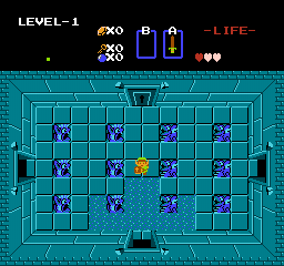
It's when you have convex corners in the walls that the perspective gets screwier (although it's still understandable). Nintendo does this in all 2-D Zelda games after Zelda 2. It's not a bad thing given the graphics limitations, but it seems to get a lot of flak from members on this site:
Note how the vertical walls on the top left and top right corners of the screen should ideally be invisible if the same perspective established on the bottom of the screen is followed. Instead, it looks like these walls are sloped--as if they are truncated pyramids, not walls.
#15
Koh
-
- Members
-
Tamer Koh
- Real Name:Dominic
- Location:Monsbaiya, Virginia
Posted 11 January 2013 - 02:49 PM
QUOTE(nicklegends @ Jan 11 2013, 02:36 PM)
Good point. This choice actually allows Zelda 1 dungeons to have consistent perspective in the walls (of course, the statues don't match):
It's when you have convex corners in the walls that the perspective gets screwier (although it's still understandable). Nintendo does this in all 2-D Zelda games after Zelda 2. It's not a bad thing given the graphics limitations, but it seems to get a lot of flak from members on this site:
Note how the vertical walls on the top left and top right corners of the screen should ideally be invisible if the same perspective established on the bottom of the screen is followed. Instead, it looks like these walls are sloped--as if they are truncated pyramids, not walls.
And this is why I say that they should've picked a side. If they wanted straight up birdseye view instead of top down, then all the sprites should have been made so that we're looking at them directly at a 180 degree angle from above, AKA Just the hat and hair (and maybe the arms swinging on the sides).
0 user(s) are reading this topic
0 members, 0 guests, 0 anonymous users

