Architect Abdiel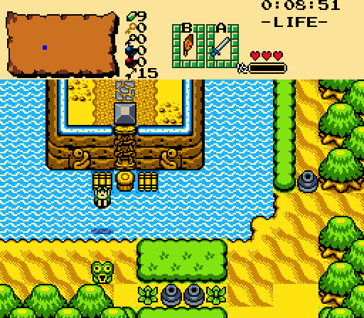
I get up and nothin' gets me down
You got it tough, I've seen the toughest around
And I know, baby, just how you feel
You got to roll with the punches and get to what's real
Might as well... JUMP!
Feenicks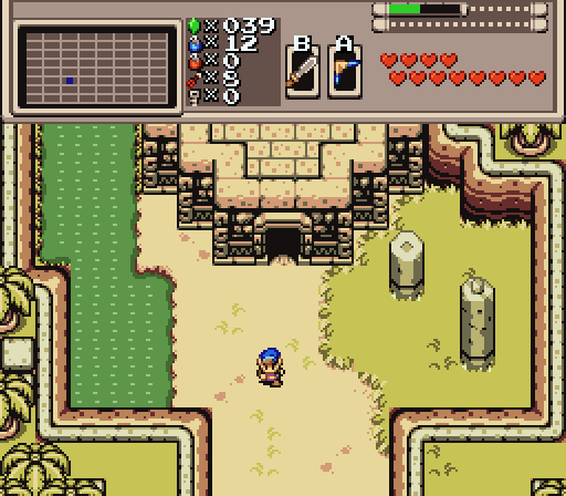
Yet another swamp ruin
Joelmacool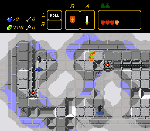
stuart the MOON !
Orithan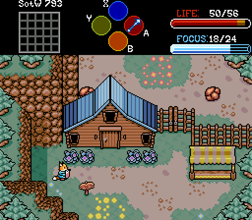
A quiet little farming hamlet. Maybe a little too quiet.

Screenshot of the Week 793
Started by
Deedee
, Sep 05 2023 04:32 PM
Joelmacool Architect Abdiel Feenicks Orithan
-
 This topic is locked
7 replies to this topic
#1

Deedee
-

- Moderators
-

Bug Frog Dragon Girl
- Real Name:Deedee
- Pronouns:She / Her, They / Them
- Location:Canada
Posted 05 September 2023 - 04:32 PM
- Anthus, Twilight Knight and Joelmacool like this
#2
Shane
-

- Moderators
-
💙
- Pronouns:He / Him
- Location:South Australia
Posted 05 September 2023 - 05:27 PM
The mix of dungeon and overworld tiles in Architect Abdiel's screenshots lately have made his screens very distinct. I do think the combination of tiles is funky, but I think it looks inoffensive. My only gripe is the lack of a transition for the sand to normal dirt.
I feel the details are a bit lacking in your screenshot, Feenicks. Mostly needing some bushes or something natural to be included with the ruins on the right and mountaintops below. Does have a nice vibe to it otherwise.
I'm honestly not sure how to read Joelmacool's screen but I really love it. It has an "impossible" feel to it and I'm really intrigued.
The custom work in Orithan's shot is really nice and fleshed out. Looking at it more, maybe the boulders could use the mountain colours more?
- Twilight Knight, Joelmacool and Bagu like this
#3
Anthus
-

- Members
-

Lord of Liquids
- Location:Ohio
Posted 05 September 2023 - 11:03 PM
It's joelver.
I like all the entries, but I voted for Joel. I like sky dungeons. I also really like the grass details, and flowers in Orithan's screen.
- Twilight Knight, Joelmacool and Matthew like this
#4
Moosh
-

- ZC Developers
-

Tiny Little Questmaker
Posted 05 September 2023 - 11:26 PM
Was really torn between Joel and Orithan's shots. It's impressive how Orithan's tileset is coming together. Really dig the look of those fences and that house. Shane mentioned the color on the boulders and now I can't unsee it. AAAAAAAAAAAA! It's been featured in several of Orithan's other shots already, but I really dig some of the UI too, the focus bar especially.
Then there's Joel's shot. Wow. It's a little hard to tell what's going on but what's going on is really cool for it. I do wish the palette was tweaked a bit to play nicer with ZC's transparency so you wouldn't have that out of place blue highlight everywhere. Other than that really cool.
Think in the end the cool concept of Joel's shot barely won out.
Also so as not to completely ignore the others...
Abdiel's shot is very vanilla. Never been much a fan of the Labrynna palette, as it's far too saturated. It's nice having a shot in motion with some gameplay elements to ponder and the level of detail feels authentic enough. I might suggest a sand to dirt transition along the bottom edge instead of the angular cutoff there is now.
Feenicks' shot is very functional but seems a little lacking in detail. Some more grass and maybe some bushes would go a long way. Especially in the far right and lower right cliff section which feels very empty.
- Twilight Knight and Joelmacool like this
#5
Twilight Knight
-

- Members
-

Tell all with glee, Argon's on PureZC
- Real Name:Sven
- Location:Rotterdam, NL
Posted 07 September 2023 - 01:52 AM
It wasn't an easy choice, but I voted for Joel, I really like that aesthetic. I don't agree with Moosh about the blue colour from the transparency, I think it looks good and gives a rather "nice contrast and colour balance" (I don't know what I'm talking about haha).
Orithan's screen looks amazing too with all the custom graphics, you are quite the spriter!
Architect's screen definitely deserves some praise for being very true to the GB games (I don't like that van Halen song though ;-) )
And I feel that though Feenick's has a nice design going, the screen is rather under detailed like others already pointed out.
- Joelmacool likes this
#6
Taco Chopper
-

- Administrators
-

protector of the darn forum
- Pronouns:He / Him
- Location:South Australia
Posted 07 September 2023 - 08:06 PM
Thank you again Deedee for posting this while I've been away on work adventures - I really appreciate it.
Voted for Orithan because I'm a sucker for good farm shots. Not totally sure that those yellows work well on that market stall, though.
Joel's is great too - a close second - and I admire the functionality of the screen as well. I think my only criticism is that there's just a lot of grey - but that's me nitpicking at this point. All I can think of is this when I see the caption though and I don't know if that's just me referencing niche Australian sports journalist moments again or what
Feenicks' shot looks really good functionally as well but I think I'm echoing similar remarks in that it just needs a bit more detail to really pop out.
Abdiel's shot has some ideas to it but the blank tiles, mismatched graphics and that specific Labrynna palette - the latter of which I touched on last week - are just factors that detract from the screen rather than helping it in any way.
- Joelmacool and Deedee like this
#7
Orithan
-

- Members
-

Studying Scientist - Commission from Silvixen
- Location:Australia
Posted 10 September 2023 - 06:28 AM
*Snip*
The custom work in Orithan's shot is really nice and fleshed out. Looking at it more, maybe the boulders could use the mountain colours more?
That I can absolutely do.
*snip*
Voted for Orithan because I'm a sucker for good farm shots. Not totally sure that those yellows work well on that market stall, though.
*snip*
Unfortunately the problem with the market stalls is that I've been lacking room for a white highlight on all of my overworld CSets. I have a couple of beige highlights for the mountains and ground but no proper white highlight. I can easily do 8-bit colours for the tarps but I will be looking into ways I can fit a white highlight on all of my overworld CSets
#8
Taco Chopper
-
- Administrators
-
protector of the darn forum
- Pronouns:He / Him
- Location:South Australia
Posted 11 September 2023 - 08:20 AM
With 44.00% of the vote, the winner of Screenshot of the Week 793 is Joelmacool!
stuart the MOON !
Congratulations!
Voting totals:
stuart the MOON !
Congratulations!
Voting totals:
- Joelmacool - 11 (44.00%)
- Orithan - 10 (40.00%)
- Feenicks - 3 (12.00%)
- Architect Abdiel - 1 (4.00%)
- Bagu likes this
Also tagged with one or more of these keywords: Joelmacool, Architect Abdiel, Feenicks, Orithan
PureZC Events →
Screenshot of the Week →
Poll Screenshot of the Week 812Started by Taco Chopper , 15 Apr 2024 |
|

|
||
 |
PureZC Events →
Screen Rebirth →
Poll Screen Rebirth 8! The Contest!Started by Taco Chopper , 25 Mar 2024 |
|

|
|
|
|
Twilight Knight
PureZC Events →
Screenshot of the Week →
Poll Screenshot of the Week 807Started by Taco Chopper , 05 Feb 2024 |
|
|
|
|
|
Phosphor
PureZC Events →
Map of the Month →
Poll Map of the Month 149Started by Shane , 02 Feb 2024 |
|

|
|
|
|
Anthus
PureZC Events →
Screenshot of the Week →
Poll Screenshot of the Year 2023 - Blue BracketStarted by Taco Chopper , 22 Jan 2024 |
|
|
1 user(s) are reading this topic
0 members, 1 guests, 0 anonymous users

