GrantGreif
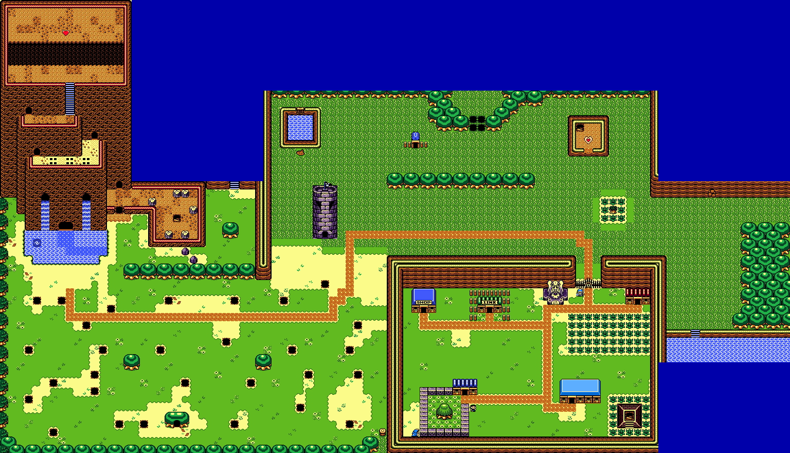
The opening area of my quest, Gereiffof Plains. Parts of the first dungeon can be seen in the top-left.
Mudkipz
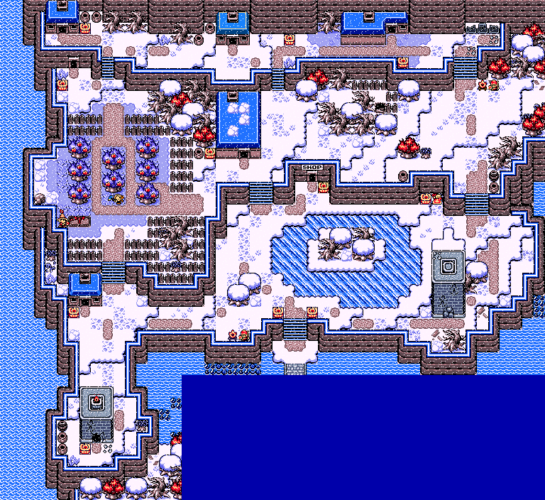
Eversnow Village. Endless snow has driven most of the village's inhabitants underground. Only a few brave souls will venture out into the cold.
Dwarlen
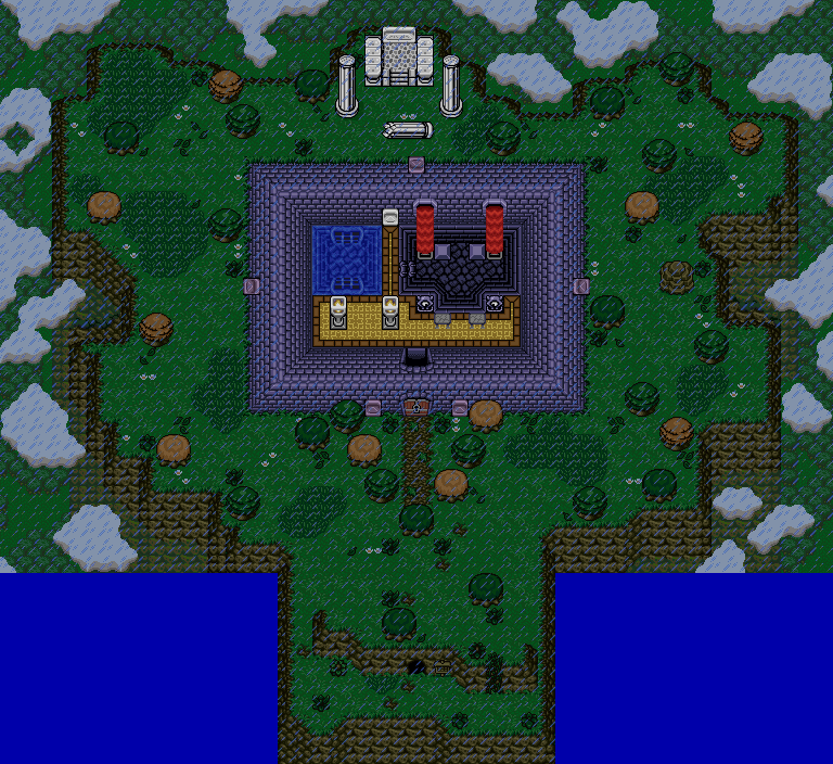
At the top of the mountain, a locked and unused forge rest.

-
 This topic is locked
7 replies to this topic
#1

nicklegends
-

- Contributors
-

Trofessional Pransposer
- Real Name:Ed
- Pronouns:He / Him
Posted 31 January 2015 - 10:55 PM
#2
Shane
-

- Moderators
-

💙
- Pronouns:He / Him
- Location:South Australia
Posted 31 January 2015 - 11:56 PM
It is out of either GrantGreif or Mudkipz; both holding great EZGBZ maps in their own regards. GrantGreif reminds me deeply of Link's Awakening and a dose of the Oracle games. Solid trees are cool, and you got palettes actually down. Mudkipz, like GrantGreif, used a really neat palette and used EZGBZ tiles in a unique way.
However, my vote goes to GrantGreif. I feel like his shot could use more grass detailing however - Mix the normal grass with the tall grass and spam flowers everywhere. That'd be the right step to a better map IMHO. But I digress, his map was really interesting and sparked my memories of Link's Awakening upon discovering a nice grassy field outside the village. So I guess you can say nostalgia plays a key element in the design here.
Dawarlen's map is interesting too. But the perspective is tad confusing.
#3
Eddy
-

- Moderators
-
ringle
- Real Name:Edward
- Pronouns:He / Him
- Location:London, United Kingdom
Posted 01 February 2015 - 07:02 AM
I voted for Mudkipz for that spectacular map. I love the design and the palette is really neat. The other maps are pretty cool as well, but I honestly preferred Mudkipz this time. Great job!
#4
Rastael
-

- Members
-

744
- Real Name:Raphael
- Location:Austria
Posted 01 February 2015 - 01:16 PM
GrantGreif
+ A good map that remebers me of Links Awakening. The small village and the left part of the map are very nice designed!
- It feels a bit unfinished and there are too much empty grass combos on the right side of the map.
Mudkipz
That's what I call a great map! There's nothing more to say. *vote*
Dwarlen
+ The outside area looks great
- The room in the middle of the screen looks on one hand nice, but on the other hand a bit out of place.
#5
David
-

- Administrators
-

Fallen leaves... adorn my night.
- Real Name:David
- Pronouns:He / Him
Posted 02 February 2015 - 08:02 PM
Voted for Mudkipz map this time. I felt like it had the most detail and was the most interesting of all 3 maps. ![]()
#6
klop422
-

- Members
-

Guess I'm full of monsters and treasure
- Real Name:Not George
- Location:Planet Earth
Posted 14 February 2015 - 08:00 AM
Mudkipz seemed the best to me this time. GrantGreif's seems kind of square (which I've been told is bad form), and I can't quite tell what makes Mudkipz's (how do you add possession to a name with a z at the end?) better than Dwarlen, but it is.
Also, this is MotM 60, and, as there are 12 per year, this should mean (unless something happened some time) that this should be the 5-year anniversary one. Or the next one. Not sure.
#7
Dwarlen
-

- Members
-

Experienced Forumer
Posted 14 February 2015 - 08:39 AM
GrantGreif
An intriguing map, looks very civilized. One thing though, all those straight cliffs and tree lines look a little unnatural. Granted, mixing them up would probably cause the map to loose some of it's civilized look, it would probably look better if the tree and cliffs lines were a little uneven.
Mudkipz
I like what I see here, if I hadn't entered the contest myself this is where I would vote. The map has a good palette, promises several interesting things to do, and offers a good amount of variance without overdoing it.
Dwarlen
The mixed perspective between the dungeon wall and the cliff tiles give the map a funny look. Also, my sister tells me that rain above the clouds is unnatural, and of course, what follows from that is that the palette is wrong because if it isn't raining, or nighttime (which it isn't), then the palette should be allot brighter. The good news is though, that after moving the rain beneath the mountain top and the clouds, and also making the palette brighter and more cheerful, the map honestly looks allot better now. I didn't fix the perspective issue however. But, the way I figure it, there isn't much I can do about that anyway ![]() .
.
#8
nicklegends
-
- Contributors
-
Trofessional Pransposer
- Real Name:Ed
- Pronouns:He / Him
Posted 01 March 2015 - 03:58 AM
GrantGreif (2 votes [5.88%])
Mudkipz (26 votes [76.47%])
Dwarlen (6 votes [17.65%])
Congratulations, Mudkipz; your snowy village wins Map of the Month 60!
Mudkipz (26 votes [76.47%])
Dwarlen (6 votes [17.65%])
Congratulations, Mudkipz; your snowy village wins Map of the Month 60!
Also tagged with one or more of these keywords: Mudkipz


1 user(s) are reading this topic
0 members, 1 guests, 0 anonymous users

